View review
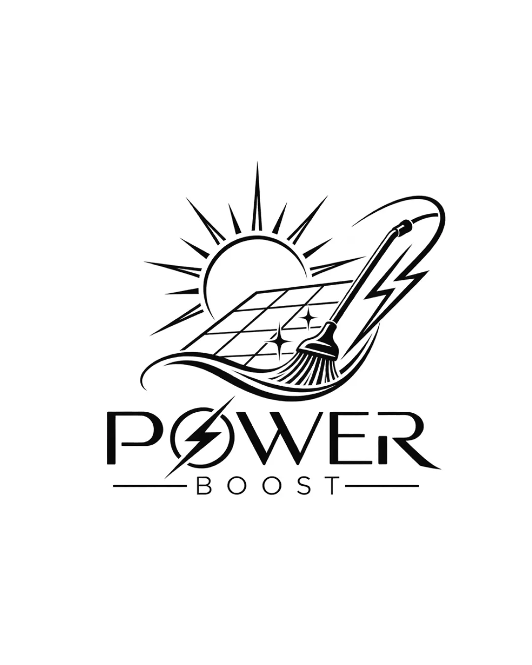
Power Boost
A compelling and industry-appropriate logo with clear messaging, balanced design, and minor improvement needs.
Objective AI feedback. Your creative decision.
What to fix first
The most important fixes to handle before polishing the full presentation.
Simplify or thicken the linework in the cleaning brush and solar panel grid for better small-size clarity.
High priorityCurrent fine details may lose definition; clearer marks enhance reproduction and professional feel.
Impact: Improves Scalability And Ensures Usability In All Practical Contexts. · Effort: Medium
Logo performance breakdown
Legibility
Text is highly readable and clear even in stylized font.
'POWER BOOST' stands out and supports the message.
The lightning bolt crossing the 'O' slightly complicates the shape but remains legible.
Originality
Distinct use of combined sun, solar panel, cleaning tool, and energy motifs.
Integrated industry-relevant concepts.
Uses visual cliches (sun, lightning) common in the energy sector.
Balance alignment
Well-balanced between illustration and text.
Good horizontal alignment and visual weight distribution.
Slight complexity in the illustration might pull focus from the wordmark at smaller scales.
Scalability
Monochrome design supports reproduction at various sizes.
Distinct elements with clear separation.
Fine line details in the brush and solar panel grid could be lost at small sizes.
200x250 px
100×125 px
50×62 px
Misinterpretations
No realistic risk of negative secondary interpretation.
Logo structure & brief match
Seamless integration between mark and wordmark through the lightning motif.
Visual style is consistent across elements.
Slight style tension between illustration detail and clean type.
Industry Relevance: Strongly fits solar energy or cleaning sector through primary visual metaphors.
Wondering how your logo performs?
Get a clear logo score, key risks, and priority fix ideas before your client or audience sees it.