 View review
Logo score
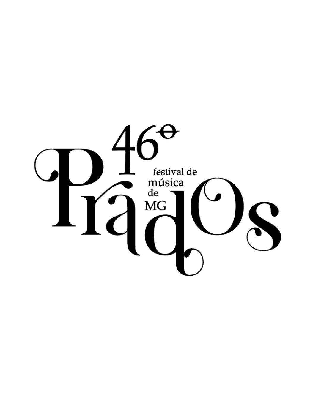
Logo review ofPrados 46° Festival De Música De Mg
Review the detailed scores below to see what is working and what should be refined first.
Legibility
Originality
Misread
Balance
Scale
Detailed review
Logo performance breakdown
Legibility
 Distinctive serif typography creates an elegant feel.
 Different sizes and styles create some legibility issues.
Originality
Creative arrangement of text elements.
Color harmony
Effective use of monochrome color scheme.
Balance alignment
Interesting interplay between text elements.
Uneven alignment makes it feel slightly off-balance.

Scalability
Single color enhances print versatility.
Complex typography may lose detail at smaller sizes.
200x250 px
100×125 px
50×62 px
Misinterpretations
No inappropriate symbolisms detected.
Try your own review
Review my logo
Wondering how your logo performs?
Get a clear logo score, key risks, and priority fix ideas before your client or audience sees it.
Keep exploring