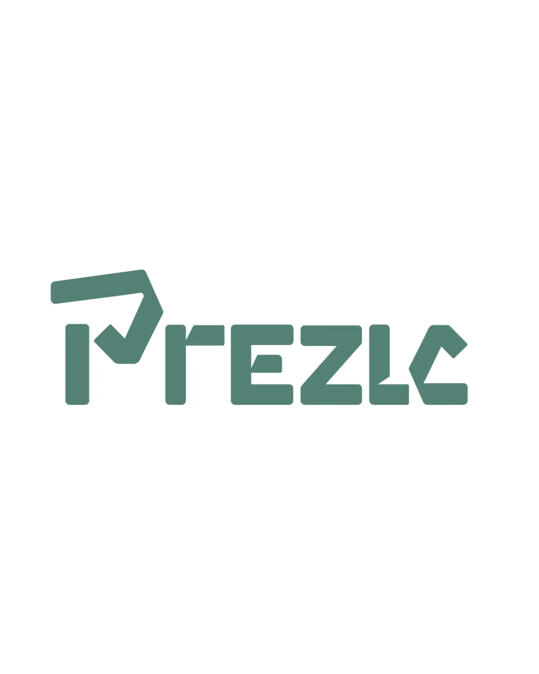
PREZLC logo review
4.1 / 5
Logo score
Logo review of

Prezlc

Review the detailed scores below to see what is working and what should be refined first.

Combination Mark Modern, Geometric, Sans-serif, Custom Wordmark Technology
3/5
Legibility
4/5
Originality
5/5
Misread
4/5
Balance
4/5
Scale
Detailed review

Logo performance breakdown

3/5

Legibility

Checkmark icon Letterforms are fairly consistent in weight and spacing.
Checkmark icon Custom geometric shapes give the wordmark a unique style.

Warning icon The 'P' and 'C' can be misread due to their abstract structure.
Warning icon Angular cuts reduce rapid letter recognition, impacting readability for new viewers.
Warning icon Geometric approach to 'E' and 'Z' adds some confusion.

4/5

Originality

Checkmark icon Custom letterforms present a strong unique visual identity.
Checkmark icon Angular approach gives it a recognizable edge among technology-focused brands.

Warning icon The angular geometric wordmark is becoming more common in tech; careful refinement can help further differentiate.

5/5

Color harmony

Checkmark icon Single muted teal color is calming, sophisticated, and non-intrusive.
Checkmark icon Contrast between the logo color and white background is effective.

CuttySark
#5D8881

White
#FFFFFF

4/5

Balance alignment

Checkmark icon Good horizontal alignment.
Checkmark icon All letters share a consistent geometric language, delivering visual cohesion.

Warning icon The abstract 'P' is slightly top-heavy compared to the rest of the wordmark, creating a minor imbalance.

logo 200x250 pixels scalability test alignment grid overlay
4/5

Scalability

Checkmark icon Bold, solid shapes maintain integrity when scaled down or up.
Checkmark icon Single color ensures clarity in monochrome and metallic versions.
Checkmark icon Works well on signage, digital assets, and packaging.

Warning icon Some small details in angular lettering may blur at very small sizes (e.g., business cards, app favicons).

logo 200x250 pixels scalability test

200x250 px

logo 100x125 pixels scalability test

100×125 px

logo 50x62 pixels scalability test

50×62 px

5/5

Misinterpretations

Checkmark icon No inappropriate or unintentional negative symbolism detected.
Checkmark icon Abstract form remains inoffensive.

4 / 5

Symbol & text fit

Checkmark icon The stylized 'P' logomark matches the custom typography style of the wordmark.
Checkmark icon Visual weight and angularity are coherent across both elements.

Warning icon Slight size disparity; 'P' could be slightly reduced or other letters adjusted for tighter cohesion.

Try your own review

Wondering how your logo performs?

Get a clear logo score, key risks, and priority fix ideas before your client or audience sees it.

Review my logo