Increase differentiation between letters in 'Pudd Cup' for instant clarity, especially the U and D shapes.
Current highly stylized letters may hinder quick reading by new viewers.
Improves everyday legibility and customer recall.
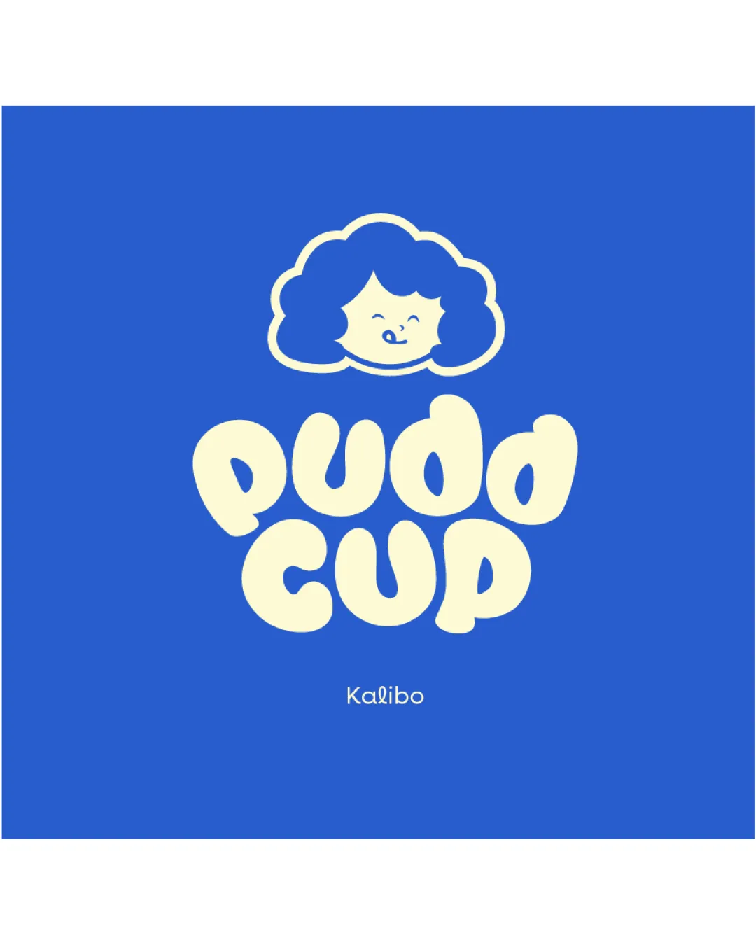
A fun, appealing, and cohesive brand mark that stands out and suits the likely market; enhanced immediate readability would perfect it.
Focus on the changes that matter. Keep what makes the logo work.
Current highly stylized letters may hinder quick reading by new viewers.
Improves everyday legibility and customer recall.
Very strong due to soft forms and smiling character.
Estimated colors. Use the original design file for exact values.
Create a full color palette using these colors
Create new palette
Inspect spacing with the guide. Optical balance may differ from geometric centering.
Get a clear logo score, key risks, and priority fix ideas before your client or audience sees it.
More credits needed
Add credits to continue without losing your work.
Then $7/month. Cancel anytime.
Essential logo review with AI
Estimated progress