Pulpi Dental Care logo logo review
4/5
Logo score

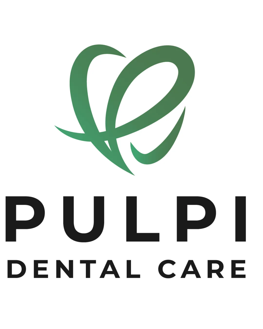
Pulpi Dental Care logo

Essential logo review

Solid, legible and modern logo, but lacks a distinctive playful or friendly accent needed for the 5-30 years target group.

This logo lockup shows strong execution, supported by visual balance and text readability; improving distinctiveness is the clearest next step.

Combination Mark Modern, Abstract, Gradient Dental/medical
5/5
Legibility
3/5
Originality
4.2/5
Balance
4/5
Scale
4/5
Color
4/5
Style consistency
@creative744592
Your next steps

What to fix first

Focus on the changes that matter. Keep what makes the logo work.

1

Standalone mark

Explore features that enhance uniqueness or playfulness for the intended age group.

High priority Worth testing Medium effort

The abstract mark could be interpreted as a heart or tooth, but it is a common motif in dental branding; visual distinctiveness is moderate.

How to check

Test if the mark is memorable and stands out among dental competitors.

See the category review
Detailed review

Logo performance breakdown

3/5

Brief & logo match

The logo is professionally suited for dental care and communicates care and dental themes, but does not clearly embody the requested 'fun and cute element' for young patients.

5/5

Legibility

Wordmark 5/5 · Layout 5/5

  • Wordmark and descriptor are highly legible, with clear letterforms and balanced spacing.
5/5

Misinterpretations

  • No unintended readings are apparent; abstract form remains benign.
4.2/5

Balance alignment

Symbol 4/5 · Wordmark 4/5 · Layout 5/5

  • Wordmark and mark are visually aligned and evenly spaced, giving stability to the lockup.
Uploaded logoAlignment guide overlay

Inspect spacing with the guide. Optical balance may differ from geometric centering.

4/5

Color harmony

Symbol 4/5 · Wordmark 4/5

  • Green gradient mark and black wordmark offer solid contrast and a modern accent.
Green Gradient#38996A
Black#202020

Estimated colors. Use the original design file for exact values.

Create a full color palette using these colors

Create new palette
4/5

Scalability

Symbol 4/5 · Wordmark 4/5 · Layout 4/5

  • The abstract mark and bold wordmark remain recognizable at moderate reduction; very small scales may lose gradient impression.
4/5

Style consistency

Available in Advanced logo reviews
3/5

Originality

Symbol 3/5 · Wordmark 3/5

Available in Advanced logo reviews
Try your own review

Wondering how your logo performs?

Get a clear logo score, key risks, and priority fix ideas before your client or audience sees it.

Review my logo