 View review
Logo score
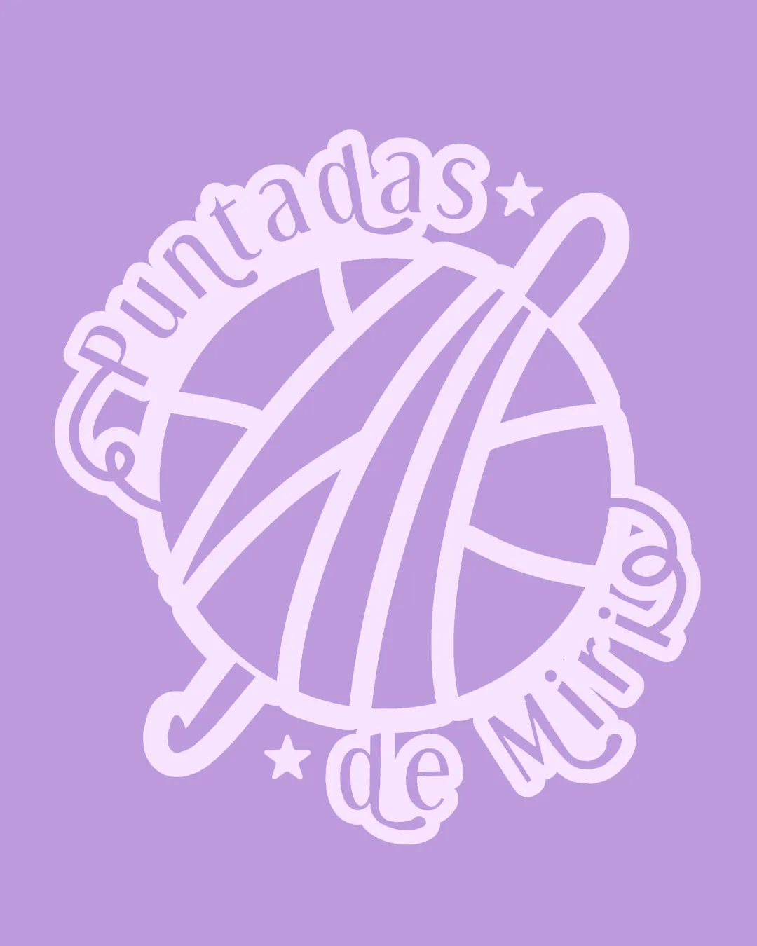
Logo review ofPuntadas De Miria
Review the detailed scores below to see what is working and what should be refined first.
Legibility
Originality
Misread
Balance
Scale
Detailed review
Logo performance breakdown
Legibility
![]() Text is playful and aligns with the handcrafting theme.
Text is playful and aligns with the handcrafting theme.![]() Contrast makes text somewhat visible.
Contrast makes text somewhat visible.
![]() Text orientation around the circle makes it harder to read, especially 'de Miria.'
Text orientation around the circle makes it harder to read, especially 'de Miria.'![]() Letter spacing is inconsistent due to the warping effect, which detracts from clarity.
Letter spacing is inconsistent due to the warping effect, which detracts from clarity.![]() Some parts of the text blend into the logo outlines, reducing immediate legibility.
Some parts of the text blend into the logo outlines, reducing immediate legibility.
Originality
![]() Encapsulates craft/knitting theme well.
Encapsulates craft/knitting theme well.![]() Illustrative approach and hand-drawn style feel personal and relevant to the market.
Illustrative approach and hand-drawn style feel personal and relevant to the market.
![]() Yarn ball with needles is a common symbol in the crafts/knitting industry.
Yarn ball with needles is a common symbol in the crafts/knitting industry.![]() Stars add little uniqueness and feel like generic decoration.
Stars add little uniqueness and feel like generic decoration.
Color harmony
![]() Consistent monochromatic palette, good harmony.
Consistent monochromatic palette, good harmony.![]() Soft tones create a friendly and inviting feel.
Soft tones create a friendly and inviting feel.
Heather
#D6BAE8
Lavender
#B492D2
Balance alignment
![]() Centering of yarn ball provides a visual anchor.
Centering of yarn ball provides a visual anchor.![]() Elements are held together within a coherent circle.
Elements are held together within a coherent circle.
![]() Circular, wrapped text creates visual imbalance and inconsistent spacing.
Circular, wrapped text creates visual imbalance and inconsistent spacing.![]() The direction and placement of the knitting needles create asymmetry.
The direction and placement of the knitting needles create asymmetry.

Scalability
![]() Simple shapes and thick lines maintain partial clarity in medium sizes.
Simple shapes and thick lines maintain partial clarity in medium sizes.![]() Recognizable at a glance in poster or digital use.
Recognizable at a glance in poster or digital use.
![]() Excessive fine detail and warped text will struggle at small scales (social icons, tags, embroidery).
Excessive fine detail and warped text will struggle at small scales (social icons, tags, embroidery).![]() Circular text and detailed illustration are not versatile for compact use cases.
Circular text and detailed illustration are not versatile for compact use cases.![]() Will likely lose definition and legibility in favicon or small merch applications.
Will likely lose definition and legibility in favicon or small merch applications.
200x250 px
100×125 px
50×62 px
Misinterpretations
![]() No inappropriate or ambiguous symbols detected.
No inappropriate or ambiguous symbols detected.
Try your own review
Review my logo
Wondering how your logo performs?
Get a clear logo score, key risks, and priority fix ideas before your client or audience sees it.
Keep exploring