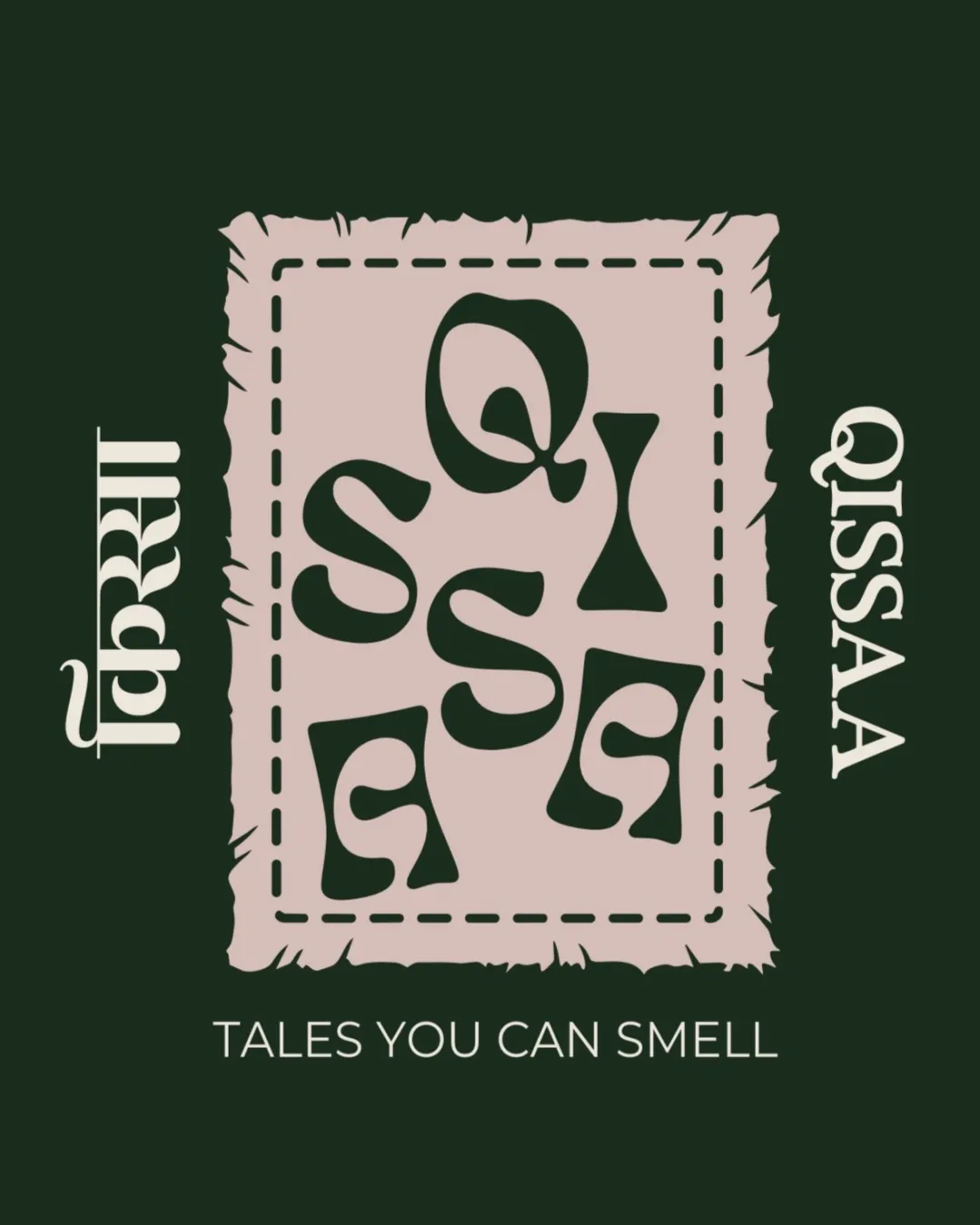
QISSAA TALES YOU CAN SMELL logo review
3.5 / 5
Logo score
Logo review of

Qissaa Tales You Can Smell

Unique, memorable, and closely tied to sensory storytelling, but legibility refinements are recommended for maximum brand impact.

Combination Mark Vintage, Literary, Handcrafted Fragrance, Storytelling
3/5
Legibility
4/5
Originality
4/5
Misread
3.5/5
Balance
3/5
Scale
Action plan

What to fix first

The most important fixes to handle before polishing the full presentation.

1

Refine the interior distorted letterforms to improve legibility, especially at smaller sizes.

High priority

Difficult-to-read letterforms could limit brand recognition and usability.

Impact: Greater Clarity And Accessibility While Retaining Uniqueness. · Effort: Medium

2

Test vertical and horizontal lockups for the QISSAA wordmark to ensure versatility across layouts.

Medium priority

Vertical placement adds character but may be restrictive in some uses.

Impact: Wider Applicability In Diverse Branding Materials. · Effort: Medium

Detailed review

Logo performance breakdown

3/5

Legibility

Checkmark icon Main wordmark ('QISSAA') and tagline are readable

Warning icon Interior distorted letters are difficult to decipher

4/5

Originality

Checkmark icon Distinctive letter distortions and hand-framed effect create strong identity

Warning icon Some hand-drawn patch aesthetics are seen in literary/indie sectors

4/5

Color harmony

Checkmark icon Moody color palette fits literary/sensory theme and stands out

Very Dark Green
#20271C

Pale Mauve
#E7D0C5

White
#FFFFFF

Your palette is close. Refine the color roles and combinations before updating the logo.

Build brand colors
3.5/5

Balance alignment

Checkmark icon Overall shape and orientation are visually balanced
Checkmark icon Framed square anchors the layout

Warning icon Vertical text orientation could feel awkward in some contexts

logo 200x250 pixels scalability test alignment grid overlay
3/5

Scalability

Checkmark icon Central graphic can scale with minimal loss

Warning icon Thin serif details and letter distortions may not reduce well to small sizes

logo 200x250 pixels scalability test

200x250 px

logo 100x125 pixels scalability test

100×125 px

logo 50x62 pixels scalability test

50×62 px

4/5

Misinterpretations

Checkmark icon No obvious problematic secondary meanings

4 / 5

Logo structure & brief match

Checkmark icon Stylistic coherence between mark and supporting wordmarks

Checkmark icon Storytelling And Scent Connection: Visually and thematically conveys sensory storytelling with tactile flair.
Checkmark icon Originality: Letter shaping and handmade framing show clear attempt at unique positioning.

Try your own review

Wondering how your logo performs?

Get a clear logo score, key risks, and priority fix ideas before your client or audience sees it.

Review my logo