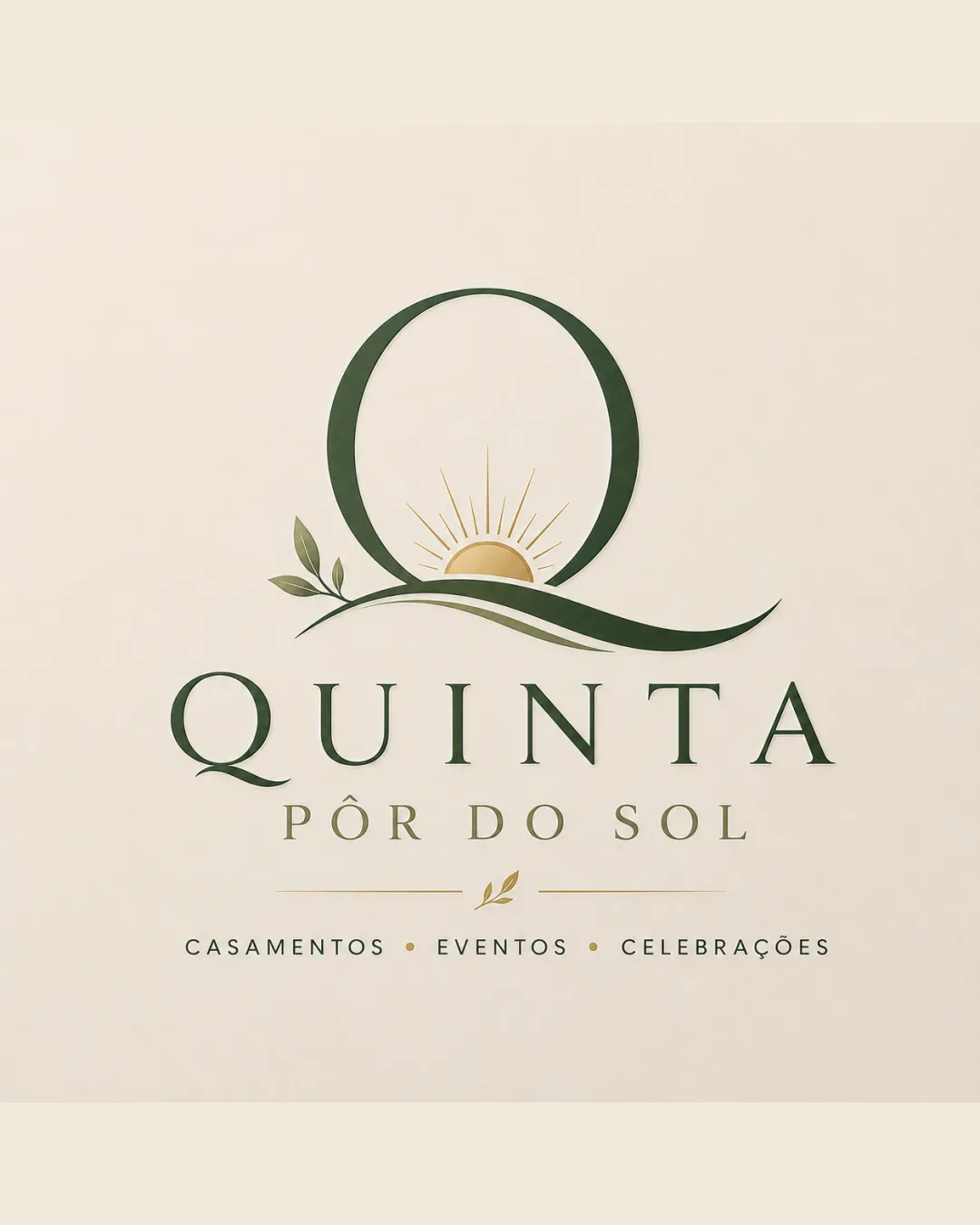
QUINTA PÔR DO SOL CASAMENTOS EVENTOS CELEBRAÇÕE.. logo review
4.4/5
Logo score
Logo review of

Quinta Pôr Do Sol Casamentos Eventos Celebraçõe..

Strong, memorable event venue logo with refined execution and clear identity.

Combination Mark Elegant, Natural, Minimalist, Upscale Events / Hospitality
4.5/5
Legibility
4/5
Originality
5/5
Misread
4.5/5
Balance
4/5
Scale
Action plan

What to fix first

The most important fixes to handle before polishing the full presentation.

1

Increase contrast of tagline text for better accessibility.

Medium priority

Tagline in gold on cream is slightly low-contrast.

Impact: Improves Readability, Especially In Print And Lower Light Contexts. · Effort: Low

2

Consider a simplified alternate mark for very small usage.

Low priority

Fine leaf/sun details may be lost at small scale.

Impact: Ensures Clarity In Favicon, Social, And Micro-print Applications. · Effort: Medium

Detailed review

Logo performance breakdown

4.5/5

Legibility

Checkmark icon Primary name and tagline are highly readable.
Checkmark icon Font choice supports a refined image.

Warning icon Slightly reduced contrast between gold tagline and cream background.

4/5

Originality

Checkmark icon Elegant, custom integration of symbol and text.
Checkmark icon Sun-and-leaf motif in the 'Q' is memorable for this industry.

Warning icon Sunset and leaf can be common in event venue branding, though the execution is above average.

4.5/5

Color harmony

Checkmark icon Natural palette supports the venue/nature theme.
Checkmark icon Gold accent adds an upscale touch.

Warning icon Tagline contrast could be marginally improved.

Dark Olive Green
#31432e

Gold
#aea369

Light Cream
#f4eadb

Your palette is close. Refine the color roles and combinations before updating the logo.

Build brand colors
4.5/5

Balance alignment

Checkmark icon Components are well-aligned and weighted.
Checkmark icon Visual hierarchy is clear with the mark drawing attention first.

Warning icon Minor risk of the leaf/curve detail overcomplicating the silhouette at micro sizes.

logo 200x250 pixels scalability test alignment grid overlay
4/5

Scalability

Checkmark icon Simple, clean forms scale well.
Checkmark icon Distinctive mark keeps clarity at a range of sizes.

Warning icon Thin serif strokes may lose definition at very small sizes.

logo 200x250 pixels scalability test

200x250 px

logo 100x125 pixels scalability test

100×125 px

logo 50x62 pixels scalability test

50×62 px

5/5

Misinterpretations

Checkmark icon No plausible misinterpretations or negative shapes.

4.5/5

Logo structure & brief match

Checkmark icon Cohesive blend between mark and wordmark; the 'Q' motif relates directly to the name.

Checkmark icon Name/Theme: Visually ties sunset and natural elements to the brand name.
Checkmark icon Industry/Positioning: Fits upscale event/hospitality venue targeting weddings and celebrations.

Try your own review

Wondering how your logo performs?

Get a clear logo score, key risks, and priority fix ideas before your client or audience sees it.

Review my logo