Wondering how your logo performs? 🧐
Get professional logo reviews in seconds and catch design issues in time.
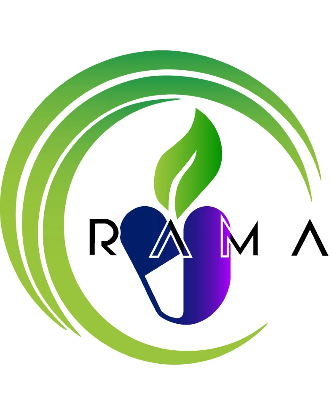
Try it Now!Logo review of RAMA
 Logo analysis by AI
Logo type:
Style:
Detected symbol:
Detected text:
Business industry:
Review requested by Aniketraj122
**If AI can recognize or misinterpret it, so can people.
Structured logo review
Legibility
![]() The text is generally readable
The text is generally readable![]() Use of a modern sans-serif font fits the style
Use of a modern sans-serif font fits the style
![]() The stylization of the 'A' with overlapping shapes from the capsule is distracting and affects clarity
The stylization of the 'A' with overlapping shapes from the capsule is distracting and affects clarity![]() Spacing between letters feels inconsistent, especially between the 'A' and 'M'
Spacing between letters feels inconsistent, especially between the 'A' and 'M'
Scalability versatility
![]() Bold iconography can be recognizable at medium-to-large sizes
Bold iconography can be recognizable at medium-to-large sizes![]() Simple shapes may translate well on billboards or signage
Simple shapes may translate well on billboards or signage
![]() Thin lines in the text and detail in the leaf will be lost at small sizes (e.g., business cards, app icons)
Thin lines in the text and detail in the leaf will be lost at small sizes (e.g., business cards, app icons)![]() The gradient and multiple colors will not reproduce well on embroidery or single-color print jobs
The gradient and multiple colors will not reproduce well on embroidery or single-color print jobs
200x250 px
100×125 px
50×62 px
Balance alignment
![]() The main icon is centered
The main icon is centered
![]() Wordmark placement feels awkward due to the pill and 'A' overlap, creating visual tension
Wordmark placement feels awkward due to the pill and 'A' overlap, creating visual tension![]() The green swoosh is heavily dominant on the left, causing imbalance
The green swoosh is heavily dominant on the left, causing imbalance

Originality
![]() Attempt to combine pill capsule and leaf to represent healthcare and natural elements
Attempt to combine pill capsule and leaf to represent healthcare and natural elements
![]() Pill and leaf motif is very common in healthcare/nutraceutical industry, lacking unique twist
Pill and leaf motif is very common in healthcare/nutraceutical industry, lacking unique twist![]() No unique letterform or symbol treatment beyond the basic combination
No unique letterform or symbol treatment beyond the basic combination
Logomark wordmark fit
![]() Both elements are modern and somewhat align in concept
Both elements are modern and somewhat align in concept
![]() Mismatch in style: the soft gradient logomark clashes with the hard-edged geometric font
Mismatch in style: the soft gradient logomark clashes with the hard-edged geometric font![]() Overlap between icon and wordmark ('A') causes confusion
Overlap between icon and wordmark ('A') causes confusion
Aesthetic look
![]() Use of gradients adds dimension
Use of gradients adds dimension![]() Clean lines in the icon
Clean lines in the icon
![]() Too many color gradients and swoosh elements make the logo busy
Too many color gradients and swoosh elements make the logo busy![]() The overall look is generic and lacks memorability
The overall look is generic and lacks memorability
Dual meaning and misinterpretations
![]() No direct inappropriate double meanings observed
No direct inappropriate double meanings observed
![]() None
None
Color harmony
![]() Green and blue/purple gradients suggest health and wellness
Green and blue/purple gradients suggest health and wellness
![]() Heavy use of gradients and many hues feel overpowering
Heavy use of gradients and many hues feel overpowering![]() Too many colors for effective, versatile branding
Too many colors for effective, versatile branding
green
#34A853
navy
#1A237E
purple
#8E24AA
black
#000000
white
#FFFFFF