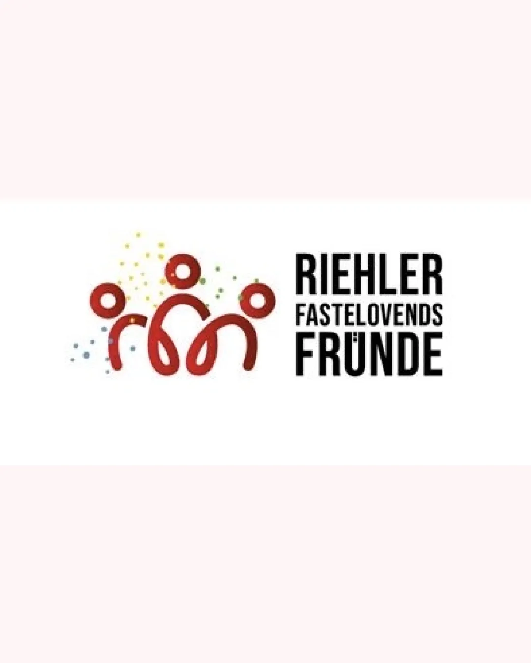
RIEHLER FASTELOVEN FÜNDE logo review
4.1 / 5
Logo score
Logo review of

Riehler Fasteloven Fünde

Festive, recognizable, and highly relevant for a German carnival group; stands out with its playful abstraction and professional execution.

Combination Mark Festive, Playful, Minimal German Carnival
4.5/5
Legibility
4/5
Originality
4.5/5
Misread
4/5
Balance
4/5
Scale
Action plan

What to fix first

The most important fixes to handle before polishing the full presentation.

1

Refine confetti details for small-scale clarity or provide a simplified version for small usage.

Medium priority

Colored detail may become cluttered at small sizes.

Impact: Improves Recognizability And Usability In Various Contexts. · Effort: Low

2

Harmonize wordmark and symbol curves slightly for even tighter integration.

Low priority

There is a mild stylistic mismatch between strict type geometry and fluid symbol.

Impact: Improves Cohesion For Design Purists. · Effort: Medium

Detailed review

Logo performance breakdown

4.5/5

Legibility

Checkmark icon Wordmark is highly readable and well spaced.

Warning icon Slightly condensed kerning in secondary text but not problematic.

4/5

Originality

Checkmark icon Playful figure abstraction is distinctive within carnival context.

Warning icon General festive confetti concept is widely used in event branding.

4/5

Color harmony

Checkmark icon Red and confetti colors express festivity, high contrast for accessibility.

Warning icon Multiple confetti colors could be simplified.

Red
#BA1B1B

Black
#000000

Yellow
#FDCB52

Light Blue
#6DC5D8

White
#FFFFFF

Your palette is close. Refine the color roles and combinations before updating the logo.

Build brand colors
4/5

Balance alignment

Checkmark icon Good alignment between mark and type.
Checkmark icon Visual rhythm successfully ties the symbol and name.

Warning icon Slight asymmetry in abstract figures may feel unbalanced to some.

logo 200x250 pixels scalability test alignment grid overlay
4/5

Scalability

Checkmark icon Distinct mark maintains integrity at smaller sizes.
Checkmark icon Simple forms work in monotone.

Warning icon Colored confetti may lose detail or become visual noise at very small scales.

logo 200x250 pixels scalability test

200x250 px

logo 100x125 pixels scalability test

100×125 px

logo 50x62 pixels scalability test

50×62 px

4.5/5

Misinterpretations

Checkmark icon Mark is clearly abstract figures, ties to group/friendship theme.

4.5 / 5

Logo structure & brief match

Checkmark icon Mark and wordmark complement each other in style and mood.

Warning icon Slight difference between organic curves of mark and geometric type.

Checkmark icon Carnival/community Focus: The logo's abstract figures, festive colors, and communal composition align strongly with carnival and friendship themes.

Try your own review

Wondering how your logo performs?

Get a clear logo score, key risks, and priority fix ideas before your client or audience sees it.

Review my logo