 View review
Logo score
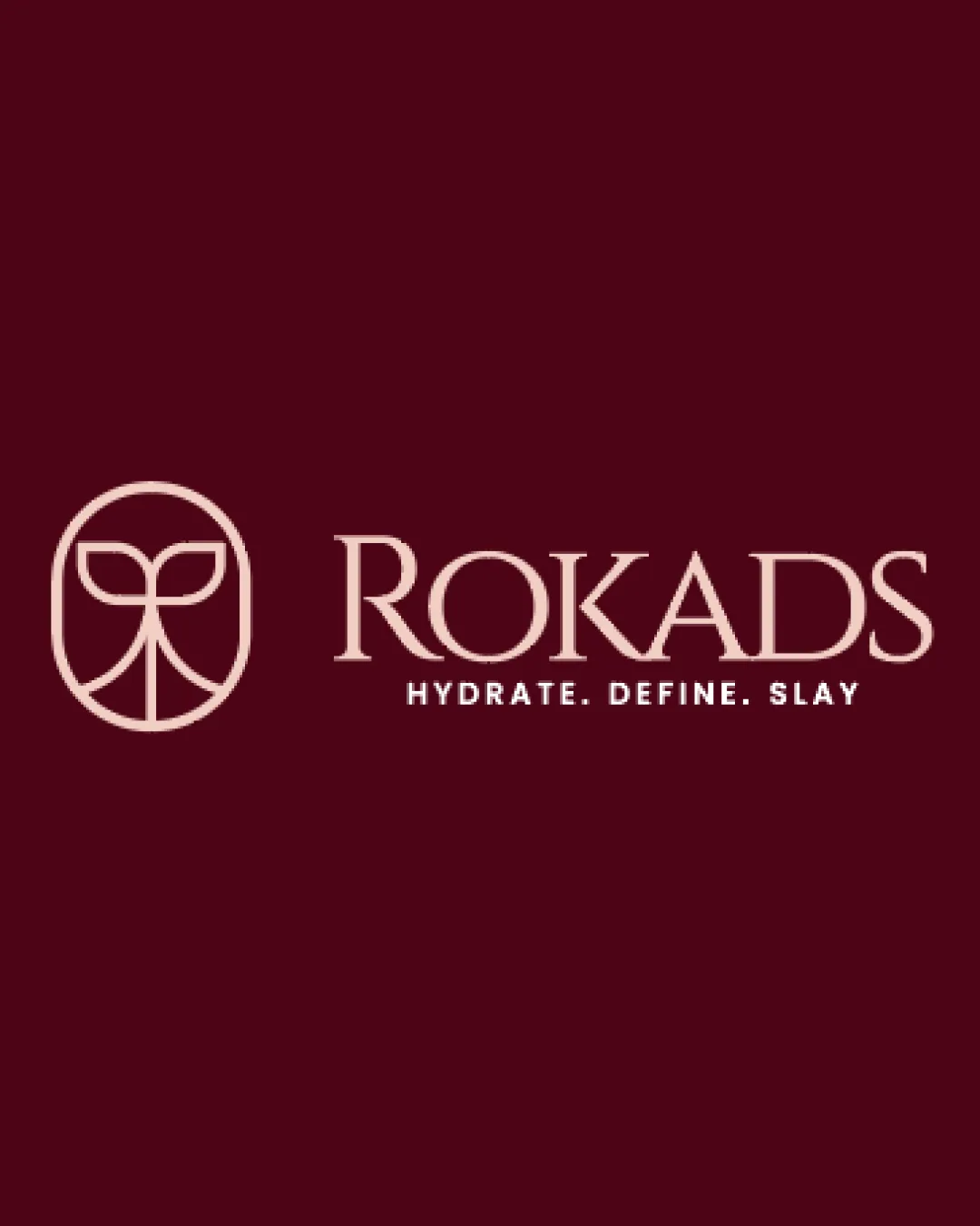
Logo review ofRokads
Review the detailed scores below to see what is working and what should be refined first.
Legibility
Originality
Misread
Balance
Scale
Detailed review
Logo performance breakdown
Legibility
![]() Clear, easy-to-read font
Clear, easy-to-read font![]() Good contrast with background
Good contrast with background
![]() Thin strokes could be less legible at smaller sizes
Thin strokes could be less legible at smaller sizes
Originality
![]() Unique abstract symbol
Unique abstract symbol
![]() Wordmark style is common in the industry
Wordmark style is common in the industry
Color harmony
![]() Elegant color contrast with background
Elegant color contrast with background![]() Consistent color scheme
Consistent color scheme
Balance alignment
![]() Well-balanced between symbol and text
Well-balanced between symbol and text![]() Good alignment between elements
Good alignment between elements

Scalability
![]() Simple design that scales well
Simple design that scales well![]() Suitable for various mediums, such as digital and print
Suitable for various mediums, such as digital and print
![]() Detailed elements in the symbol might lose clarity in very small sizes
Detailed elements in the symbol might lose clarity in very small sizes
200x250 px
100×125 px
50×62 px
Misinterpretations
![]() No inappropriate symbols detected
No inappropriate symbols detected
Symbol & text fit
![]() Both logomark and wordmark complement each other
Both logomark and wordmark complement each other
![]() Slight mismatch in complexity between symbol and text
Slight mismatch in complexity between symbol and text
Try your own review
Review my logo
Wondering how your logo performs?
Get a clear logo score, key risks, and priority fix ideas before your client or audience sees it.
Keep exploring


