 View review
Logo score
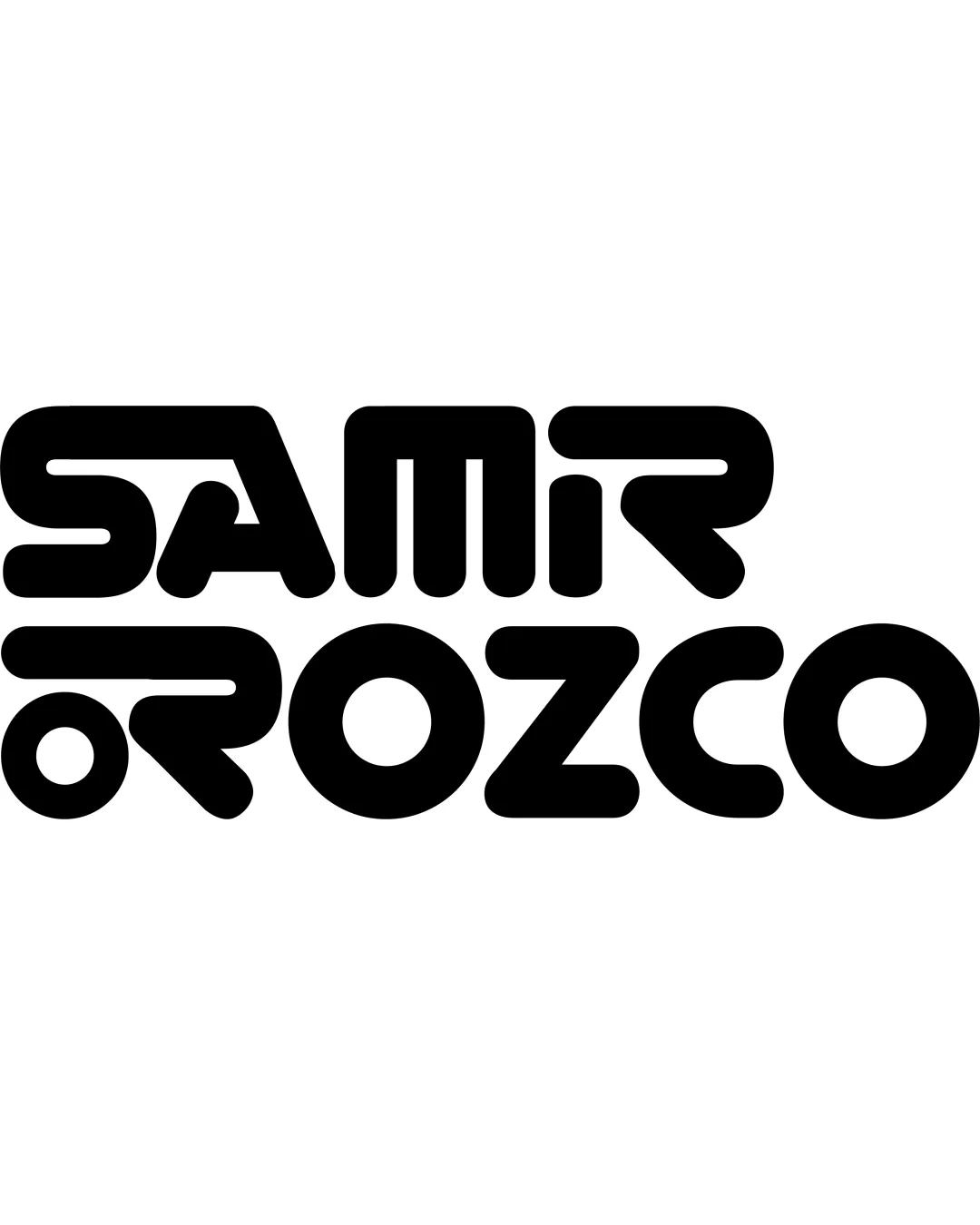
Logo review ofSamir Orozco
Review the detailed scores below to see what is working and what should be refined first.
Legibility
Originality
Misread
Balance
Scale
Detailed review
Logo performance breakdown
Legibility
![]() Bold letters are eye-catching.
Bold letters are eye-catching.
![]() Geometric shapes within letters reduce readability.
Geometric shapes within letters reduce readability.![]() Some characters blend together, making it hard to read from a distance.
Some characters blend together, making it hard to read from a distance.
Originality
![]() Unique typographic style sets it apart.
Unique typographic style sets it apart.
![]() Stylistic choices similar to 70s retro fonts.
Stylistic choices similar to 70s retro fonts.
Color harmony
![]() Single-color scheme creates simplicity.
Single-color scheme creates simplicity.
![]() The black color is strong but may lack vibrancy.
The black color is strong but may lack vibrancy.
Your palette is close. Explore sharper color combinations with Colorfly.design before updating the logo.
Explore palettesBalance alignment
![]() The alignment of text is well-distributed across two lines.
The alignment of text is well-distributed across two lines.
![]() Spacing between some letters feels inconsistent.
Spacing between some letters feels inconsistent.

Scalability
![]() Bold design makes it identifiable even at smaller sizes.
Bold design makes it identifiable even at smaller sizes.
![]() Thick geometric elements may become unclear when scaled down too much.
Thick geometric elements may become unclear when scaled down too much.
200x250 px
100×125 px
50×62 px
Misinterpretations
![]() No unintentional imagery or interpretations.
No unintentional imagery or interpretations.
Try your own review
Review my logo
Wondering how your logo performs?
Get a clear logo score, key risks, and priority fix ideas before your client or audience sees it.
Keep exploring


