View review
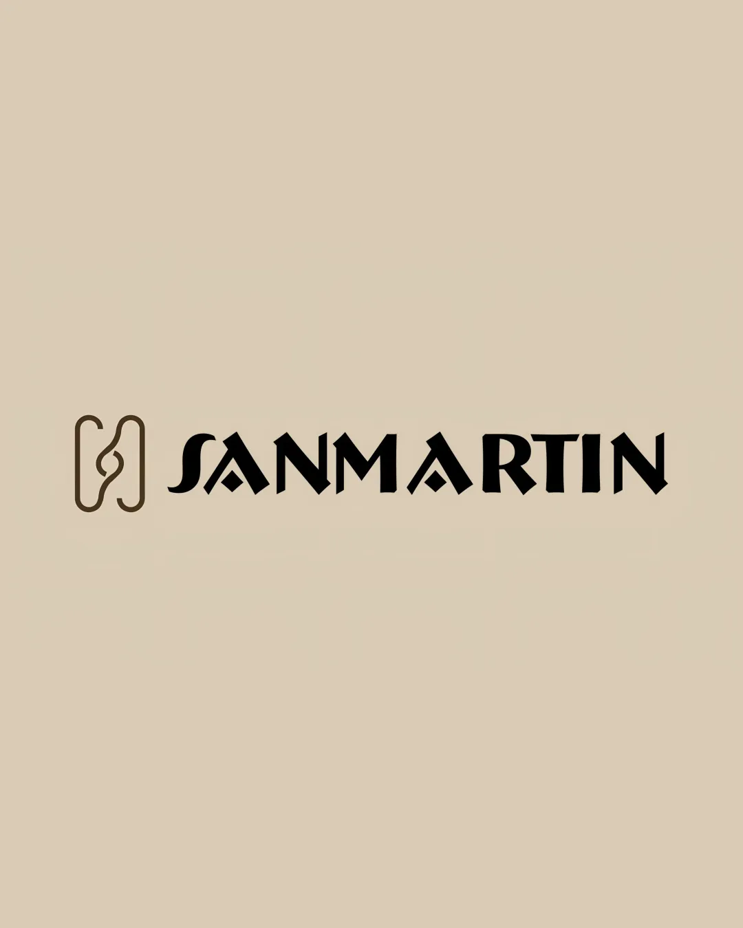
Sanmartin
Review the detailed scores below to see what is working and what should be refined first.
Objective AI feedback. Your creative decision.
Logo performance breakdown
Legibility
Text is bold and clearly separated from the background
Unique geometric cuts on letters add distinction without majorly impeding readability
Highly stylized A's may cause initial confusion on first glance
Sharp geometric letterforms could challenge quick readability at very small sizes

Originality
Monogram symbol is abstract and memorable
Letterforms incorporate unique geometric detailing
Interlocking symbol concept is somewhat common in high fashion and boutique brands; more distinctiveness would elevate originality further
Color harmony
Two-tone color scheme is sophisticated and complementary
High contrast between text/symbol and background enhances visibility
Black
#000000
Parchment
#DED1B3
Balance alignment
Strong horizontal alignment between symbol and wordmark
Well-balanced negative space around the symbol and text
Scalability
Symbol and wordmark are simple and bold, likely to scale well
Works well in large-format applications like signage or digital banners
Fine lines in the symbol may get lost in very small applications such as embroidery or favicons
Stylized type could lose clarity on tiny labels or tags—fine tuning for micro sizes is recommended
200x250 px
100×125 px
50×62 px
Misinterpretations
No obvious misinterpretations or unintended shapes
Symbol & text fit
Symbol’s rounded geometric style echoes the angularity and weight of wordmark
Cohesive relationship in terms of visual impact and style
Wondering how your logo performs?
Get a clear logo score, key risks, and priority fix ideas before your client or audience sees it.



