 View review
Logo score
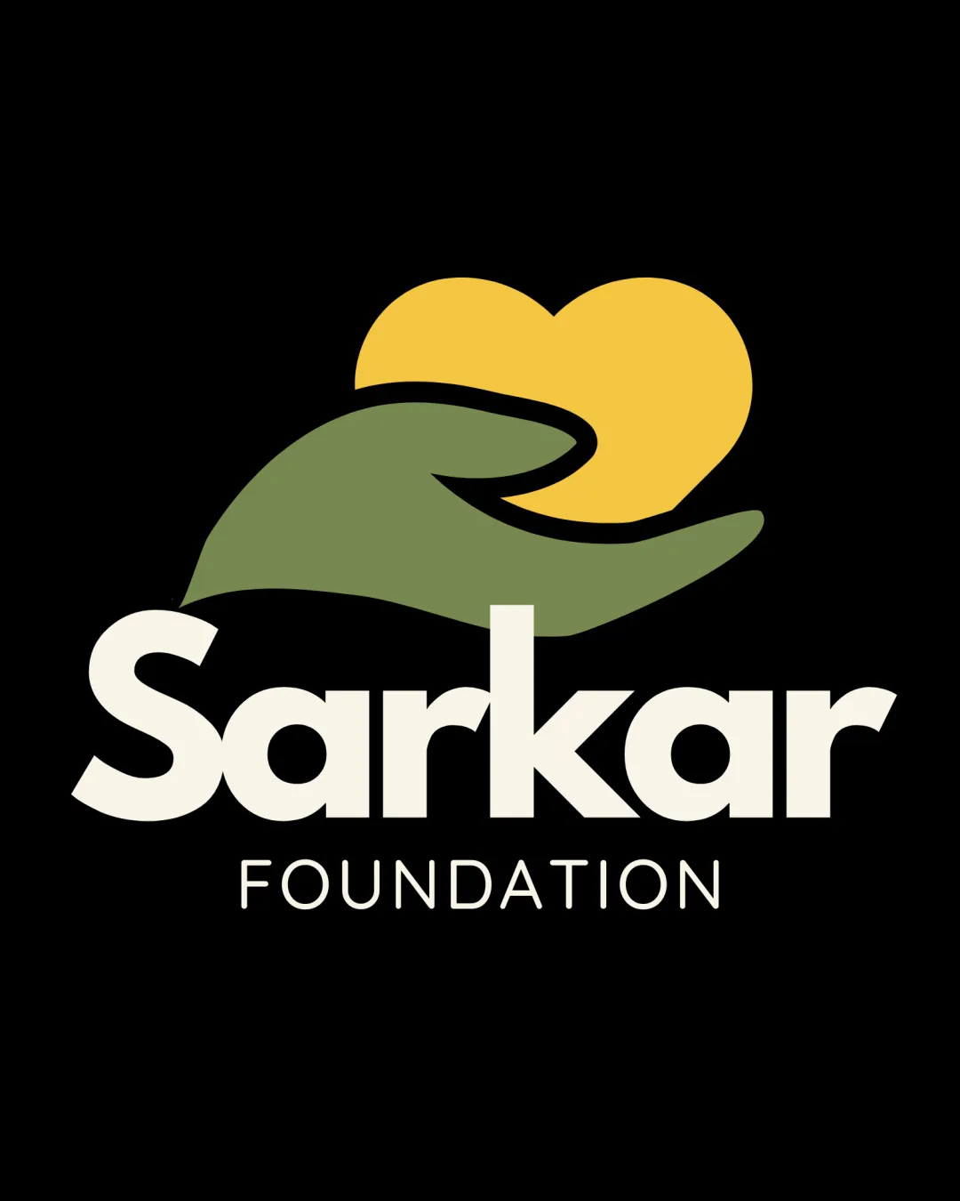
Logo review ofSarkar Foundation
Review the detailed scores below to see what is working and what should be refined first.
Legibility
Originality
Misread
Balance
Scale
Detailed review
Logo performance breakdown
Legibility
![]() Text is clear, bold, and easily readable on both small and large scales.
Text is clear, bold, and easily readable on both small and large scales.![]() Font choice provides strong contrast against the black background.
Font choice provides strong contrast against the black background.
Originality
![]() Hand holding heart is a clear, relevant symbol for nonprofits and foundations.
Hand holding heart is a clear, relevant symbol for nonprofits and foundations.
![]() The hand-and-heart motif is quite common in charity and nonprofit sectors; the treatment here lacks a unique or creative twist.
The hand-and-heart motif is quite common in charity and nonprofit sectors; the treatment here lacks a unique or creative twist.![]() No use of negative space for dual meaning or originality.
No use of negative space for dual meaning or originality.
Color harmony
![]() Color palette is harmonious and creates a welcoming, warm impression.
Color palette is harmonious and creates a welcoming, warm impression.![]() Good contrast between symbol, text, and background.
Good contrast between symbol, text, and background.
Alabaster
#E8E6D8
Avocado
#8A9654
Saffron
#F6C446
Black
#000000
Balance alignment
![]() Symbol is centered nicely above the wordmark, providing visual balance.
Symbol is centered nicely above the wordmark, providing visual balance.
![]() The heart and hand feel slightly larger than necessary relative to the wordmark, which may detract from perfect vertical harmony.
The heart and hand feel slightly larger than necessary relative to the wordmark, which may detract from perfect vertical harmony.

Scalability
![]() Symbol and text are simple and maintain clarity at smaller sizes.
Symbol and text are simple and maintain clarity at smaller sizes.![]() Design would be recognizable on signage, web, and print.
Design would be recognizable on signage, web, and print.
![]() Hand and heart detail may lose some clarity at extremely small sizes, such as a favicon.
Hand and heart detail may lose some clarity at extremely small sizes, such as a favicon.
200x250 px
100×125 px
50×62 px
Misinterpretations
![]() No unintended negative or inappropriate symbolism detected.
No unintended negative or inappropriate symbolism detected.
Symbol & text fit
![]() Color palette and style are consistent between the symbol and typography.
Color palette and style are consistent between the symbol and typography.
![]() Slight size imbalance; the symbol dominates over the wordmark.
Slight size imbalance; the symbol dominates over the wordmark.
Try your own review
Review my logo
Wondering how your logo performs?
Get a clear logo score, key risks, and priority fix ideas before your client or audience sees it.
Keep exploring


