Wondering how your logo performs? 🧐
Get professional logo reviews in seconds and catch design issues in time.
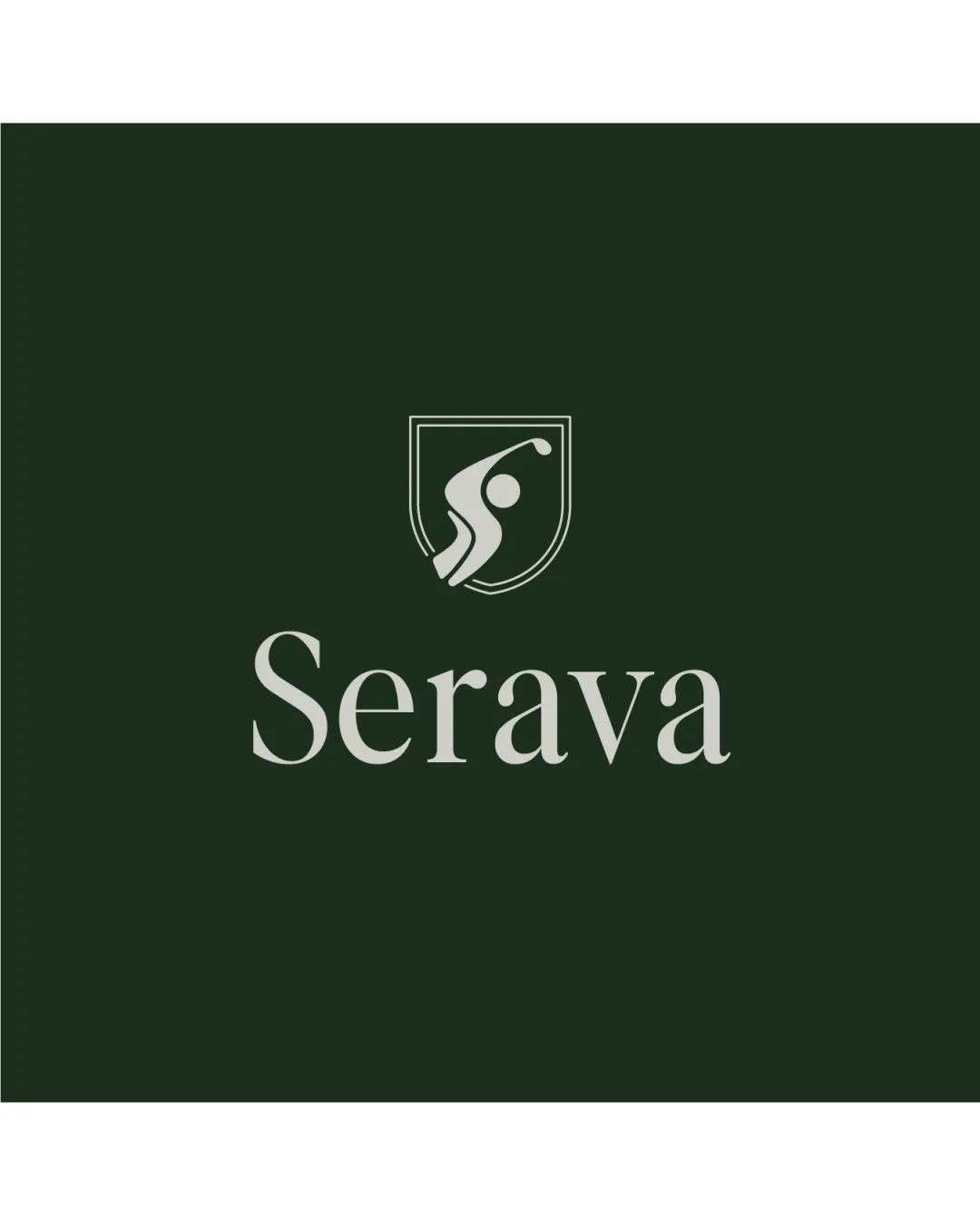
Try it Now!Logo review of Serava
 Logo analysis by AI
Logo type:
Style:
Detected symbol:
Detected text:
Business industry:
Review requested by Kevinnify
**If AI can recognize or misinterpret it, so can people.
Structured logo review
Legibility
![]() The wordmark uses a classic, serif typeface that is highly readable.
The wordmark uses a classic, serif typeface that is highly readable.![]() Letter spacing and overall clarity are strong, retaining legibility at a variety of sizes.
Letter spacing and overall clarity are strong, retaining legibility at a variety of sizes.
Scalability versatility
![]() Minimalist logomark with bold lines ensures retention of details when scaled down.
Minimalist logomark with bold lines ensures retention of details when scaled down.![]() Logo likely works well on signage, sports apparel, and digital assets.
Logo likely works well on signage, sports apparel, and digital assets.
![]() Thin outlines of the shield may lose clarity at very small sizes, such as embroidery or small mobile icons.
Thin outlines of the shield may lose clarity at very small sizes, such as embroidery or small mobile icons.
200x250 px
100×125 px
50×62 px
Balance alignment
![]() The logomark and wordmark are visually balanced, with neither element overpowering the other.
The logomark and wordmark are visually balanced, with neither element overpowering the other.![]() Vertical alignment and centering are well-executed.
Vertical alignment and centering are well-executed.

Originality
![]() Human figure swinging adds movement and slight uniqueness to the logo.
Human figure swinging adds movement and slight uniqueness to the logo.![]() Shield form is clean and recognizable.
Shield form is clean and recognizable.
![]() The use of a shield with a human figure is a common motif in sports logos.
The use of a shield with a human figure is a common motif in sports logos.![]() No particularly innovative or unexpected visual twist.
No particularly innovative or unexpected visual twist.
Logomark wordmark fit
![]() Both elements (logomark and wordmark) share a refined, classic look, with muted tones that complement each other.
Both elements (logomark and wordmark) share a refined, classic look, with muted tones that complement each other.![]() The distance between logomark and wordmark is harmonious.
The distance between logomark and wordmark is harmonious.
Aesthetic look
![]() Visual simplicity produces a clean and upscale aesthetic.
Visual simplicity produces a clean and upscale aesthetic.![]() Color palette adds sophistication.
Color palette adds sophistication.
![]() Could feel slightly generic due to widely-used shield and human figure motif.
Could feel slightly generic due to widely-used shield and human figure motif.
Dual meaning and misinterpretations
![]() No inappropriate or ambiguous elements detected.
No inappropriate or ambiguous elements detected.
Color harmony
![]() Color pairing of dark green and pale silver gives an elegant and professional appearance.
Color pairing of dark green and pale silver gives an elegant and professional appearance.![]() Excellent contrast ensures visibility.
Excellent contrast ensures visibility.
Evergreen
#243225
Pale Silver
#C1C1B7


