SHAIDAI logo review
3.5 / 5
Logo score
Logo review of

Shaidai

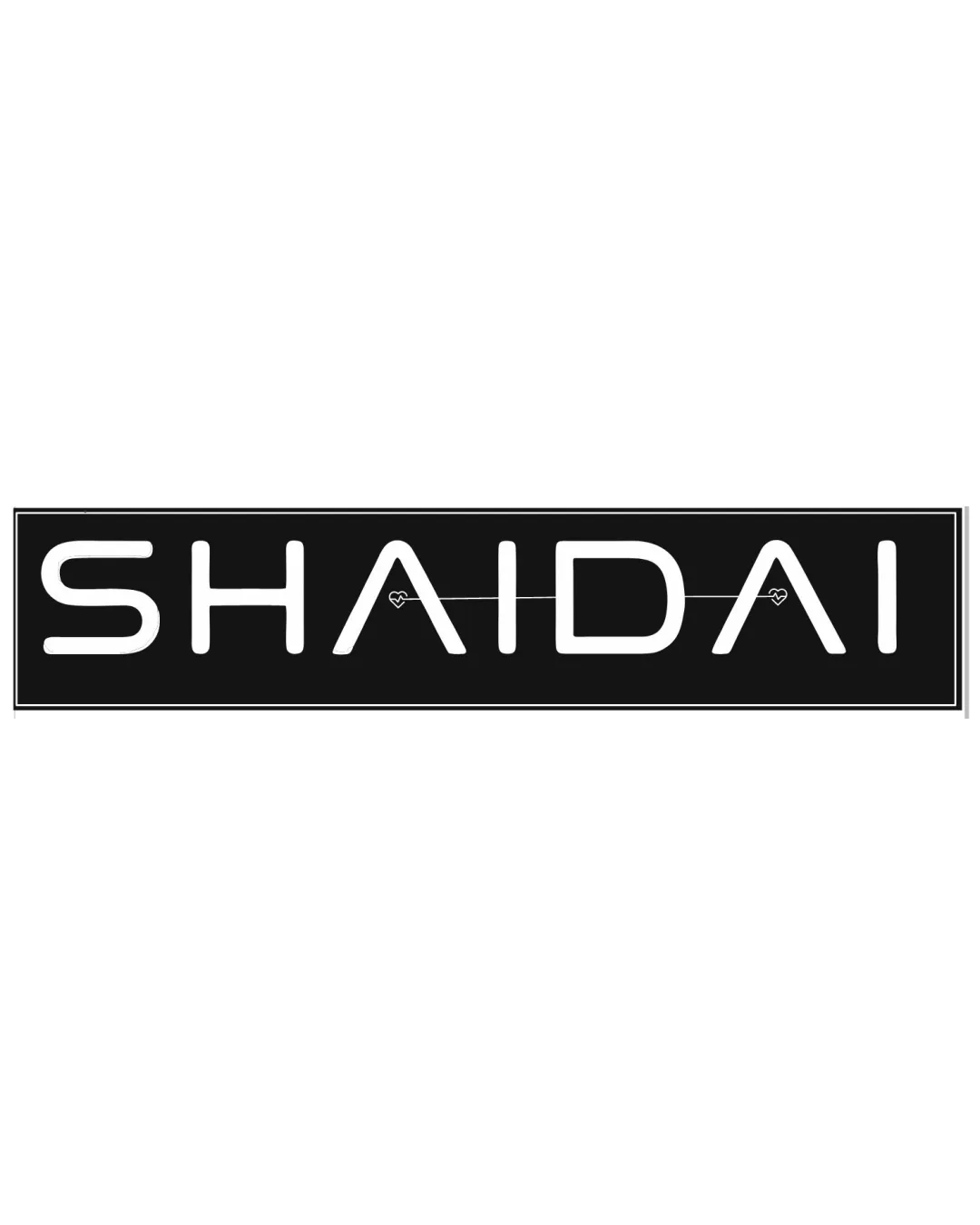
A clean, modern wordmark with a likeable, subtle accent. Solid foundation and appropriate within fashion and e-commerce; adjust delicate detailing for perfect versatility.

Wordmark Modern, Minimalist, Geometric Fashion
4/5
Legibility
3.5/5
Originality
5/5
Misread
4/5
Balance
3/5
Scale
Action plan

What to fix first

The most important fixes to handle before polishing the full presentation.

1

Increase the thickness or clarity of heart-line details or simplify them for small-size use.

High priority

Thin detail risks disappearing, especially in web thumbnails or print.

Impact: Prevents Loss Of Key Decorative Detail And Improves Reliable Scalability. · Effort: Low

2

Explore a version with slightly more distinctive or customized letterforms, particularly for the S and I, to further differentiate from generic geometric wordmarks.

Medium priority

Currently the geometric type is clear but not highly unique.

Impact: Boosts Originality And Memorability Versus Similar Brands. · Effort: Medium

Detailed review

Logo performance breakdown

4/5

Legibility

Checkmark icon All letters are clear and readable at reasonable sizes.

Warning icon Small heart lines between A's could become unclear at small scales.

3.5/5

Originality

Checkmark icon Hearts within the crossbars add subtle distinction.

Warning icon Geometric sans-serif style is becoming common, making core letter shapes somewhat generic.

4/5

Balance alignment

Checkmark icon Consistent letter spacing and strong rectangular block create a cohesive, aligned look.

Warning icon Thin connecting line may disrupt visual balance slightly at some sizes.

logo 200x250 pixels scalability test alignment grid overlay
3/5

Scalability

Checkmark icon Simple, thin custom type is generally scalable.

Warning icon Thin heart-line detail is fragile and may be lost in small reproductions.

logo 200x250 pixels scalability test

200x250 px

logo 100x125 pixels scalability test

100×125 px

logo 50x62 pixels scalability test

50×62 px

5/5

Misinterpretations

Checkmark icon No realistic risk of misinterpretation.

Brief match

Checkmark icon E-commerce Industry: Modern minimalism suits digital-first brands well.

Checkmark icon Fashion: Clean, geometric form aligns with fashion branding trends; hearts provide a gentle, appealing accent.
Checkmark icon Cosmetic Products: Hearts add a feminine and friendly touch relevant to cosmetics, though logo feels slightly more tech-forward than beauty-focused.

Try your own review

Wondering how your logo performs?

Get a clear logo score, key risks, and priority fix ideas before your client or audience sees it.

Review my logo