 View review
Logo score
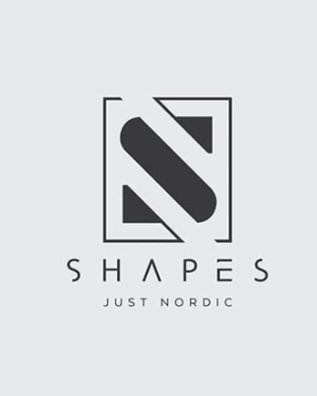
Logo review ofShapes Just Nordic
Review the detailed scores below to see what is working and what should be refined first.
Legibility
Originality
Misread
Balance
Scale
Detailed review
Logo performance breakdown
Legibility
![]() Both the main name ('SHAPES') and the tagline ('JUST NORDIC') are highly readable.
Both the main name ('SHAPES') and the tagline ('JUST NORDIC') are highly readable.![]() Clear distinction between the monogram and textual elements.
Clear distinction between the monogram and textual elements.
Originality
![]() Abstract monogram with geometric overlay provides visual interest.
Abstract monogram with geometric overlay provides visual interest.![]() Negative space treatment within the 'S' is a subtle creative decision.
Negative space treatment within the 'S' is a subtle creative decision.
![]() Monogram inside a square frame is somewhat common in the design world.
Monogram inside a square frame is somewhat common in the design world.
Color harmony
![]() Consistent monochrome palette is both versatile and aesthetically pleasing.
Consistent monochrome palette is both versatile and aesthetically pleasing.![]() High contrast maintains visibility against various backgrounds.
High contrast maintains visibility against various backgrounds.
Mine Shaft
#373737
Mercury
#E6E6E6
Balance alignment
![]() Elements are evenly spaced and the design feels visually stabilized.
Elements are evenly spaced and the design feels visually stabilized.![]() The monogram sits centrally above the wordmark, revealing thoughtful vertical alignment.
The monogram sits centrally above the wordmark, revealing thoughtful vertical alignment.

Scalability
![]() Clean geometric lines are well-suited to small and large formats (e.g., print, digital, packaging).
Clean geometric lines are well-suited to small and large formats (e.g., print, digital, packaging).![]() Minimal detail ensures good reproduction on product labels and web icons.
Minimal detail ensures good reproduction on product labels and web icons.
![]() Thin lines in the type could lose clarity in very small print or embroidery applications.
Thin lines in the type could lose clarity in very small print or embroidery applications.
200x250 px
100×125 px
50×62 px
Misinterpretations
![]() No inappropriate or confusing hidden imagery; the mark clearly functions as an 'S' and not as anything unintended.
No inappropriate or confusing hidden imagery; the mark clearly functions as an 'S' and not as anything unintended.
Symbol & text fit
![]() Consistent line-weight and geometric style across the symbol and typography.
Consistent line-weight and geometric style across the symbol and typography.
![]() Both monogram and wordmark evoke a minimal, Nordic design language.
Both monogram and wordmark evoke a minimal, Nordic design language.
Try your own review
Review my logo
Wondering how your logo performs?
Get a clear logo score, key risks, and priority fix ideas before your client or audience sees it.
Keep exploring