CreativityAwarded on 9 October 2026Congratulations on creating such an authentic logo! Our team loved its abstract and elegant style, and we wanted to recognize your creativity with this award.
SPIRITED HANDS logo logo review
4/5
Logo score

SPIRITED HANDS logo

Advanced logo review

A highly original, visually engaging logo that effectively signals creativity and craft, though minor readability and detail scalability issues merit corrective testing.

This logo lockup shows strong execution, supported by distinctive construction and visual balance; improving text readability is the clearest next step.

Combination Mark (symbol Above Wordmark With Tagline) Geometric, Stylized, Contemporary Crafts/marketplace/artisan
3.4/5
Legibility
4.6/5
Originality
4/5
Balance
3/5
Scale
4/5
Color
4/5
Style consistency
@graphstorm
Your next steps

What to fix first

Focus on the changes that matter. Keep what makes the logo work.

1

wordmark middle (R, I, T, E, D)

Test and consider subtle adjustment of decorative letter elements to improve rapid readability.

Medium priority Visible issue Medium effort

Some stylized inner marks on the R, I, T, and D reduce immediate letter clarity, especially at small sizes.

See the category review
2

standalone mark (hands and star)

Test mark at small scale and on embroidered materials for clarity and recognizability.

Medium priority Worth testing Low effort

The mark's relatively thin-fingered hands and fine star details may be less crisp at small sizes or when embroidered.

See the category review
3

overall composition

Compare focus balance between mark and wordmark; consider subtle refinement or use of a simplified mark for small sizes.

Medium priority Visible issue Medium effort

The letterform style (with geometric accents) complements the mark's motif, but the wordmark's complexity slightly competes with the symbol on visual attention.

How to check

Complexity in both elements could challenge hierarchy at small scale—worth testing for visual clarity.

See the category review
Detailed review

Logo performance breakdown

4/5

Brief & logo match

The logo strongly expresses a creative, artisan marketplace with its hand motif and crafted letterforms, though wordmark legibility could be improved for rapid user recognition.

3.4/5

Legibility

Wordmark 3/5 · Layout 4/5

  • Primary wordmark is generally readable despite heavy stylization.
  • Some stylized inner marks on the R, I, T, and D reduce immediate letter clarity, especially at small sizes.

    Visible issue wordmark middle (R, I, T, E, D)

    Try: Test and consider subtle adjustment of decorative letter elements to improve rapid readability.

4.6/5

Originality

Symbol 5/5 · Wordmark 4/5

  • Distinctive hand motif with creative letterform detailing.
4/5

Color harmony

Symbol 4/5 · Wordmark 4/5

  • Warm brown and peach are inviting and complementary.
Brown#7D4C23
Peach#F69A8F

Estimated colors. Use the original design file for exact values.

Create a full color palette using these colors

Create new palette
4/5

Balance alignment

Symbol 4/5 · Wordmark 4/5 · Layout 4/5

  • Top-down lockup is visually centered and well balanced vertically.
Uploaded logoAlignment guide overlay

Inspect spacing with the guide. Optical balance may differ from geometric centering.

3/5

Scalability

Symbol 3/5 · Wordmark 3/5 · Layout 3/5

  • Mark and wordmark are distinguishable at moderate sizes; test results needed for extremities.
  • The mark's relatively thin-fingered hands and fine star details may be less crisp at small sizes or when embroidered.

    Worth testing standalone mark (hands and star)

    Try: Test mark at small scale and on embroidered materials for clarity and recognizability.

5/5

Misinterpretations

  • No plausible unintended readings or negative associations detected.
4/5

Style consistency

  • Unified theme between symbol and custom letter detailing.
  • The letterform style (with geometric accents) complements the mark's motif, but the wordmark's complexity slightly competes with the symbol on visual attention.

    Visible issue overall composition

    Try: Compare focus balance between mark and wordmark; consider subtle refinement or use of a simplified mark for small sizes.

    Check: Complexity in both elements could challenge hierarchy at small scale—worth testing for visual clarity.

5/5
Market fit

Category positioning

Distinctive and category-appropriate for artisan/craft marketplaces; highly differentiated for memorable brand presence.

1
Category Fit
Good fit

The hand motif and starburst clearly express craftsmanship and creativity, matching craft/marketplace sector expectations.

2
Differentiation Risk
Distinct enough

Unique geometric mark and custom wordmark stand apart; visual originality is high within the sector.

Brand impression

Logo personality

The impression your logo creates.

This logo combines bold originality and caring, creative warmth, balancing confident presence with an inviting handcrafted spirit.

AI interpretation of the visible design. These describe personality, not quality.

Presence

Strongly bold

How strongly it attracts attention.

UnderstatedBold

The mirrored hands and starburst form a visually engaging, high-contrast focal point.

Attitude

Mixed

How serious or lighthearted it feels.

SeriousPlayful

The custom details add playfulness but the geometric structure maintains seriousness.

Formality

Mixed

How relaxed or formal it appears.

CasualFormal

It uses geometric styling for discipline, but graphic hands and soft colors keep it informal.

Style

Strongly contemporary

Heritage cues versus a current look.

ClassicContemporary

The logo showcases a custom contemporary style, eschewing classic type for an original look.

Emotional tone

Leans warm

Its emotional feel, beyond colour temperature.

WarmCool

The warm brown/peach palette and inward, open shapes create an inviting, caring emotional feel.

Positioning

Mixed

Everyday appeal versus luxury cues.

EverydayLuxury

Visual cues (hand motif, approachable color) balance between accessible marketplace and creative boutique, not exclusive luxury.

From design file to real use

Use-case readiness

See your logo in context, then check what needs attention before production. Settings use the colors detected in your logo where available.

  • 6 look suitable
  • 3 need adjustment

Website header

Ready

Desktop

Mobile

Favicon

Adjust first
Before you use it

Simplified mark or increased contrast may be needed for clarity at tiny sizes.

Google search

Adjust first
Before you use it

Simplified mark or increased contrast may be needed for clarity at tiny sizes.

Social media avatar

Ready

Business card

Ready

Signs & signage

Ready

Packaging & labels

Ready

Embroidery

Adjust first
Before you use it

Test for mark readability—fine fingers and star points may blur on fabric.

One-color printing

Ready
Delivery checklist

Logo delivery checklist

Format templates · Included versions and delivery checklist
Uploaded logo
Reviewed upload

Primary logo lockup

Included

A mark and wordmark are both visible in the uploaded asset.

Standalone wordmark

High priority Recommended

Export the wordmark separately, without the symbol or tagline, for narrow placements and smaller sizes.

Standalone logomark or monogram

High priority Recommended

Export the existing symbol, mascot, or monogram on its own for avatars, favicons, and compact placements. Check its clarity at small sizes.

Wordmark with tagline

Medium priority Recommended

Prepare a separate wordmark with the existing tagline for larger placements. Keep the tagline-free wordmark for small sizes.

One-color logo version

High priority Recommended

Prepare a monochrome version for restricted print and production methods.

Reversed light logo version

Medium priority Recommended

Prepare a light version for dark brand backgrounds.

Simplified small-size version

Medium priority Recommended

Use a responsive variant where fine details become fragile at small sizes.

Presentation kit

Logo presentation copy and mockup ideas

Logo presentation ideas

Hover over or select a slide to highlight its notes.

Slide 1

Positioning statement

A unique, spirited identity celebrating artisanal craft and creative community.

Slide 2

Primary lockup

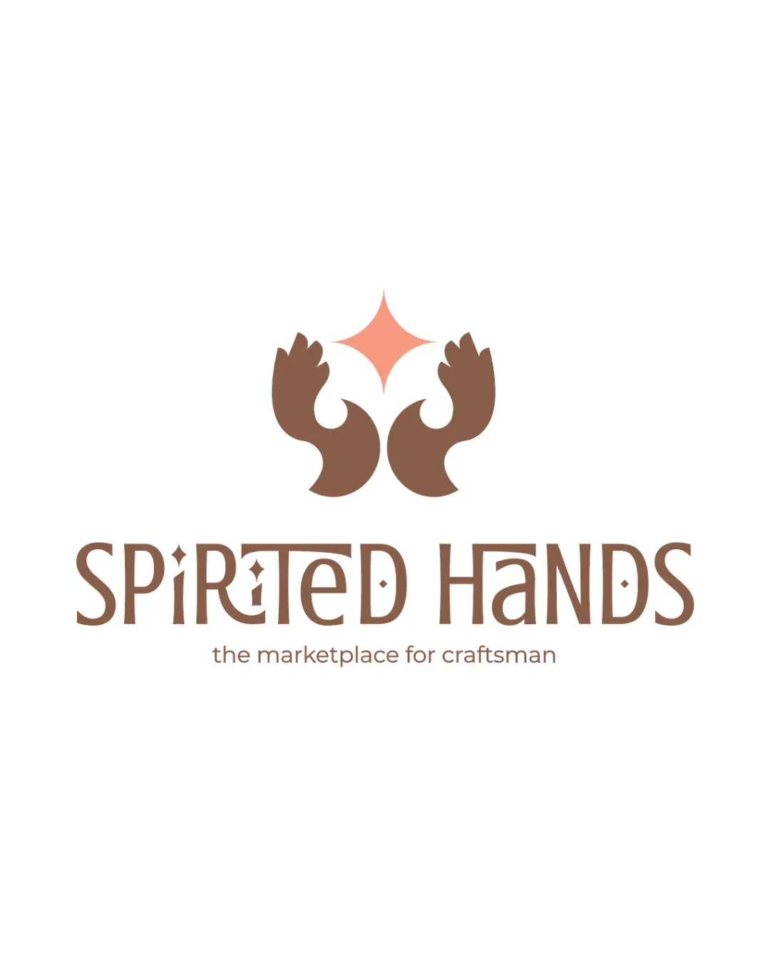
Logo features two mirrored stylized brown hands with a peach starburst above, centered over a custom geometric wordmark and a smaller tagline below.

Slide 3 · Application idea

Mockup idea 1

Business card with raised spot-gloss on the hand symbol.

Slide 4

Wordmark

Custom brown geometric lettering reads 'SPIRITED HANDS' with distinctive diamond-shaped accents integrated within various letters.

Slide 5 · Application idea

Mockup idea 2

Marketplace platform homepage hero banner with the symbol as watermark.

Slide 6

Logomark

Abstract symbol of two hands reaching toward a warm star, evoking a sense of craft, guidance, and collaboration.

Slide 7 · Application idea

Mockup idea 3

Eco-friendly craft packaging, symbol debossed in natural paper.

Slide 8

Design rationale

The mirrored hands and star convey collaboration, care, and craftmanship central to the brand values.
Bespoke letterforms with geometric motifs reinforce the handmade, artisanal theme for added memorability and cohesion with the symbol.

Try your own review

Wondering how your logo performs?

Get a clear logo score, key risks, and priority fix ideas before your client or audience sees it.

Review my logo