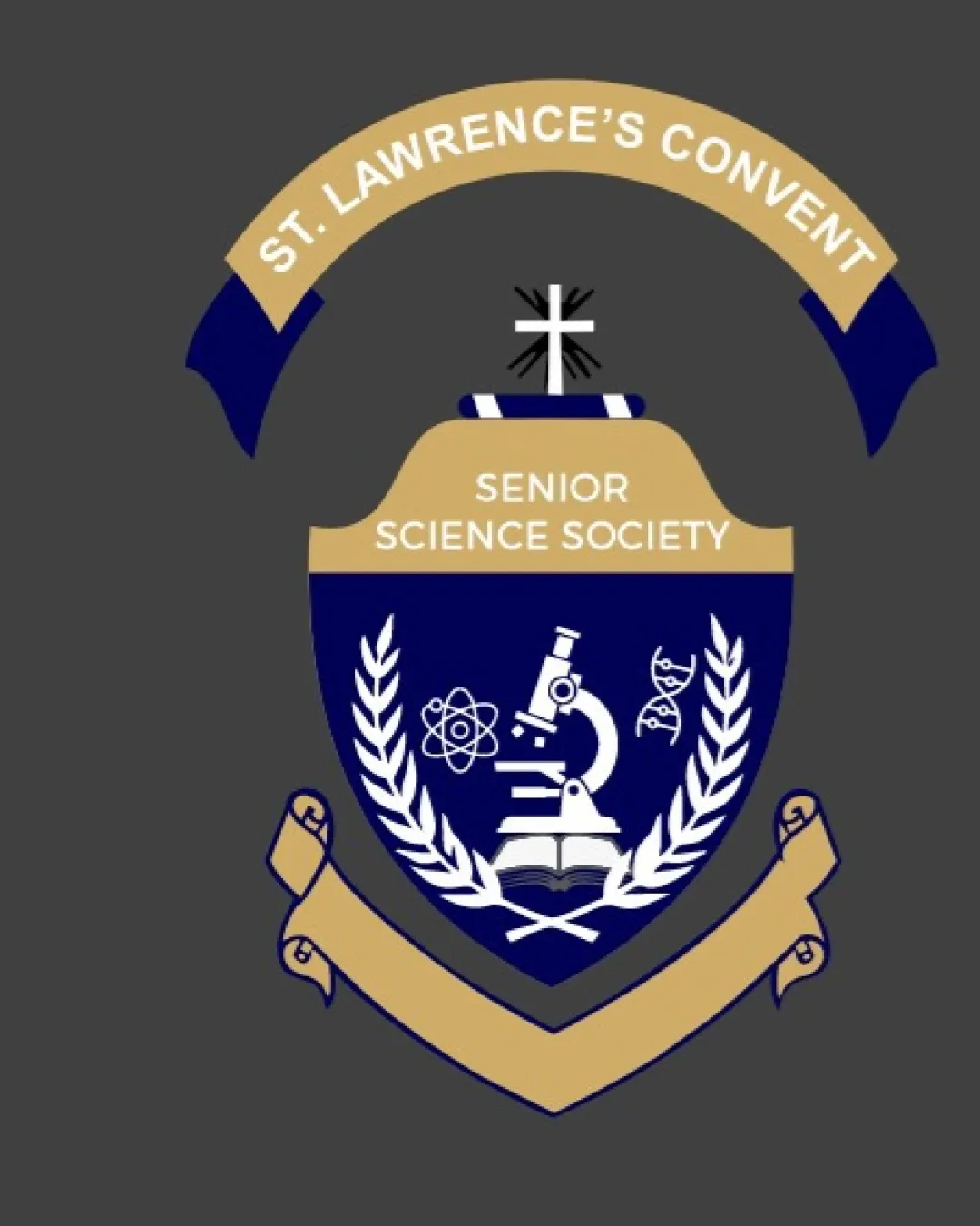
ST. LAWRENCE'S CONVENT SENIOR SCIENCE SOCIETY logo review
3.8 / 5
Logo score
Logo review of

St. Lawrence's Convent Senior Science Society

A functional, institutionally appropriate emblem that effectively signals a science society, but would benefit from simplification and a more distinctive twist.

Objective AI feedback. Your creative decision.

Emblem Academic Traditional Badge Education
4.5/5
Legibility
3.5/5
Originality
5/5
Misread
4/5
Balance
3.5/5
Scale
Action plan

What to fix first

The most important fixes to handle before polishing the full presentation.

1

Simplify intricate details in key symbols (microscope, DNA, book) for better small-scale clarity.

High priority

Ensures the most important symbols remain effective when scaled down.

Impact: Improves Practical Usability Across Print And Digital Media. · Effort: Medium

2

Consider introducing a unique visual motif or stylization to differentiate from standard science crests.

Medium priority

Increases originality while maintaining tradition.

Impact: Helps The Society's Brand Stand Out Among Similar Academic Emblems. · Effort: Medium

Detailed review

Logo performance breakdown

4.5/5

Legibility

Checkmark icon All text is highly readable with strong contrast against backgrounds.

Warning icon Text on curved banners could be less legible at very small sizes.

3.5/5

Originality

Checkmark icon Combines classic academic and science symbols in a coherent arrangement.

Warning icon Heavily relies on conventional science imagery and academic crest formula; lacks a unique visual twist.

4/5

Color harmony

Checkmark icon Academic navy-and-gold feel traditional and professional.
Checkmark icon Strong contrast throughout.

Warning icon Palette could be modernized for greater distinctiveness.

Gold
#C6B178

Navy
#16204D

White
#FFFFFF

Your palette is close. Refine the color roles and combinations before updating the logo.

Build brand colors
4/5

Balance alignment

Checkmark icon Symmetrical design creates a solid, prestigious feel.
Checkmark icon Central element well-framed by laurel and banners.

Warning icon Top and bottom banners can feel visually heavy, creating slightly excess framing.

logo 200x250 pixels scalability test alignment grid overlay
3.5/5

Scalability

Checkmark icon Overall forms remain clear at moderate sizes.
Checkmark icon Core symbols are familiar and recognizable.

Warning icon Fine details in the microscope, book, and DNA could lose clarity at small sizes; banners may become cluttered.

logo 200x250 pixels scalability test

200x250 px

logo 100x125 pixels scalability test

100×125 px

logo 50x62 pixels scalability test

50×62 px

5/5

Misinterpretations

Checkmark icon No distracting or inappropriate secondary readings.

4 / 5

Logo structure & brief match

Checkmark icon Wordmark is well-integrated within the emblem structure.

Warning icon Banner integration feels slightly forced but not disruptive.

Checkmark icon School Science Society: Clearly represents an academic science group with well-chosen symbols and hierarchical structure.

Try your own review

Wondering how your logo performs?

Get a clear logo score, key risks, and priority fix ideas before your client or audience sees it.

Review my logo