Wondering how your logo performs? 🧐

Get professional logo reviews in seconds and catch design issues in time.

Try it Now!

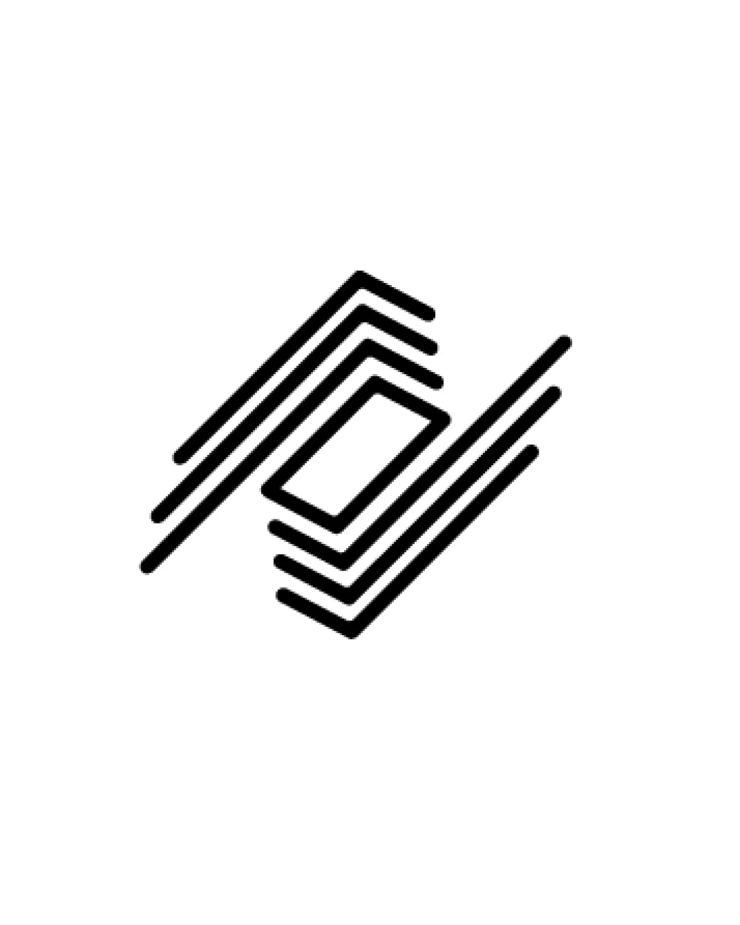
Logo review of stacked parallelograms, abstract geometric lines f..

Zoom icon Logo analysis by AI

Logo type: Abstract symbol

Style: Minimalist, geometric, line-based

Detected symbol: Stacked parallelograms, abstract geometric lines forming a diamond-like shape

Negative space: Diamond shape formed by the intersection of lines

Business industry: Real estate

Review requested by Poon9889

**If AI can recognize or misinterpret it, so can people.

Structured logo review

4 / 5

Scalability versatility

Checkmark icon Bold line work ensures the mark retains clarity in small sizes.
Checkmark icon No fine detailing, making it suitable for embroidery, business cards, and digital applications.
Checkmark icon Single-color usage translates well to monochrome mediums.

Warning icon Close spacing in lines may cause shapes to merge at micro sizes, especially for favicons or stamps.
Warning icon With only the symbol, brand context may be lost in single-symbol placements without supporting text.

logo 200x250 pixels scalability test

200x250 px

logo 100x125 pixels scalability test

100×125 px

logo 50x62 pixels scalability test

50×62 px

5 / 5

Balance alignment

Checkmark icon Strong geometric symmetry gives the logo a cohesive, stable appearance.
Checkmark icon Spacing and alignment are meticulously executed; visual weight is evenly distributed.

logo 200x250 pixels scalability test alignment grid overlay
3 / 5

Originality

Checkmark icon Abstract approach to a common form gives the mark some distinctive character.
Checkmark icon Diamond-shaped layering adds visual interest.

Warning icon Stacked parallelograms and diamond layering are overused in real estate and construction industries, resulting in a somewhat generic feel.
Warning icon No unique twist or clever integration that standalone makes the symbol memorable.

4 / 5

Aesthetic look

Checkmark icon Minimalist style results in a modern, visually appealing logo.
Checkmark icon Line weight and spacing feel calculated and consistent.

Warning icon Overall concept lacks a distinctive feature that would elevate its aesthetic to a premium level.

5 / 5

Dual meaning and misinterpretations

Checkmark icon No inappropriate or accidental dual meanings detected on initial review.

5 / 5

Color harmony

Checkmark icon Single black color on white ensures universal application and strong visibility.
Checkmark icon Maximum contrast contributes to overall clarity.

Black
#000000

White
#FFFFFF



