Wondering how your logo performs? 🧐
Get professional logo reviews in seconds and catch design issues in time.
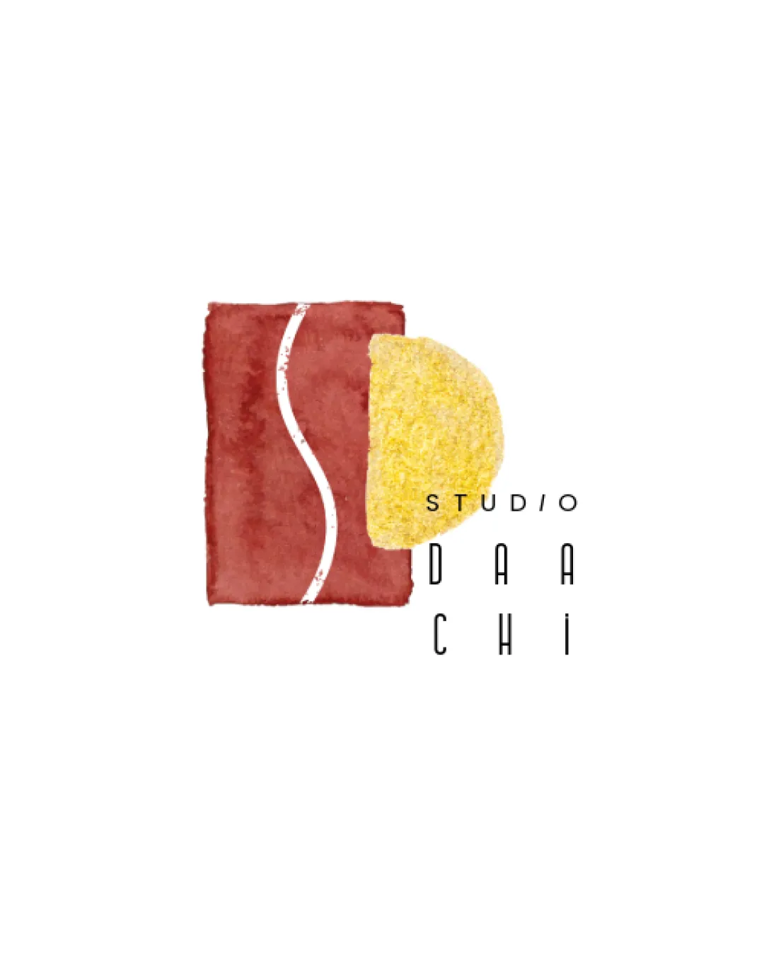
Try it Now!Logo review of STUDIO DAACHI
 Logo analysis by AI
Logo type:
Style:
Detected symbol:
Detected text:
Business industry:
Review requested by Frethead
**If AI can recognize or misinterpret it, so can people.
Structured logo review
Legibility
![]() The text is clean, modern, and fairly easy to read.
The text is clean, modern, and fairly easy to read.![]() Adequate spacing between letters improves readability.
Adequate spacing between letters improves readability.
![]() The split arrangement of 'STUDIO' and the vertical stacking of 'DAACHI' may cause slight confusion at small sizes or rapid glances.
The split arrangement of 'STUDIO' and the vertical stacking of 'DAACHI' may cause slight confusion at small sizes or rapid glances.![]() The light weight of the font could become less legible at small scales.
The light weight of the font could become less legible at small scales.
Scalability versatility
![]() Simple geometric forms contribute to versatility.
Simple geometric forms contribute to versatility.![]() Minimal color palette is generally adaptable.
Minimal color palette is generally adaptable.
![]() Textured elements may lose detail and appear fuzzy at small sizes or in single-color applications.
Textured elements may lose detail and appear fuzzy at small sizes or in single-color applications.![]() Thin typography may not reproduce well in embroidery or small product applications.
Thin typography may not reproduce well in embroidery or small product applications.![]() Watercolor effect may not translate to black-and-white uses.
Watercolor effect may not translate to black-and-white uses.
200x250 px
100×125 px
50×62 px
Balance alignment
![]() Interesting juxtaposition between the geometric shape and vertical text layout.
Interesting juxtaposition between the geometric shape and vertical text layout.
![]() Text and symbol alignment feels disconnected; ‘STUDIO’ floats awkwardly to the top right.
Text and symbol alignment feels disconnected; ‘STUDIO’ floats awkwardly to the top right.![]() Negative space around the yellow shape and text feels slightly off, causing mild imbalance.
Negative space around the yellow shape and text feels slightly off, causing mild imbalance.

Originality
![]() Unique watercolor texture and shape combination.
Unique watercolor texture and shape combination.![]() Unconventional layout distinguishes it from conventional studio logos.
Unconventional layout distinguishes it from conventional studio logos.
![]() The abstract geometric approach has become increasingly common in modern creative brands.
The abstract geometric approach has become increasingly common in modern creative brands.
Logomark wordmark fit
![]() Typography is modern and pairs adequately with the abstract shapes.
Typography is modern and pairs adequately with the abstract shapes.
![]() The disconnect in placement and scale creates a lack of cohesion between symbol and wordmark.
The disconnect in placement and scale creates a lack of cohesion between symbol and wordmark.
Aesthetic look
![]() Hand-painted effect is visually appealing and contemporary.
Hand-painted effect is visually appealing and contemporary.![]() Minimalist color palette gives a refined look.
Minimalist color palette gives a refined look.
![]() Watercolor texture’s fuzziness may appear unrefined when scaled up or down.
Watercolor texture’s fuzziness may appear unrefined when scaled up or down.
Dual meaning and misinterpretations
![]() No inappropriate or confusing shapes present.
No inappropriate or confusing shapes present.
Color harmony
![]() Color palette is limited and harmonious.
Color palette is limited and harmonious.![]() Warm, natural tones work well together and support the brand’s creative aesthetic.
Warm, natural tones work well together and support the brand’s creative aesthetic.
Copper Red
#B15343
Flax
#EDD67E
White
#FFFFFF
Black
#000000


