 View review
Logo score
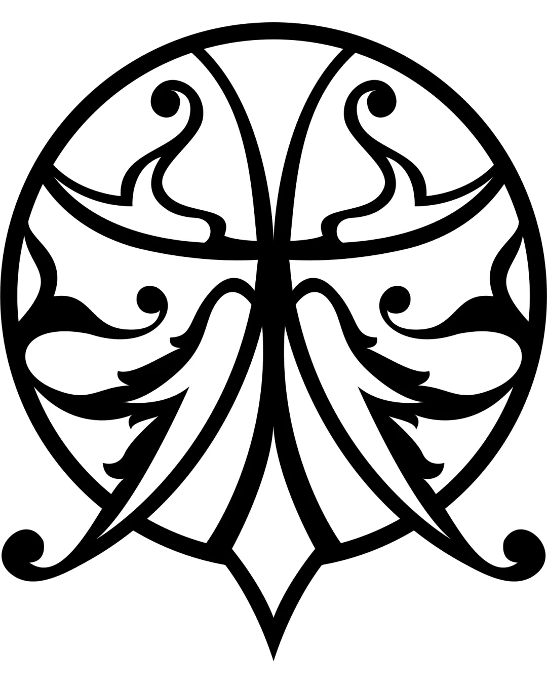
Logo review ofStylized, Mirrored Symmetrical Shape Resembling Le..
Review the detailed scores below to see what is working and what should be refined first.
Originality
Misread
Balance
Scale
Detailed review
Logo performance breakdown
Originality
![]() Distinct ornamental motif unlike typical industry symbols
Distinct ornamental motif unlike typical industry symbols![]() Creative mirrored design provides visual uniqueness
Creative mirrored design provides visual uniqueness
![]() Ornamental approach is derivative of art nouveau or tribal motifs, limiting complete originality
Ornamental approach is derivative of art nouveau or tribal motifs, limiting complete originality
Color harmony
![]() High contrast black and white palette enhances clarity and timelessness
High contrast black and white palette enhances clarity and timelessness![]() No color clashes or unnecessary gradients present
No color clashes or unnecessary gradients present
Black
#000000
White
#FFFFFF
Balance alignment
![]() Logo is perfectly symmetrical on both axes
Logo is perfectly symmetrical on both axes![]() Visual weight is evenly distributed, adding to a cohesive feel
Visual weight is evenly distributed, adding to a cohesive feel

Scalability
![]() Simple, bold lines stand out at larger scales
Simple, bold lines stand out at larger scales![]() Monochrome palette assists with reproduction
Monochrome palette assists with reproduction
![]() Excessive fine detail and thin lines risk losing clarity at small sizes (e.g., business cards, embroidery, mobile app icons)
Excessive fine detail and thin lines risk losing clarity at small sizes (e.g., business cards, embroidery, mobile app icons)![]() Complex shapes with narrow curves may blur when reduced
Complex shapes with narrow curves may blur when reduced
200x250 px
100×125 px
50×62 px
Misinterpretations
![]() No overtly inappropriate or accidental imagery detected
No overtly inappropriate or accidental imagery detected
Try your own review
Review my logo
Wondering how your logo performs?
Get a clear logo score, key risks, and priority fix ideas before your client or audience sees it.
Keep exploring


