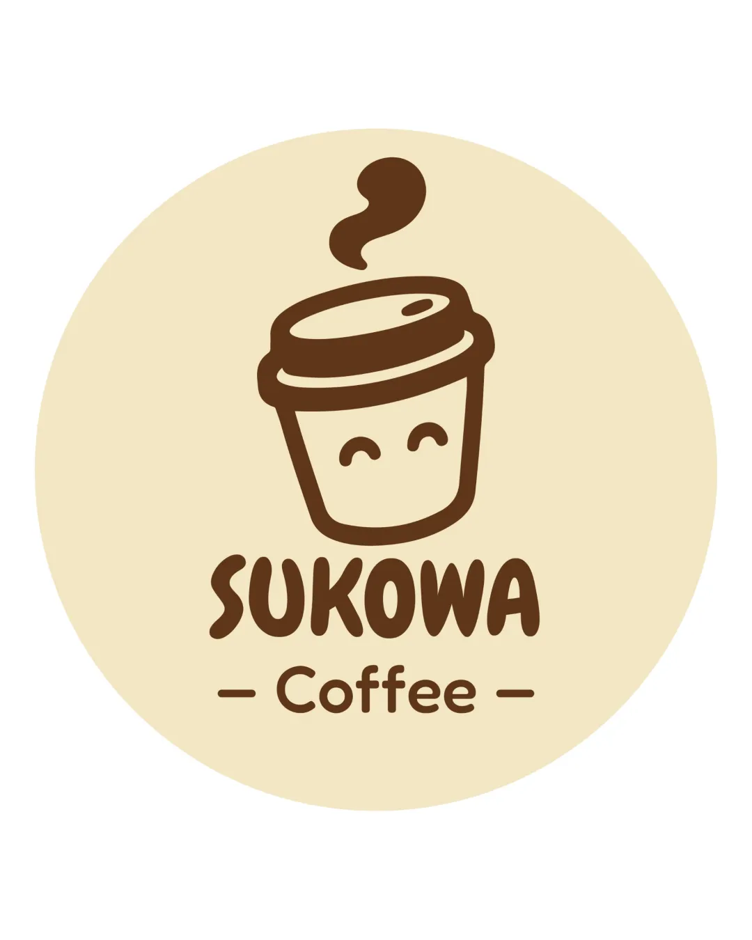
SUKOWA Coffee logo logo review
4/5
Logo score

SUKOWA Coffee logo

Essential logo review

A friendly, effective coffee shop logo with minor refinements optional and small size testing advisable.

This emblem shows strong execution, supported by text readability and clarity at smaller sizes; improving distinctiveness is the clearest next step.

Emblem Flat, Friendly, Cartoon-like Coffee Shop / Cafe
5/5
Legibility
3/5
Originality
4/5
Balance
4/5
Scale
5/5
Color
@creative194508
Your next steps

What to fix first

Focus on the changes that matter. Keep what makes the logo work.

1

mark, text

Test at reduced sizes to confirm all details remain clear and legible.

High priority Worth testing Low effort

The steam swirl and facial details on the cup, as well as the thin lines in 'Coffee,' may lose sharpness at very small sizes due to their light weight.

See the category review

Detailed review

Logo performance breakdown

4/5

Brief & logo match

Expresses a friendly coffee shop identity with a clear cup symbol and playful text, though the motif is somewhat familiar.

5/5

Legibility

  • All text is clearly readable with appropriate font choice.
5/5

Color harmony

  • Warm brown and beige palette is inviting and fitting for coffee brand.
Beige#F6E6C6
Deep Brown#58351A

Estimated colors. Use the original design file for exact values.

Create a full color palette using these colors

Create new palette
5/5

Misinterpretations

  • No hidden or problematic misreadings detected.
4/5

Balance alignment

  • Logo components are well centered and visually harmonious.
  • The text and illustration are well centered, but the horizontal dividers around 'Coffee' are slightly thin compared to the letter strokes above.

    Optional refinement overall emblem
Uploaded logoAlignment guide overlay

Inspect spacing with the guide. Optical balance may differ from geometric centering.

4/5

Scalability

Available in Advanced logo reviews
3/5

Originality

Available in Advanced logo reviews

Style consistency

  • Cup graphic and text styles are playful and complementary.
Try your own review

Wondering how your logo performs?

Get a clear logo score, key risks, and priority fix ideas before your client or audience sees it.

Review my logo