 View review
Logo score
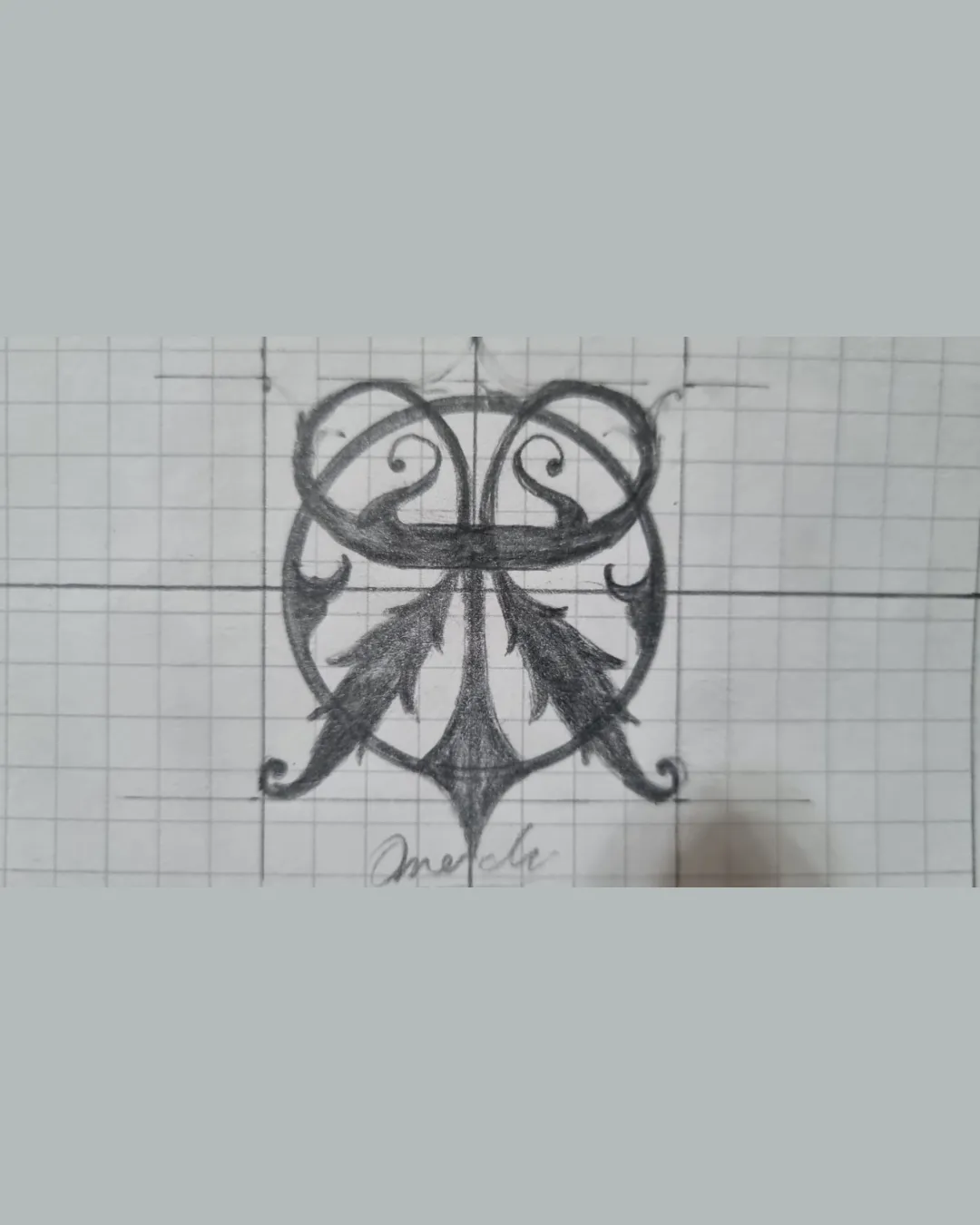
Logo review ofSymmetrical Crest Featuring Mirrored Flourishes An..
Review the detailed scores below to see what is working and what should be refined first.
Originality
Misread
Balance
Scale
Action plan
What to fix first
The most important fixes to handle before polishing the full presentation.
1
Fix possible misinterpretation
High priorityAbstract form could be interpreted as an animal mask, owl, or non-specific symbol, leading to potential ambiguity if the brand message is not clear
Impact: High · Effort: Medium
Detailed review
Logo performance breakdown
Originality
![]() Ornamental and vintage motif is less common in contemporary logos
Ornamental and vintage motif is less common in contemporary logos![]() Combines flourishes with abstract organic elements in a unique way
Combines flourishes with abstract organic elements in a unique way
![]() Crest/emblem approach is traditional and not wholly unique
Crest/emblem approach is traditional and not wholly unique
Color harmony
![]() Monochromatic approach is harmonious and elegant
Monochromatic approach is harmonious and elegant![]() Minimal color keeps focus on form
Minimal color keeps focus on form
Charcoal
#222222
Gray
#E6E6E6
Silver
#BFC4C6
Balance alignment
![]() Excellent symmetry on both vertical and horizontal axes
Excellent symmetry on both vertical and horizontal axes![]() Elements are evenly distributed, lending visual stability
Elements are evenly distributed, lending visual stability

Scalability
![]() Symmetrical structure allows for recognition at medium sizes
Symmetrical structure allows for recognition at medium sizes![]() Would stand out on packaging or as a wall engraving
Would stand out on packaging or as a wall engraving
![]() Intricate details and fine lines will blur or disappear at small sizes such as favicons, business cards, or embroidery
Intricate details and fine lines will blur or disappear at small sizes such as favicons, business cards, or embroidery![]() Lack of a simple version reduces adaptability
Lack of a simple version reduces adaptability![]() Shaded areas may not translate well to digital or single-color printing
Shaded areas may not translate well to digital or single-color printing
200x250 px
100×125 px
50×62 px
Misinterpretations
![]() No direct inappropriate or negative imagery detected
No direct inappropriate or negative imagery detected
![]() Abstract form could be interpreted as an animal mask, owl, or non-specific symbol, leading to potential ambiguity if the brand message is not clear
Abstract form could be interpreted as an animal mask, owl, or non-specific symbol, leading to potential ambiguity if the brand message is not clear
Try your own review
Review my logo
Wondering how your logo performs?
Get a clear logo score, key risks, and priority fix ideas before your client or audience sees it.
Keep exploring


