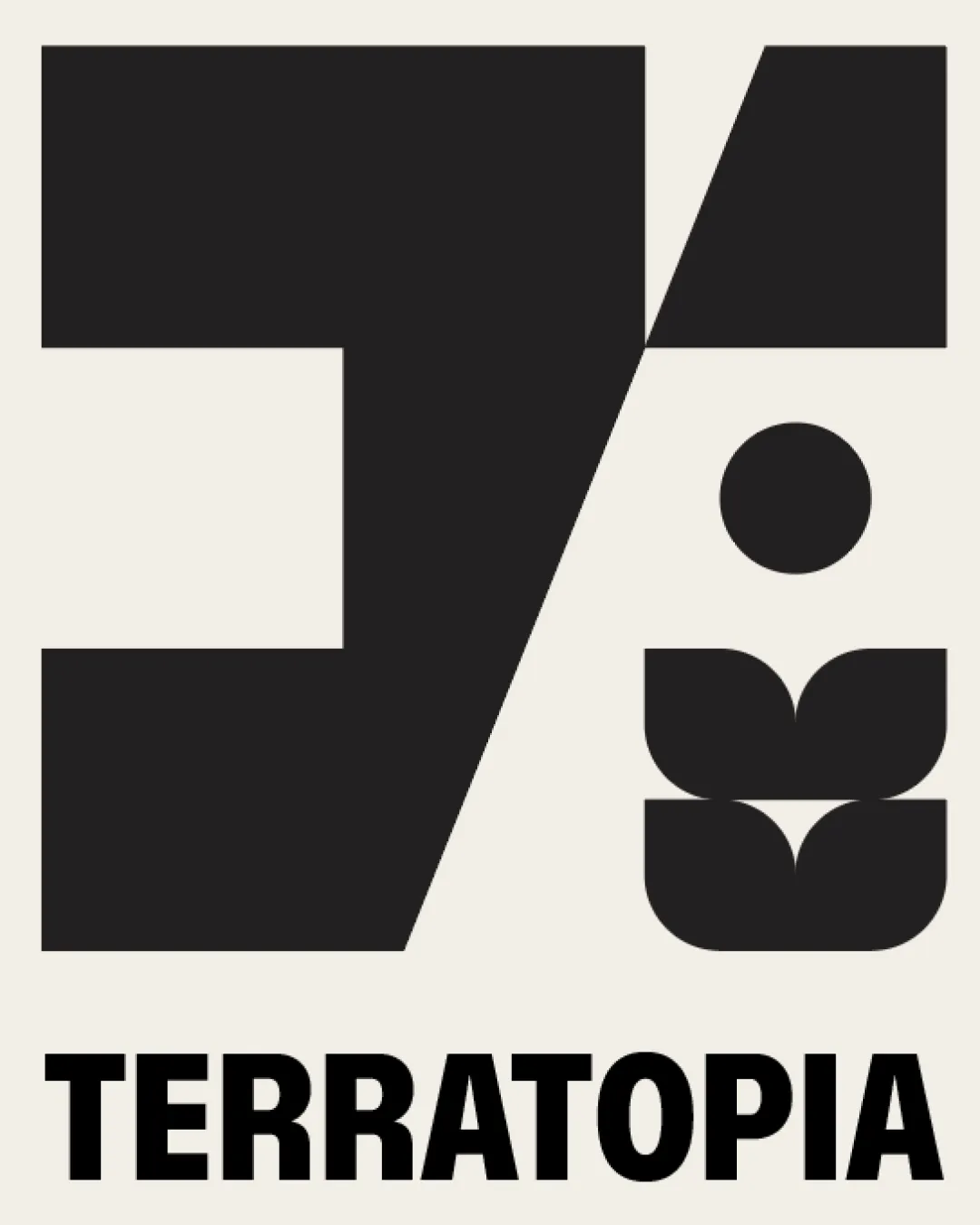
TERRATOPIA logo logo review
3.7/5
Logo score

TERRATOPIA logo

Essential logo review

A visually compelling, highly legible logo with a memorable geometric mark; polish shape proportions for best results.

This logo lockup shows solid execution, supported by text readability and text hierarchy; improving visual balance is the clearest next step.

Combination Mark Bold Geometric Design/architecture/landscape
4.6/5
Legibility
3.6/5
Originality
3.3/5
Balance
4/5
Scale
4/5
Color
4/5
Style consistency
@0966060739
Your next steps

What to fix first

Focus on the changes that matter. Keep what makes the logo work.

1

Standalone mark

Refine proportional alignment of shapes for improved visual balance.

High priority Visible issue Medium effort

The left and right sides of the mark are visually heavy, but the division and negative space are slightly asymmetric, giving a sense of imbalance.

See the category review
Detailed review

Logo performance breakdown

4/5

Brief & logo match

The bold, abstract geometric forms align well with landscape, design, or environmental themes, clearly evoking 'TERRATOPIA's' potential focus on land and environment, though mark balance needs refinement for sophistication.

5/5

Misinterpretations

  • No visible misinterpretations or unintended associations.
4.6/5

Legibility

Wordmark 5/5 · Layout 4/5

  • Wordmark is very clear and easy to read.
4/5

Color harmony

Symbol 4/5 · Wordmark 4/5

  • Strong black on neutral background gives excellent contrast and presence.
Black#181716
Light Beige#ECE8DE

Estimated colors. Use the original design file for exact values.

Create a full color palette using these colors

Create new palette
4/5

Scalability

Symbol 3/5 · Wordmark 5/5 · Layout 4/5

  • The intricate relationship and spacing of the geometric shapes may blur when the mark is reduced in size.

    Worth testing Standalone mark
4/5

Style consistency

  • Unified by boldness and geometric construction.
3.6/5

Originality

Symbol 4/5 · Wordmark 3/5

Available in Advanced logo reviews
3.3/5

Balance alignment

Symbol 3/5 · Wordmark 4/5 · Layout 3/5

Available in Advanced logo reviews
Try your own review

Wondering how your logo performs?

Get a clear logo score, key risks, and priority fix ideas before your client or audience sees it.

Review my logo