 View review
Logo score
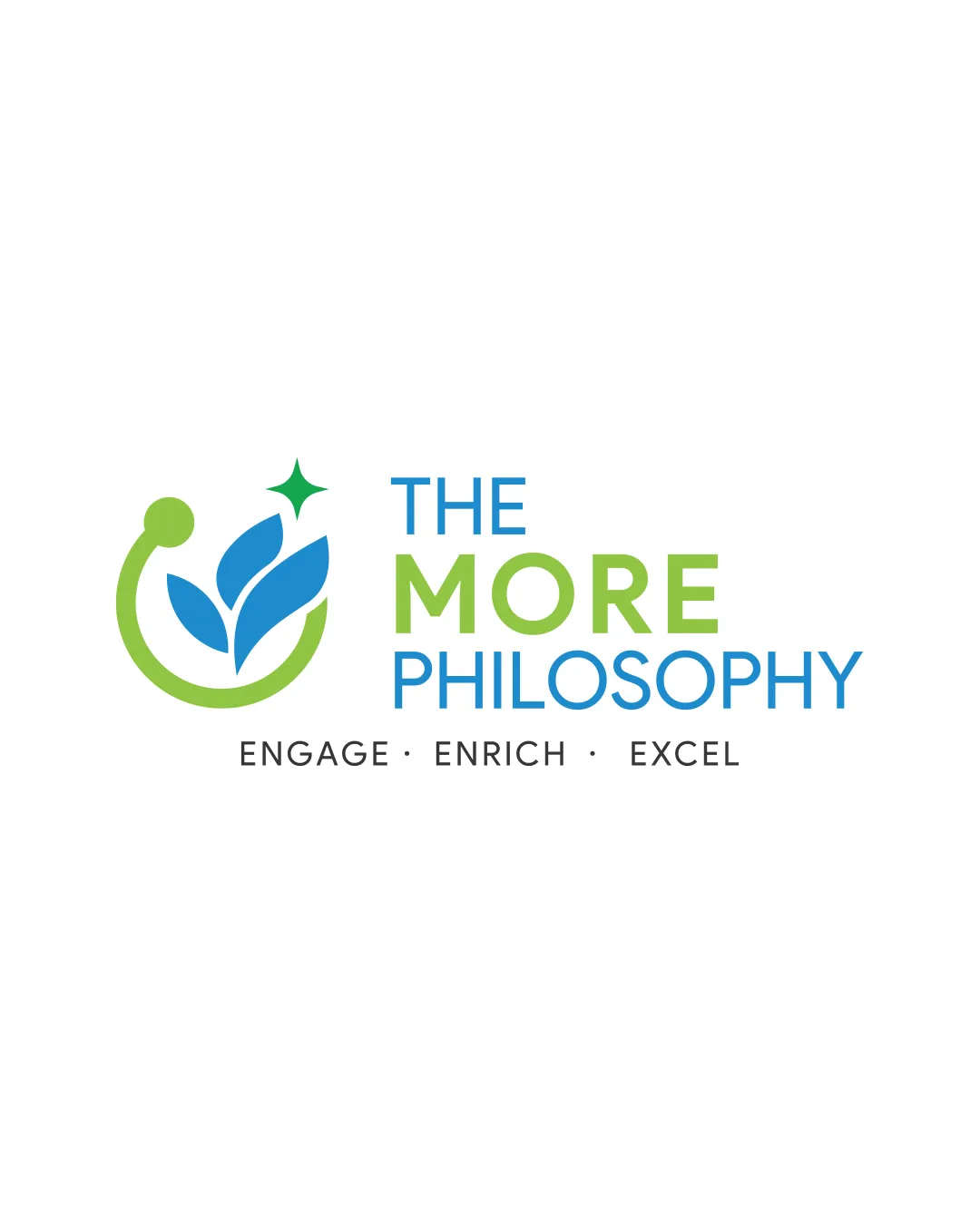
Logo review ofThe More Philosophy Engage Enrich Excel
Review the detailed scores below to see what is working and what should be refined first.
Legibility
Originality
Misread
Balance
Scale
Detailed review
Logo performance breakdown
Legibility
![]() All words are clear, with excellent letter spacing and differentiation between lines.
All words are clear, with excellent letter spacing and differentiation between lines.![]() Consistent sans-serif typeface preserves readability at various sizes.
Consistent sans-serif typeface preserves readability at various sizes.
Originality
![]() Plant motif inside a circular shape is mildly creative, attempting to blend growth and engagement.
Plant motif inside a circular shape is mildly creative, attempting to blend growth and engagement.![]() Color integration between logomark and wordmark creates some differentiation.
Color integration between logomark and wordmark creates some differentiation.
![]() Leaf inside a circle is a common trope in education and wellness industries and not highly distinctive.
Leaf inside a circle is a common trope in education and wellness industries and not highly distinctive.![]() Sparkle/star element does not significantly differentiate the logo in a crowded market.
Sparkle/star element does not significantly differentiate the logo in a crowded market.
Color harmony
![]() Good coordination between green and blue hues, which complement each other well.
Good coordination between green and blue hues, which complement each other well.![]() Color contrast makes both icon and text legible against white background.
Color contrast makes both icon and text legible against white background.
Pastel Green
#8DD340
Blue
#2090C9
Green
#1B996B
Black
#232323
Balance alignment
![]() The elements are well-aligned and visually balanced, giving a professional appearance.
The elements are well-aligned and visually balanced, giving a professional appearance.![]() Vertical distribution of main logomark and text feels intentional and cohesive.
Vertical distribution of main logomark and text feels intentional and cohesive.
![]() The visual weight between the symbol and the company name is slightly off; the symbol feels marginally light versus the bold 'MORE'.
The visual weight between the symbol and the company name is slightly off; the symbol feels marginally light versus the bold 'MORE'.

Scalability
![]() Logo is relatively simple and should hold up at small scales for social media, app icons, and business cards.
Logo is relatively simple and should hold up at small scales for social media, app icons, and business cards.![]() Clean symbol and bold text enable use on larger signage, educational merchandise, and flyers.
Clean symbol and bold text enable use on larger signage, educational merchandise, and flyers.
![]() Small sparkle/star element and tagline text could become illegible or disappear when used at very small sizes, especially for embroidery or small digital favicons.
Small sparkle/star element and tagline text could become illegible or disappear when used at very small sizes, especially for embroidery or small digital favicons.
200x250 px
100×125 px
50×62 px
Misinterpretations
![]() Logo does not contain any inappropriate or accidentally suggestive shapes.
Logo does not contain any inappropriate or accidentally suggestive shapes.![]() Symbol clearly relates to growth and learning without ambiguity.
Symbol clearly relates to growth and learning without ambiguity.
Symbol & text fit
![]() Symbol and wordmark use similar color palettes for cohesion.
Symbol and wordmark use similar color palettes for cohesion.
![]() Both share a contemporary, clean finish, visually tying them together.
Both share a contemporary, clean finish, visually tying them together.
![]() The rounded nature of the logomark slightly clashes with the squared sans-serif of the text, leading to a marginal style mismatch.
The rounded nature of the logomark slightly clashes with the squared sans-serif of the text, leading to a marginal style mismatch.
![]() Visual size of the logomark could be increased to better match the bold wordmark.
Visual size of the logomark could be increased to better match the bold wordmark.
Try your own review
Review my logo
Wondering how your logo performs?
Get a clear logo score, key risks, and priority fix ideas before your client or audience sees it.
Keep exploring


