Wondering how your logo performs? 🧐
Get professional logo reviews in seconds and catch design issues in time.
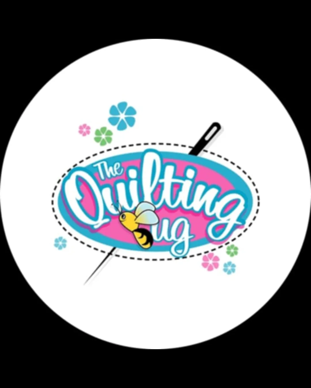
Try it Now!Logo review of The Quilting Bug
 Logo analysis by AI
Logo type:
Style:
Detected symbol:
Detected text:
Business industry:
Review requested by Alistudiocreatives
**If AI can recognize or misinterpret it, so can people.
Structured logo review
Legibility
![]() Script font is playful and fitting for the craft theme.
Script font is playful and fitting for the craft theme.![]() Text stands out against the colorful background.
Text stands out against the colorful background.
![]() Busy background and overlapping elements make parts of the word 'ug' less distinct.
Busy background and overlapping elements make parts of the word 'ug' less distinct.![]() Excessive outlines and varying font weights reduce clarity at small sizes.
Excessive outlines and varying font weights reduce clarity at small sizes.
Scalability versatility
![]() Colorful and illustrative style works well for merchandise, store signs, and posters.
Colorful and illustrative style works well for merchandise, store signs, and posters.
![]() Fine details like the needle, flowers, and bee wings will be lost or illegible at small sizes (e.g., business cards, favicons, embroidery).
Fine details like the needle, flowers, and bee wings will be lost or illegible at small sizes (e.g., business cards, favicons, embroidery).![]() Logo may appear cluttered or lose impact when scaled down.
Logo may appear cluttered or lose impact when scaled down.
200x250 px
100×125 px
50×62 px
Balance alignment
![]() Circular composition feels generally cohesive.
Circular composition feels generally cohesive.![]() Visual elements balance the playful brand personality.
Visual elements balance the playful brand personality.
![]() Text and illustrations compete for attention -- the bee overlaps and adds imbalance.
Text and illustrations compete for attention -- the bee overlaps and adds imbalance.![]() Stitch lines and flowers create a scattered look instead of a tightly contained emblem.
Stitch lines and flowers create a scattered look instead of a tightly contained emblem.

Originality
![]() Clever use of a bee as a visual pun on 'bug', referencing both quilting and the brand name.
Clever use of a bee as a visual pun on 'bug', referencing both quilting and the brand name.![]() Custom illustration adds personality and distinction.
Custom illustration adds personality and distinction.
![]() Illustration style is familiar within craft logos, somewhat diminishing uniqueness.
Illustration style is familiar within craft logos, somewhat diminishing uniqueness.![]() Flowers are generic and don’t add unique narrative impact.
Flowers are generic and don’t add unique narrative impact.
Logomark wordmark fit
![]() Color scheme and playful style of logomark and wordmark are cohesive.
Color scheme and playful style of logomark and wordmark are cohesive.
![]() Bee overlaps text awkwardly, causing conflict rather than synergy.
Bee overlaps text awkwardly, causing conflict rather than synergy.![]() Relative sizing draws uneven attention between elements—bee and needle overpower the text.
Relative sizing draws uneven attention between elements—bee and needle overpower the text.
Aesthetic look
![]() Bright palette and playful shapes catch the eye.
Bright palette and playful shapes catch the eye.![]() Logo is friendly and fitting for creative, craft-oriented businesses.
Logo is friendly and fitting for creative, craft-oriented businesses.
![]() Overdecorated—too many visual elements (bee, flowers, detailed stitch lines, needle) add clutter.
Overdecorated—too many visual elements (bee, flowers, detailed stitch lines, needle) add clutter.![]() Multiple font treatments and busy background diminish professional feel.
Multiple font treatments and busy background diminish professional feel.
Dual meaning and misinterpretations
![]() No inappropriate shapes or accidental meanings detected.
No inappropriate shapes or accidental meanings detected.
Color harmony
![]() Colors are cheerful and align with a crafts audience.
Colors are cheerful and align with a crafts audience.
![]() Six distinct colors cause visual busyness—palette could be simplified.
Six distinct colors cause visual busyness—palette could be simplified.![]() High saturation and contrasting hues may not reproduce well across all media formats.
High saturation and contrasting hues may not reproduce well across all media formats.
Vivid Sky Blue
#35C9F6
Pink
#E84A92
Black
#000000
White
#FFFFFF
Yellow
#FFD700
Light Green
#61D68C


