Wondering how your logo performs? 🧐
Get professional logo reviews in seconds and catch design issues in time.
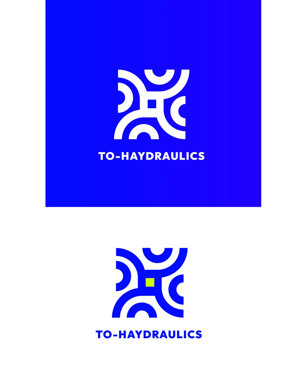
Try it Now!Logo review of TO-HAYDRAULICS
 Logo analysis by AI
Logo type:
Style:
Detected symbol:
Detected text:
Business industry:
Review requested by Dalia
**If AI can recognize or misinterpret it, so can people.
Structured logo review
Legibility
![]() Clear and bold typography
Clear and bold typography![]() High contrast between text and background
High contrast between text and background
![]() Hyphen in name may be slightly confusing
Hyphen in name may be slightly confusing
Scalability versatility
![]() Simple geometric shapes allow for usability in various sizes
Simple geometric shapes allow for usability in various sizes![]() Works well on larger formats
Works well on larger formats
![]() Fine details within the symbol may not translate well to very small applications like favicons
Fine details within the symbol may not translate well to very small applications like favicons
200x250 px
100×125 px
50×62 px
Balance alignment
![]() Well-balanced symbol
Well-balanced symbol![]() Aligned text and symbol
Aligned text and symbol

Originality
![]() Unique integration of geometric shapes
Unique integration of geometric shapes
![]() Geometric patterns are somewhat common in engineering logos
Geometric patterns are somewhat common in engineering logos
Logomark wordmark fit
![]() The geometric style of the logomark complements the wordmark
The geometric style of the logomark complements the wordmark
Aesthetic look
![]() Modern aesthetic with strong color contrast
Modern aesthetic with strong color contrast![]() Visually appealing geometric form
Visually appealing geometric form
![]() Limited color scheme might feel stark without additional context or adaptation
Limited color scheme might feel stark without additional context or adaptation
Dual meaning and misinterpretations
![]() No inappropriate imagery detected
No inappropriate imagery detected
Color harmony
![]() Strong color contrast
Strong color contrast![]() Limited color palette promotes brand recognition
Limited color palette promotes brand recognition
![]() Lime green accent could be jarring in certain contexts
Lime green accent could be jarring in certain contexts
Blue
#0000FF
White
#FFFFFF
Light Blue
#AADAFF
Lime Green
#B7E92E


