Wondering how your logo performs? 🧐
Get professional logo reviews in seconds and catch design issues in time.
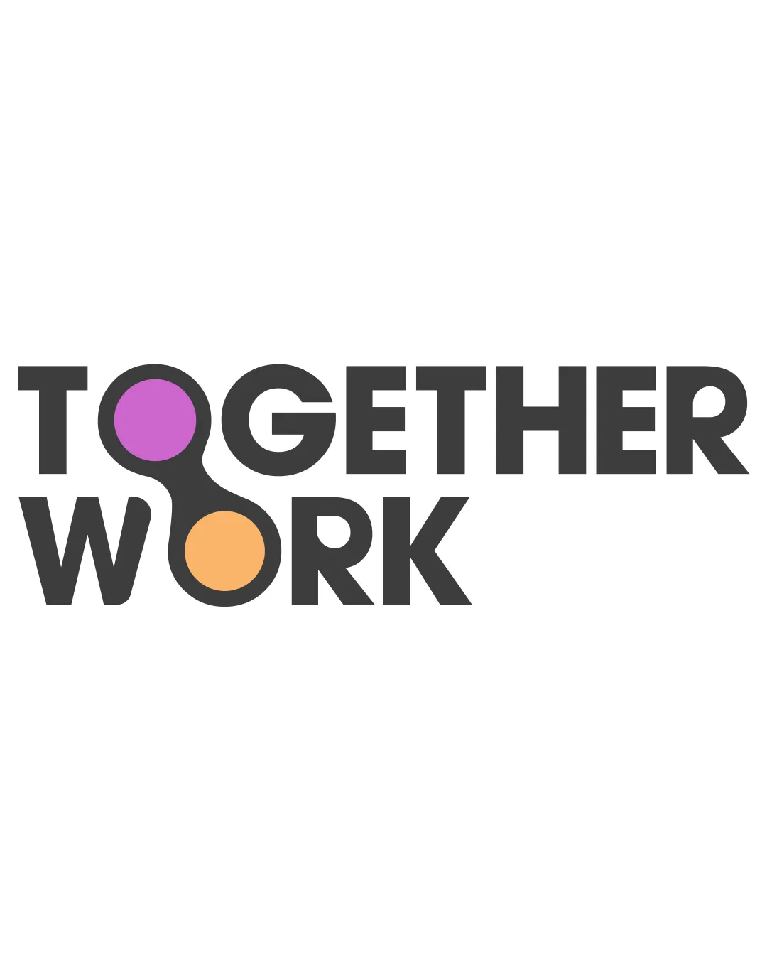
Try it Now!Logo review of TOGETHER WORK
 Logo analysis by AI
Logo type:
Style:
Detected symbol:
Detected text:
Business industry:
Review requested by Khoa123vn
**If AI can recognize or misinterpret it, so can people.
Structured logo review
Legibility
![]() Clear, bold typography
Clear, bold typography![]() Good contrast against white background
Good contrast against white background
![]() Slight distraction due to colorful circles
Slight distraction due to colorful circles
Scalability versatility
![]() Simple shapes ensure clarity in various sizes
Simple shapes ensure clarity in various sizes![]() Minimal detail aids in scalability
Minimal detail aids in scalability
![]() Thin lines of circles may lose clarity in very small sizes
Thin lines of circles may lose clarity in very small sizes
200x250 px
100×125 px
50×62 px
Balance alignment
![]() Well-aligned elements
Well-aligned elements![]() Balanced use of negative space
Balanced use of negative space
![]() The circles could misalign when resized improperly
The circles could misalign when resized improperly

Originality
![]() Unique interlocking circle concept
Unique interlocking circle concept
![]() Simple geometric shapes are commonly used
Simple geometric shapes are commonly used
Aesthetic look
![]() Modern and clean aesthetic
Modern and clean aesthetic![]() Effective color usage
Effective color usage
Dual meaning and misinterpretations
![]() No inappropriate symbols detected
No inappropriate symbols detected
Color harmony
![]() Pleasant color contrast
Pleasant color contrast![]() Colors reinforce the concept of collaboration
Colors reinforce the concept of collaboration
![]() Could be overwhelming on smaller print
Could be overwhelming on smaller print


