View review
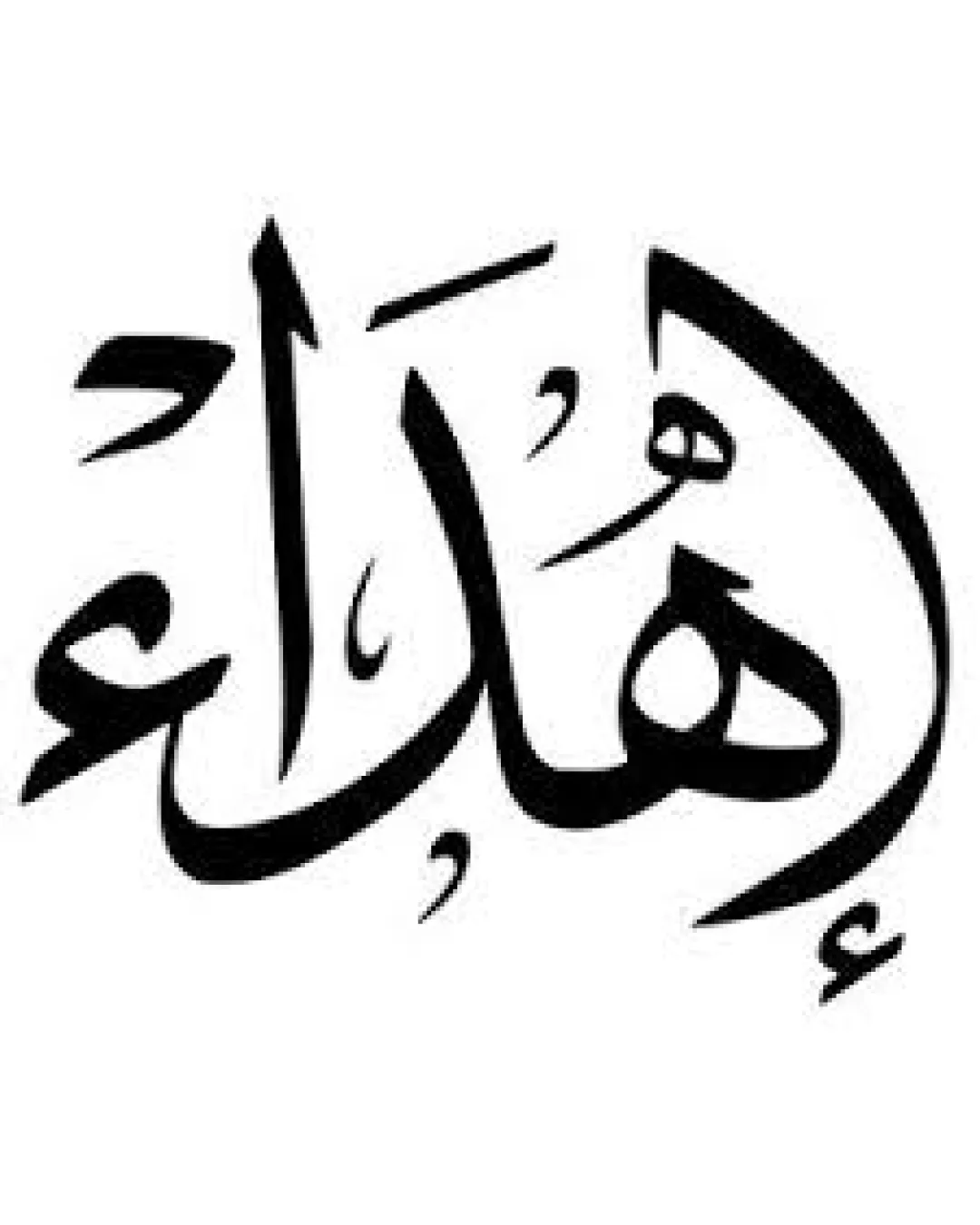
اهْدِ
Visually striking and culturally appropriate; ready for client presentation with option for minor readability enhancement.
What to fix first
The most important fixes to handle before polishing the full presentation.
Slightly increase clarity of letterforms and diacritics for enhanced legibility, especially at small sizes.
Medium prioritySome users may struggle with intricate letterforms if scaled down or viewed quickly.
Impact: Improves Accessibility And Versatility For All Use Cases. · Effort: Medium
Logo performance breakdown
Legibility
Text is artistically executed in a visually appealing style.
Ornate calligraphy may reduce readability for those unfamiliar with the script or style.
Originality
Distinct cultural style with hand-rendered uniqueness.
Common approach for Arabic logos in arts/cultural contexts.
Color harmony
Classic black-and-white palette is timeless and adaptable.
Black
#000000
White
#FFFFFF
Balance alignment
Composition is mostly balanced with flowing lines typical of calligraphy.
Some stroke thickness variation and extended shapes may create minor optical imbalance.
Scalability
Single color ensures broad adaptability.
Bold strokes retain definition at various sizes.
Fine lines and diacritics may become less distinguishable at small sizes.
200x250 px
100×125 px
50×62 px
Misinterpretations
No inappropriate or confusing visual misread detected.
Brief match
Detected Industry: The traditional calligraphy fits well for cultural, arts, or heritage-related contexts.
Wondering how your logo performs?
Get a clear logo score, key risks, and priority fix ideas before your client or audience sees it.