Wondering how your logo performs? 🧐
Get professional logo reviews in seconds and catch design issues in time.
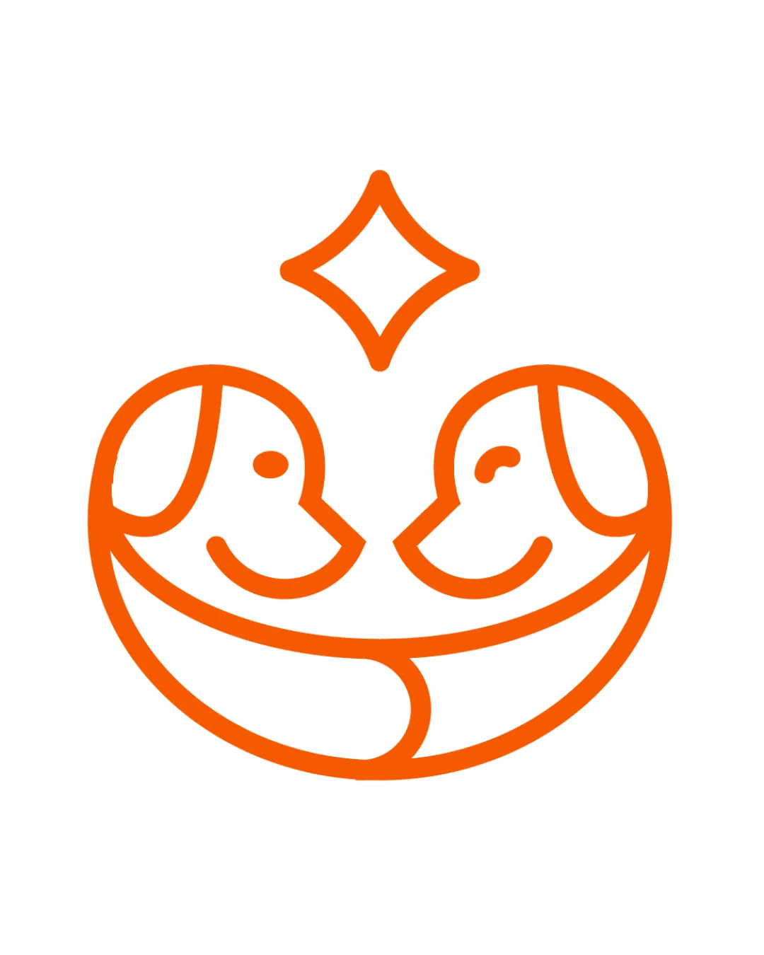
Try it Now!Logo review of Two symmetrical dog faces forming a heart shape, s..
 Logo analysis by AI
Logo type:
Style:
Detected symbol:
Negative space:
Business industry:
Review requested by Graphstorm
**If AI can recognize or misinterpret it, so can people.
Structured logo review
Scalability versatility
![]() Simple, bold lines ensure it’s sharp and clear at both large and small sizes.
Simple, bold lines ensure it’s sharp and clear at both large and small sizes.![]() Translates well on signage, business cards, pet tags, and merchandise.
Translates well on signage, business cards, pet tags, and merchandise.![]() Single-color design boosts adaptability across print and digital platforms.
Single-color design boosts adaptability across print and digital platforms.
200x250 px
100×125 px
50×62 px
Balance alignment
![]() Composition is perfectly symmetrical, lending a sense of harmony and professionalism.
Composition is perfectly symmetrical, lending a sense of harmony and professionalism.![]() The central positioning of the star above the dogs reinforces vertical balance.
The central positioning of the star above the dogs reinforces vertical balance.

Originality
![]() Creative integration of two dogs forming a heart is visually clever and emotionally resonant.
Creative integration of two dogs forming a heart is visually clever and emotionally resonant.![]() Inclusion of a star element enhances uniqueness slightly.
Inclusion of a star element enhances uniqueness slightly.
![]() Dog/heart combos are not unprecedented in the pet industry, so the concept isn’t entirely new.
Dog/heart combos are not unprecedented in the pet industry, so the concept isn’t entirely new.
Aesthetic look
![]() Aesthetically pleasing, friendly, and inviting thanks to the curved lines and open shapes.
Aesthetically pleasing, friendly, and inviting thanks to the curved lines and open shapes.![]() Minimalist approach keeps the design contemporary and accessible.
Minimalist approach keeps the design contemporary and accessible.
Dual meaning and misinterpretations
![]() Dual meaning is positive: dogs and a heart for animal care and love.
Dual meaning is positive: dogs and a heart for animal care and love.
Color harmony
![]() Single vibrant color ensures instant brand recognition and contrast.
Single vibrant color ensures instant brand recognition and contrast.![]() Color is energetic and optimistic, suitable for the industry.
Color is energetic and optimistic, suitable for the industry.
Orange
#FF6600
White
#FFFFFF