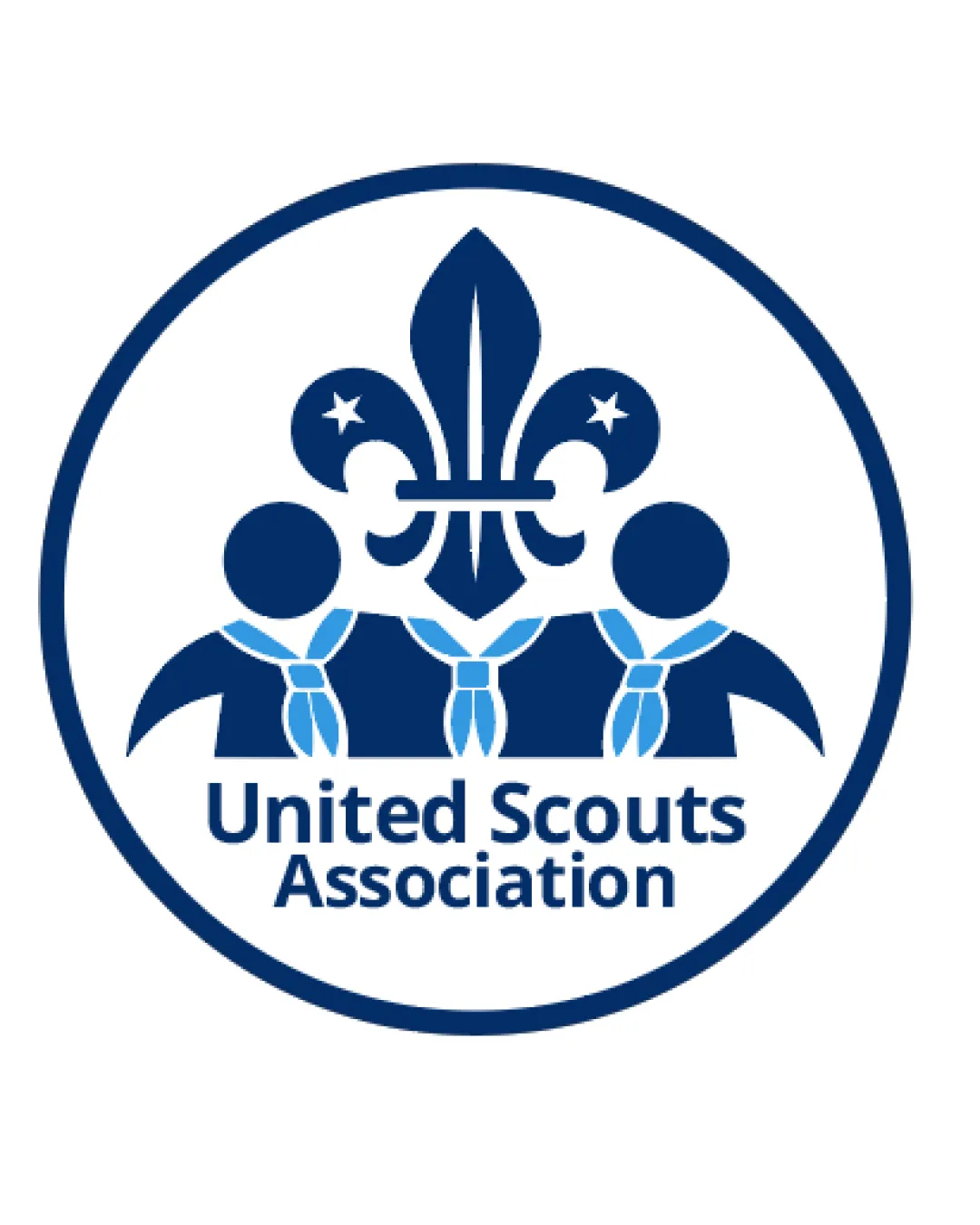
United Scouts Association logo logo review
3.7/5
Logo score

United Scouts Association logo

Essential logo review

A strong, unified scouting emblem readily communicates its mission, with only a small risk of fine detail loss when scaled down.

This emblem shows solid execution, supported by distinctive construction and visual balance; improving clarity at smaller sizes is the clearest next step.

Emblem Flat, Illustrative Youth Organization
4/5
Originality
4/5
Balance
3/5
Scale
4/5
Color
Your next steps

What to fix first

Focus on the changes that matter. Keep what makes the logo work.

1

overall emblem

Test reduced-size clarity, especially for finer emblem details.

High priority Worth testing Low effort

Some illustrative details, such as the knots on the scarves and stars in the fleur-de-lis, may merge or become indistinct when scaled down, which could impact clarity at very small sizes.

See the category review
Detailed review

Logo performance breakdown

5/5

Brief & logo match

This logo convincingly expresses the unified, welcoming spirit of a scouting association with clear, relevant visual elements and strong legibility.

5/5

Misinterpretations

  • No unintended readings or inappropriate associations observed.
4/5

Originality

  • Strong, category-appropriate illustration with custom scout figures.
4/5

Color harmony

  • Clear, harmonious blues suit the youth scouting theme.
Dark Blue#13356A
Light Blue#63A3D4
White#FFFFFF

Estimated colors. Use the original design file for exact values.

Create a full color palette using these colors

Create new palette
4/5

Balance alignment

Available in Advanced logo reviews
3/5

Scalability

Available in Advanced logo reviews

Legibility

  • Text is clear and readable; familiar font choice for the category.
Try your own review

Wondering how your logo performs?

Get a clear logo score, key risks, and priority fix ideas before your client or audience sees it.

Review my logo