Wondering how your logo performs? 🧐
Get professional logo reviews in seconds and catch design issues in time.
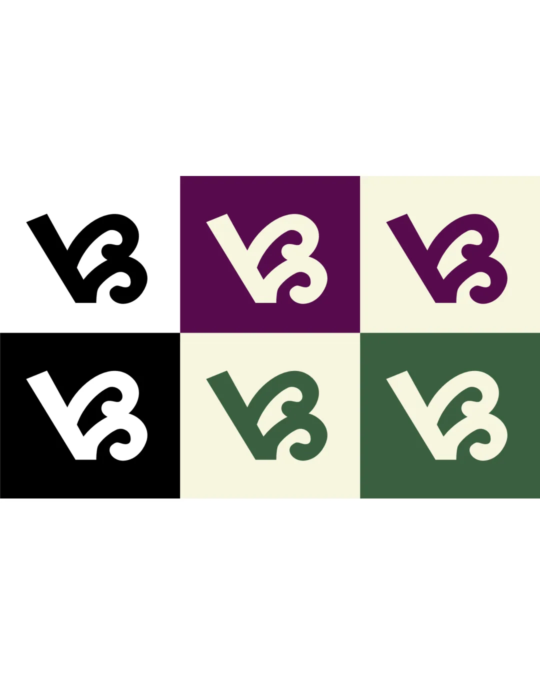
Try it Now!Logo review of VB
 Logo analysis by AI
Logo type:
Style:
Detected symbol:
Detected text:
Business industry:
Review requested by GlorytoGod
**If AI can recognize or misinterpret it, so can people.
Structured logo review
Legibility
![]() The VB letterforms are mostly clear and readable.
The VB letterforms are mostly clear and readable.![]() Single color versions enhance readability at most sizes.
Single color versions enhance readability at most sizes.
![]() The stylistic curl on the B can be mistaken for another symbol or reduce instant recognition for some viewers.
The stylistic curl on the B can be mistaken for another symbol or reduce instant recognition for some viewers.![]() At smaller sizes, the curl may compromise clarity.
At smaller sizes, the curl may compromise clarity.
Scalability versatility
![]() Monoline weight works well on business cards, letterheads, and digital avatars.
Monoline weight works well on business cards, letterheads, and digital avatars.![]() Multiple background options improve its adaptation for different contexts.
Multiple background options improve its adaptation for different contexts.
![]() Overly fine curls could become muddy or indistinct at very small sizes (e.g., favicon, tiny embroidery).
Overly fine curls could become muddy or indistinct at very small sizes (e.g., favicon, tiny embroidery).
200x250 px
100×125 px
50×62 px
Balance alignment
![]() Even distribution of visual weight.
Even distribution of visual weight.![]() Diagonal angle and composition give a dynamic, forward-moving energy.
Diagonal angle and composition give a dynamic, forward-moving energy.

Originality
![]() The curled base adds a unique flair to a standard monogram.
The curled base adds a unique flair to a standard monogram.![]() Not a common combination or arrangement for VB.
Not a common combination or arrangement for VB.
![]() Monogram-based logos with curled embellishments exist in fashion and boutique industries, so it's not utterly groundbreaking.
Monogram-based logos with curled embellishments exist in fashion and boutique industries, so it's not utterly groundbreaking.
Aesthetic look
![]() Clean, modern appeal with attractive curves.
Clean, modern appeal with attractive curves.![]() Limited palette enhances sophistication.
Limited palette enhances sophistication.
![]() May appear slightly decorative or whimsical, which might not suit very formal or corporate contexts.
May appear slightly decorative or whimsical, which might not suit very formal or corporate contexts.
Dual meaning and misinterpretations
![]() No inappropriate shapes or ambiguous meanings detected.
No inappropriate shapes or ambiguous meanings detected.
Color harmony
![]() Palette uses two to three harmonizing colors, avoiding overload.
Palette uses two to three harmonizing colors, avoiding overload.![]() All combinations deliver strong contrast and legibility.
All combinations deliver strong contrast and legibility.
Black
#000000
White
#FFFFFF
Eggplant
#47204E
Ivory
#E8E6D5
Green
#4A6A55