MetNeuro Lab logo review
4.4 / 5
Logo score
Logo review of

Metneuro Lab

Review the detailed scores below to see what is working and what should be refined first.

Objective AI feedback. Your creative decision.

Combination Mark Modern, Minimal, Flat, Gradient Science
5/5
Legibility
4/5
Originality
5/5
Misread
4/5
Balance
3/5
Scale
Detailed review

Logo performance breakdown

5/5

Legibility

Checkmark icon The logotype is very clear and easily readable.
Checkmark icon Font selection is clean and modern, aligning well with the symbol.
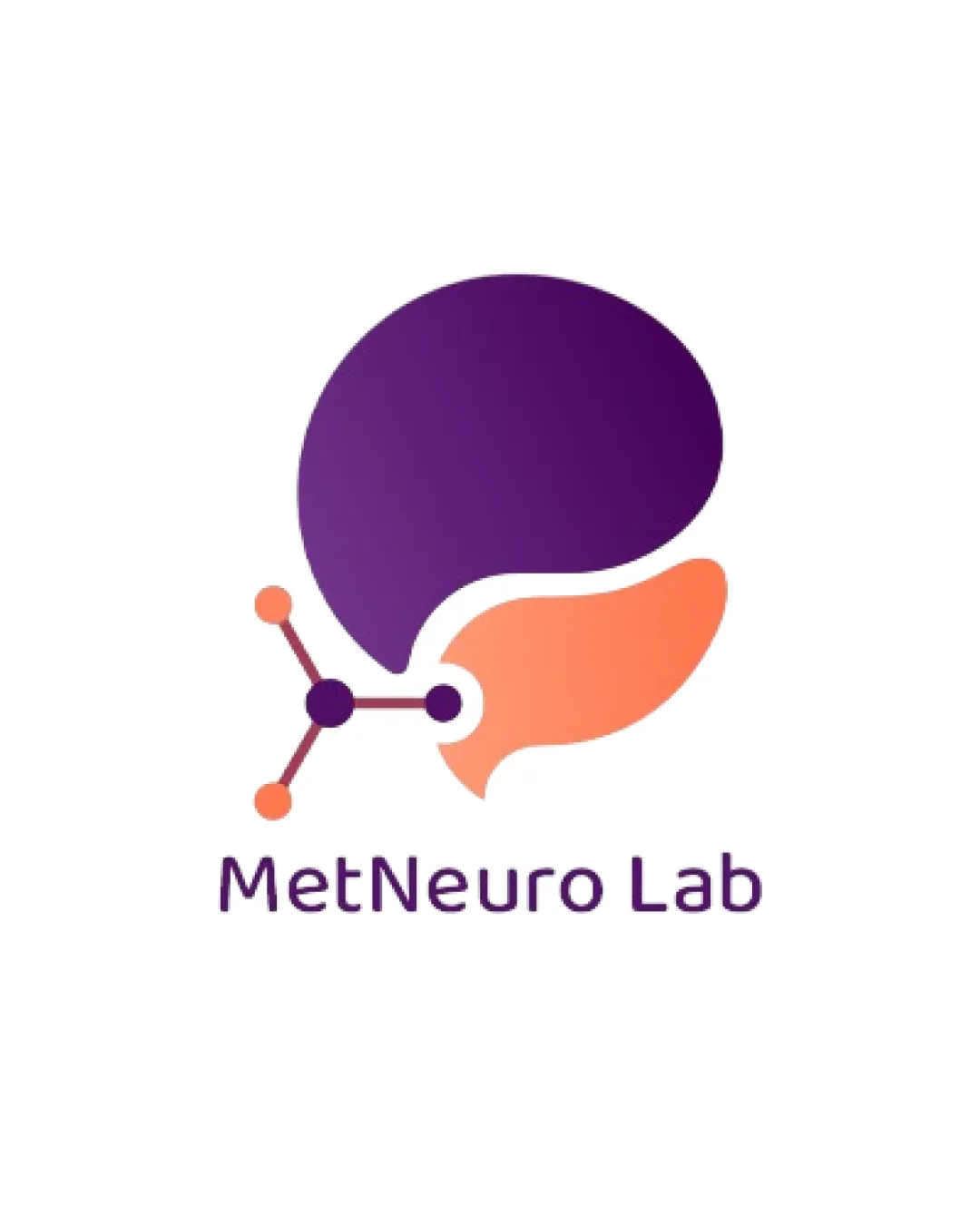
4/5

Originality

Checkmark icon Combines brain and molecule motifs in a creative, non-literal way.
Checkmark icon Gradient usage adds unique visual interest.

Warning icon Brain-molecule hybrid is a somewhat common approach in the neuroscience sector.
Warning icon No entirely new or unexpected approach to neural or scientific iconography.

4/5

Color harmony

Checkmark icon Purple and peach/orange gradients blend well and enhance visual appeal.
Checkmark icon Limited color palette keeps the look professional.

Warning icon Gradient can be challenging for consistent application across all print materials.
Warning icon Contrast between the two core shapes could be slightly improved for even better separation, especially for black and white versions.

Purple
#6B1F86

Peach
#FF905C

White
#FFFFFF

Your palette is close. Refine the color roles and combinations before updating the logo.

Build brand colors
4/5

Balance alignment

Checkmark icon The arrangement of elements feels visually balanced overall.
Checkmark icon Spacing between the symbol and the text is adequate.

Warning icon The connector in the molecular structure juts out to the left and creates some visual imbalance, making the left side slightly heavier than the right.

logo 200x250 pixels scalability test alignment grid overlay
3/5

Scalability

Checkmark icon Simple shapes allow some scalability.
Checkmark icon No excessive intricate details.

Warning icon Gradient color and thin lines in the molecular structure may lose legibility in embroidery or very small sizes (e.g., favicons).
Warning icon Gradient might not reproduce well for single-color applications.

logo 200x250 pixels scalability test

200x250 px

logo 100x125 pixels scalability test

100×125 px

logo 50x62 pixels scalability test

50×62 px

5/5

Misinterpretations

Checkmark icon No inappropriate or confusing shapes detected.
Checkmark icon Imagery is clearly evocative of neuroscience and molecular science.

5 / 5

Symbol & text fit

Checkmark icon Logomark and wordmark have a cohesive modern and soft aesthetic.
Checkmark icon Colors and styles match perfectly between the symbol and type.

Try your own review

Wondering how your logo performs?

Get a clear logo score, key risks, and priority fix ideas before your client or audience sees it.

Review my logo




