View review
The Next Influencer
Review the detailed scores below to see what is working and what should be refined first.
Objective AI feedback. Your creative decision.
Logo performance breakdown
Legibility
Text is highly readable and well-kerned.
Font size and capitalization enhance clarity.
Good contrast against the light background.
Originality
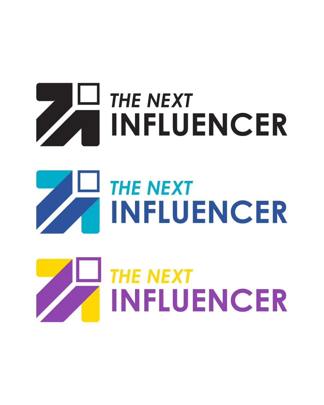
Arrow motif and geometric square provide a modern touch.
Use of negative space for arrow direction is effective.
Upward arrow and geometric combination is fairly common in media and tech branding.
Doesn’t introduce a new concept or distinctive approach that would set it apart in a saturated industry.
Color harmony
Color schemes are bold yet complementary.
Multi-color versions separate elements without overwhelming the composition.
Yellow and purple in the bottom version lack contrast and may be problematic for accessibility or print.
Three distinct colorways could create inconsistency in brand recognition unless usage is strictly defined.
Black
#000000
Vivid Sky Blue
#1BA1E2
Dark Blue
#27408B
Yellow
#FFD700
Purple
#8A2BE2
Your palette is close. Refine the color roles and combinations before updating the logo.
Build brand colorsBalance alignment
Symbol and wordmark are aligned, providing solid visual hierarchy.
Consistent spacing gives a composed look.
Square may feel slightly disconnected from the rest of the logomark if scaled down.
Logo mark minorly outweighs the wordmark in some color variants.
Scalability
Geometric shapes and clean lines support clear visibility at small sizes.
Logo is provided in single and multi-color versions for flexible applications.
Works well for social media avatars, business cards, and large-scale signage.
Square and arrow details may lose some definition if reduced to favicon size.
Gradient/dual color variations may not print as cleanly in very small sizes or on fabric embroidery.
200x250 px
100×125 px
50×62 px
Misinterpretations
No inappropriate or unintended visual interpretations detected.
Arrow and square are clear geometric representations.
Symbol & text fit
Font style and icon both adopt a geometric, clean aesthetic.
Visual weight is mostly balanced between symbol and text.
Wordmark presence slightly overshadowed by the bold symbol in colorful variants.
Wondering how your logo performs?
Get a clear logo score, key risks, and priority fix ideas before your client or audience sees it.