 View review
Logo score
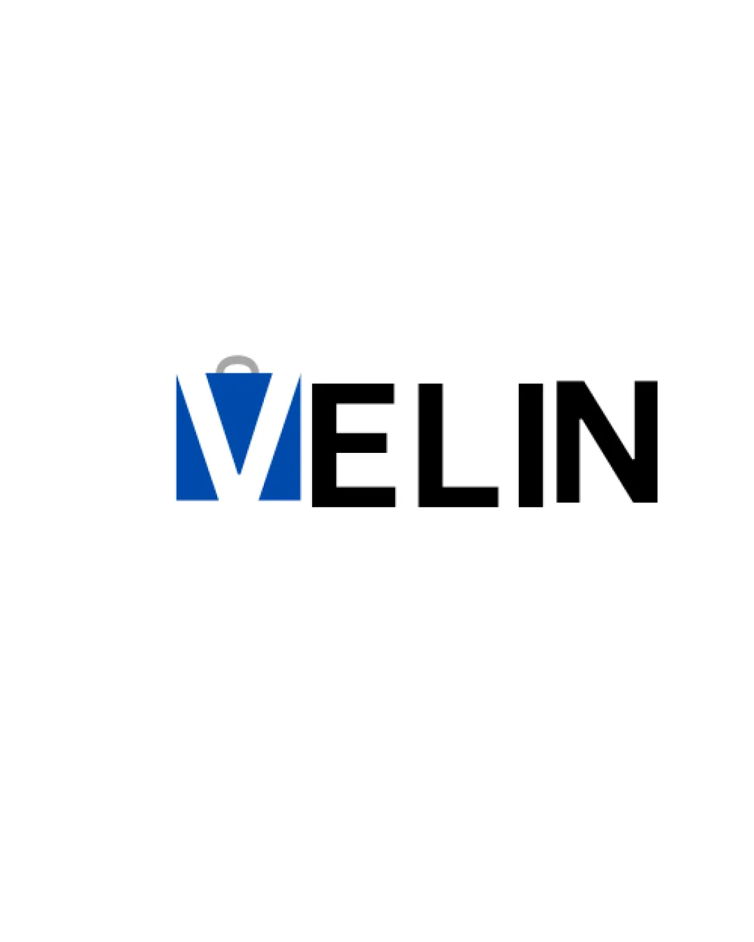
Logo review ofVelin
Review the detailed scores below to see what is working and what should be refined first.
Legibility
Originality
Misread
Balance
Scale
Detailed review
Logo performance breakdown
Legibility
![]() Text is clear and easy to read.
Text is clear and easy to read.![]() Font choice is bold and simple, enhancing recognition.
Font choice is bold and simple, enhancing recognition.
![]() The 'V' letter merges with the bag symbol which may cause slight ambiguity at small sizes.
The 'V' letter merges with the bag symbol which may cause slight ambiguity at small sizes.
Originality
![]() Incorporates the shopping bag shape into the letter 'V' for a functional dual-purpose letterform.
Incorporates the shopping bag shape into the letter 'V' for a functional dual-purpose letterform.
![]() Shopping bag concept is overused in retail branding, so the symbol lacks uniqueness.
Shopping bag concept is overused in retail branding, so the symbol lacks uniqueness.![]() Execution is straightforward with minimal creative twist beyond the integration.
Execution is straightforward with minimal creative twist beyond the integration.
Color harmony
![]() Blue and black provide professional, trustworthy contrast.
Blue and black provide professional, trustworthy contrast.![]() Gray handle is subtle and non-intrusive.
Gray handle is subtle and non-intrusive.
![]() Gray handle detail may not be visible on all backgrounds.
Gray handle detail may not be visible on all backgrounds.
Blue
#1658A6
Black
#000000
Light Gray
#C0C0C0
White
#FFFFFF
Your palette is close. Explore sharper color combinations with Colorfly.design before updating the logo.
Explore palettesBalance alignment
![]() Wordmark is generally aligned with the logomark.
Wordmark is generally aligned with the logomark.
![]() The blue symbol on the left side creates a heavier visual weight compared to the rest of the text, making alignment feel slightly off-balance.
The blue symbol on the left side creates a heavier visual weight compared to the rest of the text, making alignment feel slightly off-balance.

Scalability
![]() Logo is relatively simple and should work in large-scale applications such as billboards and store signage.
Logo is relatively simple and should work in large-scale applications such as billboards and store signage.![]() Strong contrast helps maintain visibility across various backgrounds.
Strong contrast helps maintain visibility across various backgrounds.
![]() Fine detail of the bag handle (gray arc) may disappear in small-scale formats like app icons or embroidery.
Fine detail of the bag handle (gray arc) may disappear in small-scale formats like app icons or embroidery.![]() Blue block of the 'M/V' symbol may blend into dark backgrounds without proper spacing or outline.
Blue block of the 'M/V' symbol may blend into dark backgrounds without proper spacing or outline.
200x250 px
100×125 px
50×62 px
Misinterpretations
![]() No inappropriate or unintended imagery detected.
No inappropriate or unintended imagery detected.
Symbol & text fit
![]() Logomark and wordmark share a similar geometric style and thickness, providing some cohesion.
Logomark and wordmark share a similar geometric style and thickness, providing some cohesion.
![]() The integration of the bag and 'V' is not perfectly seamless, and the gray handle arc feels disconnected from the letter shapes.
The integration of the bag and 'V' is not perfectly seamless, and the gray handle arc feels disconnected from the letter shapes.
Try your own review
Review my logo
Wondering how your logo performs?
Get a clear logo score, key risks, and priority fix ideas before your client or audience sees it.
Keep exploring


