 View review
Logo score
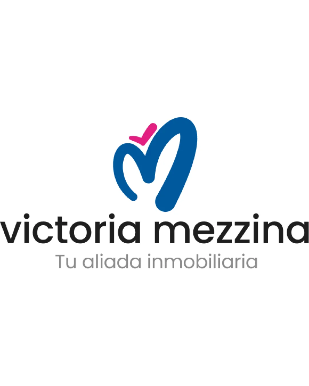
Logo review ofVictoria Mezzina, Tu Aliada Inmobiliaria
Review the detailed scores below to see what is working and what should be refined first.
Legibility
Originality
Misread
Balance
Scale
Detailed review
Logo performance breakdown
Legibility
![]() Typography is simple, sans-serif, and highly readable.
Typography is simple, sans-serif, and highly readable.![]() Contrast between text and background is excellent.
Contrast between text and background is excellent.
Originality
![]() Abstract 'M' with a playful accent is distinct and creates a memorable shape.
Abstract 'M' with a playful accent is distinct and creates a memorable shape.![]() Use of a checkmark motif subtly suggests trust or approval—suitable for real estate.
Use of a checkmark motif subtly suggests trust or approval—suitable for real estate.
![]() Abstract 'M' designs with similar swoosh/check accents are not rare, slightly reducing uniqueness.
Abstract 'M' designs with similar swoosh/check accents are not rare, slightly reducing uniqueness.
Color harmony
![]() Blue and pink contrast nicely and evoke a positive, energetic feel.
Blue and pink contrast nicely and evoke a positive, energetic feel.![]() Limited use of color avoids visual clutter.
Limited use of color avoids visual clutter.
Curious Blue
#1769A1
Cerise Pink
#ED3C8B
Black
#232323
Silver
#BDBDBD
Balance alignment
![]() Logo mark is centered above the wordmark, maintaining vertical alignment.
Logo mark is centered above the wordmark, maintaining vertical alignment.![]() Weight of the symbol matches the wordmark, creating a cohesive feel.
Weight of the symbol matches the wordmark, creating a cohesive feel.
![]() Pink accent sits slightly off-center over the mark, which might create a minor imbalance.
Pink accent sits slightly off-center over the mark, which might create a minor imbalance.

Scalability
![]() Bold shapes and clear lines ensure good readability at medium and large sizes.
Bold shapes and clear lines ensure good readability at medium and large sizes.![]() Would work well on billboards, signage, and digital platforms.
Would work well on billboards, signage, and digital platforms.
![]() Thin tagline text may lose legibility at small sizes such as business cards or favicons.
Thin tagline text may lose legibility at small sizes such as business cards or favicons.![]() Pink accent could blur into the main mark at very small sizes.
Pink accent could blur into the main mark at very small sizes.
200x250 px
100×125 px
50×62 px
Misinterpretations
![]() No inappropriate or ambiguous shapes detected.
No inappropriate or ambiguous shapes detected.![]() Design elements are on-brand and clear in meaning.
Design elements are on-brand and clear in meaning.
Symbol & text fit
![]() Shapes, line thickness, and style of logomark match well with the rounded, modern wordmark.
Shapes, line thickness, and style of logomark match well with the rounded, modern wordmark.
![]() Visual harmony between the symbol and type enhances brand recognition.
Visual harmony between the symbol and type enhances brand recognition.
Try your own review
Review my logo
Wondering how your logo performs?
Get a clear logo score, key risks, and priority fix ideas before your client or audience sees it.
Keep exploring


