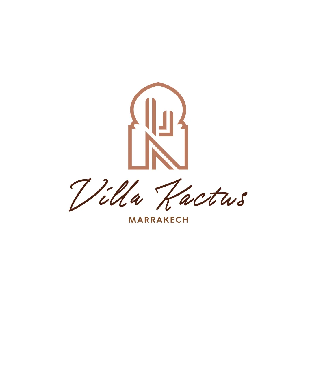
Villa Kactus MARRAKECH logo review
4.1 / 5
Logo score

Logo review ofVilla Kactus Marrakech

Review the detailed scores below to see what is working and what should be refined first.

Combination Mark Minimalist, Line Art, Script Typography Hospitality
4/5
Legibility
4/5
Originality
5/5
Misread
4/5
Balance
3/5
Scale
Review next
Detailed review

Logo performance breakdown

4/5

Legibility

Checkmark icon Villa Kactus is easy to read with a stylish script font.
Checkmark icon MARRAKECH in all caps improves clarity for the location.

Warning icon Script font for 'Villa Kactus' may hinder quick readability, especially at small sizes or from distance.
4/5

Originality

Checkmark icon Clever integration of cactus form and initials within a Moroccan-inspired arch.
Checkmark icon Script paired with geometric emblem feels distinct.

Warning icon Moroccan arches and cactus motifs are somewhat common in the hospitality sector for Marrakech, lessening complete originality.

5/5

Color harmony

Checkmark icon Color palette is limited, harmonious, and fitting for the Marrakech/hospitality context.
Checkmark icon Contrast is solid throughout logo.

Teak
#B7996E

Dark Brown
#4A2C14

White
#FFFFFF

4/5

Balance alignment

Checkmark icon Good vertical alignment between symbol and text.
Checkmark icon Balanced proportion between symbol, brand name, and tagline.

Warning icon Script font and geometric symbol styles contrast strongly, introducing a slight disconnect in overall balance.

logo 200x250 pixels scalability test alignment grid overlay
3/5

Scalability

Checkmark icon Minimalist line style maintains clarity in medium-to-large formats.
Checkmark icon Works well on signage, menus, and digital applications.

Warning icon Thin lines in the symbol may disappear or lose clarity at very small sizes or in embroidery.
Warning icon Script font can lose legibility when scaled down, making it less versatile for favicons or small merchandise tags.

logo 200x250 pixels scalability test

200x250 px

logo 100x125 pixels scalability test

100×125 px

logo 50x62 pixels scalability test

50×62 px

5/5

Misinterpretations

Checkmark icon No inappropriate or confusing imagery detected.
Checkmark icon Symbol and text are both clear in meaning.

4 / 5

Symbol & text fit

Checkmark icon Geometric symbol references brand identity; script wordmark adds elegance for hospitality.
Checkmark icon Overall visual harmony is achieved, but not perfect.

Warning icon Slight stylistic mismatch between the organic fluidity of the script and the rigid architectural symbol.

Try your own review

Wondering how your logo performs?

Get a clear logo score, key risks, and priority fix ideas before your client or audience sees it.

Review my logo