Wondering how your logo performs? 🧐
Get professional logo reviews in seconds and catch design issues in time.
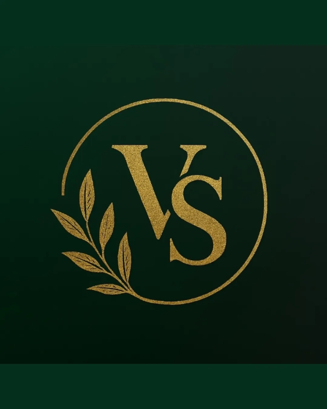
Try it Now!Logo review of VS
 Logo analysis by AI
Logo type:
Style:
Detected symbol:
Detected text:
Business industry:
Review requested by Som
**If AI can recognize or misinterpret it, so can people.
Structured logo review
Legibility
![]() Letterforms 'VS' are highly readable and well proportioned
Letterforms 'VS' are highly readable and well proportioned![]() Font choice aligns with the elegant theme
Font choice aligns with the elegant theme
Scalability versatility
![]() Simple monogram and clean illustration make it suitable for upscale packaging and print
Simple monogram and clean illustration make it suitable for upscale packaging and print![]() Strong emblematic presence works well on letterheads and signage
Strong emblematic presence works well on letterheads and signage
![]() Fine lines in the botanical element and circle may be lost at small sizes (e.g., business cards, favicons)
Fine lines in the botanical element and circle may be lost at small sizes (e.g., business cards, favicons)![]() Textural gold effect may not reproduce well in black-and-white or embroidery
Textural gold effect may not reproduce well in black-and-white or embroidery
200x250 px
100×125 px
50×62 px
Balance alignment
![]() Circle encloses the elements, providing overall containment
Circle encloses the elements, providing overall containment![]() Letters are well centered within the graphic
Letters are well centered within the graphic
![]() Botanical branch on the left disrupts perfect left-right visual balance, making the right side feel heavier
Botanical branch on the left disrupts perfect left-right visual balance, making the right side feel heavier

Originality
![]() The integration of a botanical motif with classic monogram adds a premium touch
The integration of a botanical motif with classic monogram adds a premium touch
![]() Monogram with foliage and a circle is a common visual trope in the luxury and boutique industries
Monogram with foliage and a circle is a common visual trope in the luxury and boutique industries![]() Lacks unique conceptual twist or distinct customization in letterforms
Lacks unique conceptual twist or distinct customization in letterforms
Aesthetic look
![]() Elegant, high-end visual appeal
Elegant, high-end visual appeal![]() Harmonious pairing of serif typography and naturalistic element
Harmonious pairing of serif typography and naturalistic element
![]() Gold texture might appear cliché if not executed with superior print finishes
Gold texture might appear cliché if not executed with superior print finishes
Dual meaning and misinterpretations
![]() No inappropriate or unintended hidden meanings detected
No inappropriate or unintended hidden meanings detected
Color harmony
![]() Gold and dark green convey luxury and sophistication
Gold and dark green convey luxury and sophistication![]() Limited color palette maintains brand exclusivity
Limited color palette maintains brand exclusivity
Teak
#B7996E
Green
#223F2F
DarkGreen
#273A23


