Wondering how your logo performs? 🧐
Get professional logo reviews in seconds and catch design issues in time.
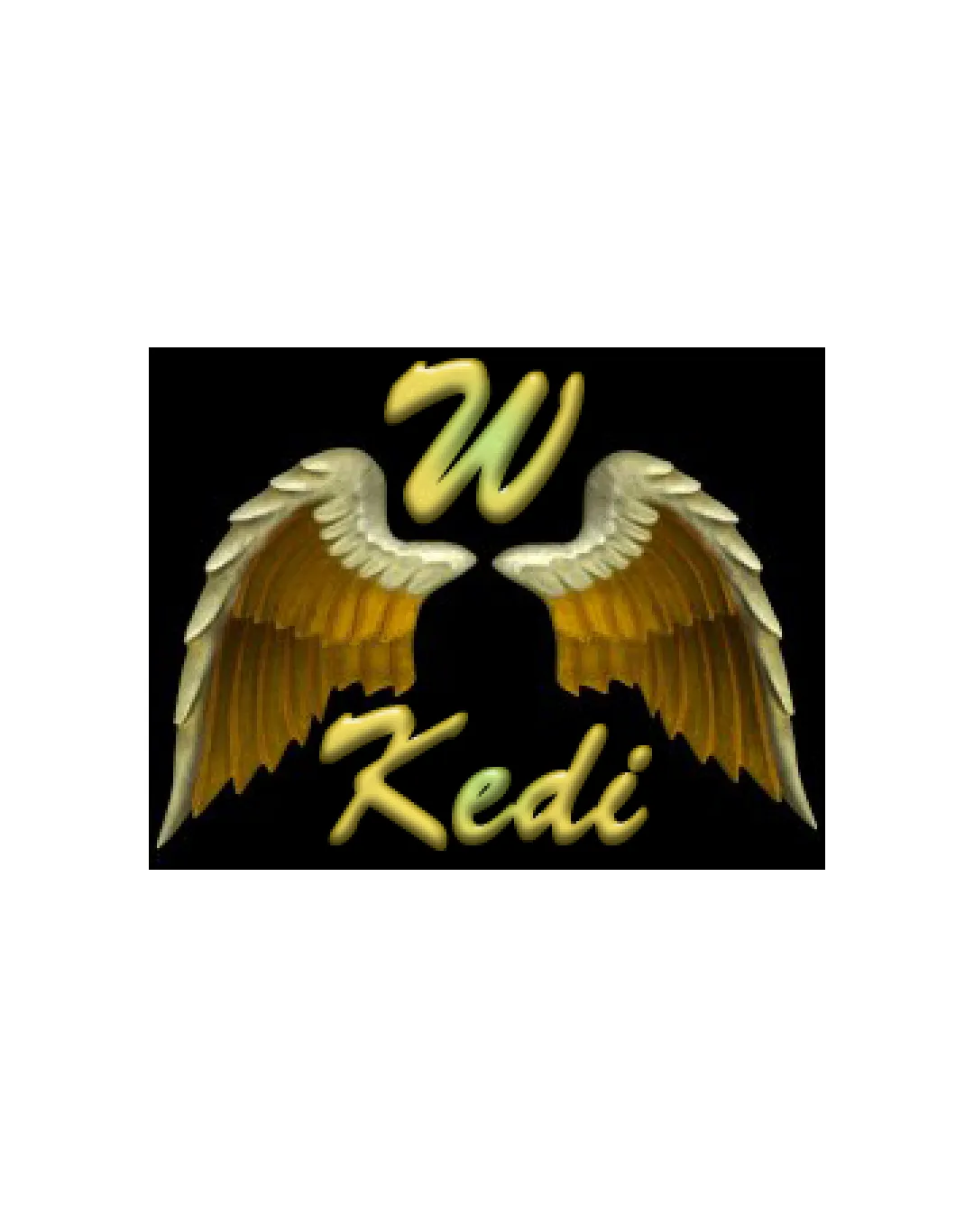
Try it Now!Logo review of W Kedi
 Logo analysis by AI
Recognized style:
Logo type:
Detected symbol:
Detected text:
Business industry:
Review requested by Vetor
**If AI can recognize or misinterpret it, so can people.
Structured logo review
Legibility
![]() The brand name 'Kedi' is clearly distinguishable.
The brand name 'Kedi' is clearly distinguishable.
![]() The script style of 'W' and 'Kedi' can be challenging to read at smaller sizes.
The script style of 'W' and 'Kedi' can be challenging to read at smaller sizes.
Scalability versatility
![]() The logo's simplicity aids in scalability to an extent.
The logo's simplicity aids in scalability to an extent.
![]() Ornate details on the wings may not reproduce well in small applications.
Ornate details on the wings may not reproduce well in small applications.
200x250 px
100×125 px
50×62 px
Balance alignment
![]() The elements are centered, providing a sense of balance.
The elements are centered, providing a sense of balance.
![]() The 'W' might appear detached from the rest of the design.
The 'W' might appear detached from the rest of the design.

Originality
![]() The combination of wings and the letter 'W' gives some uniqueness.
The combination of wings and the letter 'W' gives some uniqueness.
![]() Wings are a common motif in logos, affecting originality.
Wings are a common motif in logos, affecting originality.
Aesthetic look
![]() The logo has a decorative and classic look.
The logo has a decorative and classic look.
![]() The color and style may not appeal to modern, minimal aesthetic tastes.
The color and style may not appeal to modern, minimal aesthetic tastes.
Cultural sensitivity dual meaning
![]() No cultural sensitivity issues detected.
No cultural sensitivity issues detected.
Color harmony
![]() The gold color provides a luxurious feel.
The gold color provides a luxurious feel.
![]() The use of gradient might not work well across varied backgrounds.
The use of gradient might not work well across varied backgrounds.