Wondering how your logo performs? 🧐
Get professional logo reviews in seconds and catch design issues in time.
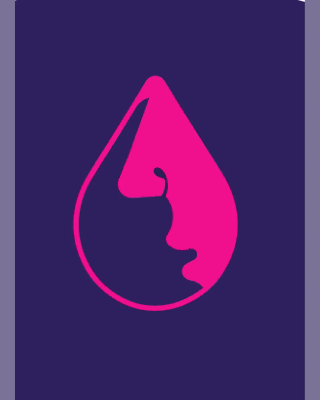
Try it Now!Logo review of water droplet outline with two faces in profile fo..
 Logo analysis by AI
Logo type:
Style:
Detected symbol:
Negative space:
Business industry:
Review requested by Danielr
**If AI can recognize or misinterpret it, so can people.
Structured logo review
Scalability versatility
Simple, geometric outline ensures clarity at small and large sizes.
Icon will work well on business cards, app icons, and large signage.

200x250 px

100×125 px

50×62 px
Balance alignment
Silhouette is mostly symmetrical and aligns visually with the droplet perimeter.
Faces are balanced within the negative and positive space.
Minor asymmetry in the face contour may create tension, especially when scaled up.


Originality
Clever use of negative space to combine dual human profiles with a droplet shape shows creativity.
Distinctive concept that avoids generic motifs.
Aesthetic look
Minimal palette and crisp lines create a modern, professional appearance.
Vivid color scheme is visually striking and likely to be memorable.
Bright pink may be polarizing and doesn’t always align with professional or medical expectations.
Dual meaning and misinterpretations
Dual profiles are immediately recognizable and thoughtfully executed.
Abstract facial shapes could be misinterpreted or appear ambiguous at a glance.
Color harmony
High contrast between pink and blue creates a strong visual anchor.
Limited palette is harmonious and not overwhelming.
Dark Blue
#2D235A
Vivid Pink
#E61E88

