 View review
Logo score
Logo review of
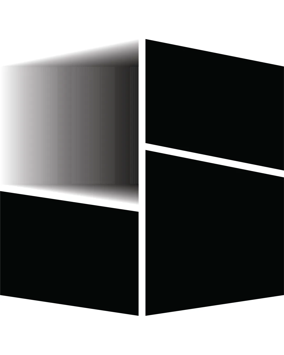
Window Like Quadrants With A 3d Perspective Effect..
Review the detailed scores below to see what is working and what should be refined first.
Objective AI feedback. Your creative decision.
Originality
Misread
Balance
Scale
Detailed review
Logo performance breakdown
Originality
 Perspective effect adds a unique twist to an otherwise familiar concept.
 Overall shape is extremely generic and reminiscent of widely recognized tech logos. No unique twist to quadrant arrangement or iconography besides the gradient.
Color harmony
Simple black, white, and gray palette is neutral and broadly applicable.
The grayscale gradient could cause inconsistencies in various use cases and may reproduce poorly in certain print conditions.
Black
#000000
White
#FFFFFF
Light Gray
#B0B0B0
Your palette is close. Refine the color roles and combinations before updating the logo.
Build brand colorsBalance alignment
Vertical and horizontal axes are evenly divided. Geometric quadrants generally feel balanced.
3D perspective causes left side to feel heavier and visually weighted. Fade-out disrupts symmetry and consistent alignment.

Scalability
Simple geometric shapes can scale well if not for the gradient effect.
The left-side gradient/fade degrades at smaller sizes or in low-resolution applications. Gradient effect will not translate well to embroidery, small icons, or black-and-white printing. Loses clarity and impact in contexts like business cards or app favicons.
200x250 px
100×125 px
50×62 px
Misinterpretations
No obvious accidental dual meanings or inappropriate interpretations detected.
Try your own review
Review my logo
Wondering how your logo performs?
Get a clear logo score, key risks, and priority fix ideas before your client or audience sees it.
Keep exploring


