 View review
Logo score
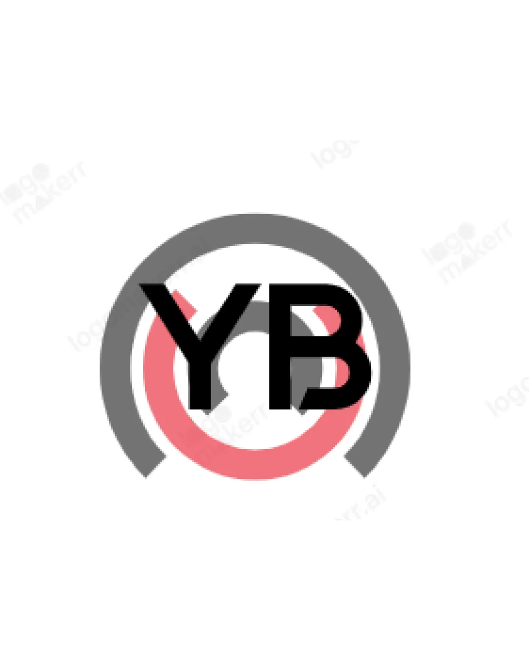
Logo review ofYb
Review the detailed scores below to see what is working and what should be refined first.
Legibility
Originality
Misread
Balance
Scale
Detailed review
Logo performance breakdown
Legibility
![]() The letters 'YB' are bold and placed centrally, making them relatively prominent.
The letters 'YB' are bold and placed centrally, making them relatively prominent.![]() Contrast between black typography and the light background aids visibility.
Contrast between black typography and the light background aids visibility.
![]() The abstract circles in the background intersect with the text, making parts of the letter 'Y' less clear.
The abstract circles in the background intersect with the text, making parts of the letter 'Y' less clear.![]() Overlapping elements decrease readability at small sizes or from a distance.
Overlapping elements decrease readability at small sizes or from a distance.
Originality
![]() Combines letterforms with abstract circular motifs.
Combines letterforms with abstract circular motifs.
![]() The layout—letters inside abstract rings—is a standard generic style and lacks a unique visual twist.
The layout—letters inside abstract rings—is a standard generic style and lacks a unique visual twist.![]() No creative integration or clever negative space present; looks like stock logo templates.
No creative integration or clever negative space present; looks like stock logo templates.
Color harmony
![]() Only two dominant colors are used, which keeps the palette simple.
Only two dominant colors are used, which keeps the palette simple.![]() Adequate contrast between logomark and white background.
Adequate contrast between logomark and white background.
![]() Subtle color differences between red and gray are not distinctive; could cause blending on colored or grayscale backgrounds.
Subtle color differences between red and gray are not distinctive; could cause blending on colored or grayscale backgrounds.
Dark Gray
#4A4A4A
Light Red
#EA6676
White
#FFFFFF
Your palette is close. Explore sharper color combinations with Colorfly.design before updating the logo.
Explore palettesBalance alignment
![]() The circular layout attempts to frame the text centrally.
The circular layout attempts to frame the text centrally.
![]() The lettermark floats awkwardly over the partially open rings, breaking compositional harmony.
The lettermark floats awkwardly over the partially open rings, breaking compositional harmony.![]() The outer gray ring’s gap is not visually referenced by the inner red ring, resulting in misalignment.
The outer gray ring’s gap is not visually referenced by the inner red ring, resulting in misalignment.

Scalability
![]() Bold typography should reproduce well in larger formats such as banners or posters.
Bold typography should reproduce well in larger formats such as banners or posters.
![]() Fine overlaps and concentric circles create visual clutter at smaller sizes, risking lack of clarity on business cards or mobile icons.
Fine overlaps and concentric circles create visual clutter at smaller sizes, risking lack of clarity on business cards or mobile icons.![]() The current dual-color setup and overlapping details are difficult to embroider or use in one-color applications.
The current dual-color setup and overlapping details are difficult to embroider or use in one-color applications.
200x250 px
100×125 px
50×62 px
Misinterpretations
![]() No inappropriate or controversial hidden imagery detected.
No inappropriate or controversial hidden imagery detected.
Symbol & text fit
![]() Logotype and logomark are closely overlaid.
Logotype and logomark are closely overlaid.
![]() The visual weight of the circular forms and bold letterforms conflict—neither element supports the other.
The visual weight of the circular forms and bold letterforms conflict—neither element supports the other.
![]() Stylistic disconnect between geometric rings and heavy sans-serif text.
Stylistic disconnect between geometric rings and heavy sans-serif text.
Try your own review
Review my logo
Wondering how your logo performs?
Get a clear logo score, key risks, and priority fix ideas before your client or audience sees it.
Keep exploring