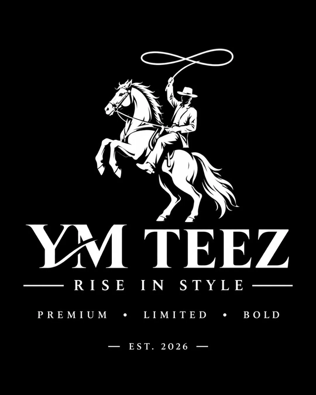
YM TEEZ RISE IN STYLE PREMIUM • LIMITED • BOLD.. logo review
4/5
Logo score
Logo review of

Ym Teez Rise In Style Premium • Limited • Bold..

A strong, memorable western-themed logo with bold illustration and professional execution, needing small adjustments for maximum versatility.

Combination Mark Western-inspired, Detailed, Monochrome Apparel
5/5
Legibility
4/5
Originality
5/5
Misread
3/5
Balance
3/5
Scale
Your next steps

What to fix first

Focus on the changes that matter. Keep what makes the logo work.

1

cowboy and horse illustration (upper section)

Test the logo at reduced scales to ensure essential details and character are preserved, or create a simplified alternate mark for small use.

Worth testing High priority Medium effort
Area to inspectApproximate location

The intricate detailing in the cowboy and horse illustration may lose clarity at small sizes.

How to check

Shrink the artwork to 1 inch wide and review for any lost clarity.

See the category review
2

'YM TEEZ' wordmark (middle section)

Adjust the joining stroke to better harmonize with the baseline of 'TEEZ', or soften its angle for improved balance.

Optional refinement Medium priority Low effort
Area to inspectApproximate location

The left-leaning slash element on the 'M' adds visual energy but disrupts the visual weight and alignment between 'YM' and 'TEEZ'.

How to check

Compare the current and revised lockup side by side for perceived balance.

See the category review
Detailed review

Logo performance breakdown

4/5

Brief & logo match

Based on your brief
Compared with

Branding for a premium t-shirt and cotton apparel line, with a western influence.

Captures the rugged western style and premium positioning, but risks minor clarity loss at small scale.

  • Distinctive Western Theme

    The cowboy and horse motif clearly signals a rugged, unique identity well-suited to apparel rooted in Americana.

  • Premium Positioning

    Serif type, structured tagline, and monochrome palette create an upscale, classic impression in line with 'premium' and 'limited'.

5/5

Legibility

  • Readable serif wordmark
  • Clear supporting taglines
4/5

Originality

  • Unique cowboy motif
  • Custom typographic tweak
3/5

Balance alignment

  • Dramatic layout
  • Eye-catching hierarchy
  • The left-leaning slash element on the 'M' adds visual energy but disrupts the visual weight and alignment between 'YM' and 'TEEZ'.

    Optional refinement 'YM TEEZ' wordmark (middle section)

    Try: Adjust the joining stroke to better harmonize with the baseline of 'TEEZ', or soften its angle for improved balance.

    Check: Compare the current and revised lockup side by side for perceived balance.

    Area to inspectApproximate location
Uploaded logoAlignment guide overlay

Inspect spacing with the guide. Optical balance may differ from geometric centering.

3/5

Scalability

  • Bold silhouette
  • Distinct subject
  • The intricate detailing in the cowboy and horse illustration may lose clarity at small sizes.

    Worth testing cowboy and horse illustration (upper section)

    Try: Test the logo at reduced scales to ensure essential details and character are preserved, or create a simplified alternate mark for small use.

    Check: Shrink the artwork to 1 inch wide and review for any lost clarity.
    Area to inspectApproximate location
Uploaded logo at 200 pixels wide
200 × 250 px
Uploaded logo at 100 pixels wide
100 × 125 px
Uploaded logo at 50 pixels wide
50 × 63 px

Compare the detail at different sizes. Labels show the full image dimensions.

5/5

Misinterpretations

  • No confusing forms
3/5

Symbol & text fit

  • Unified feel with visual connection
  • The detailed cowboy mark strongly draws attention, slightly overshadowing the brand name below.

    Optional refinement overall composition

    Try: Consider adjusting mark size or weight for better harmony between mark and wordmark.

    Check: Assess which element dominates at first glance; recalibrate scaling if the symbol consistently overshadows the name.

Black & white

Does the shape still work without color?

These tests are available only for logos uploaded in vector (SVG) format.

Background contrast

Find the surfaces where your logo stays clear.

These tests are available only for logos uploaded in vector (SVG) format.

Blur & silhouette

A 3px blur softens fine details so you can check whether the overall shape stays recognizable. If key gaps close or elements merge, the logo may rely too heavily on detail.

These tests are available only for logos uploaded in vector (SVG) format.

Try your own review

Wondering how your logo performs?

Get a clear logo score, key risks, and priority fix ideas before your client or audience sees it.

Review my logo