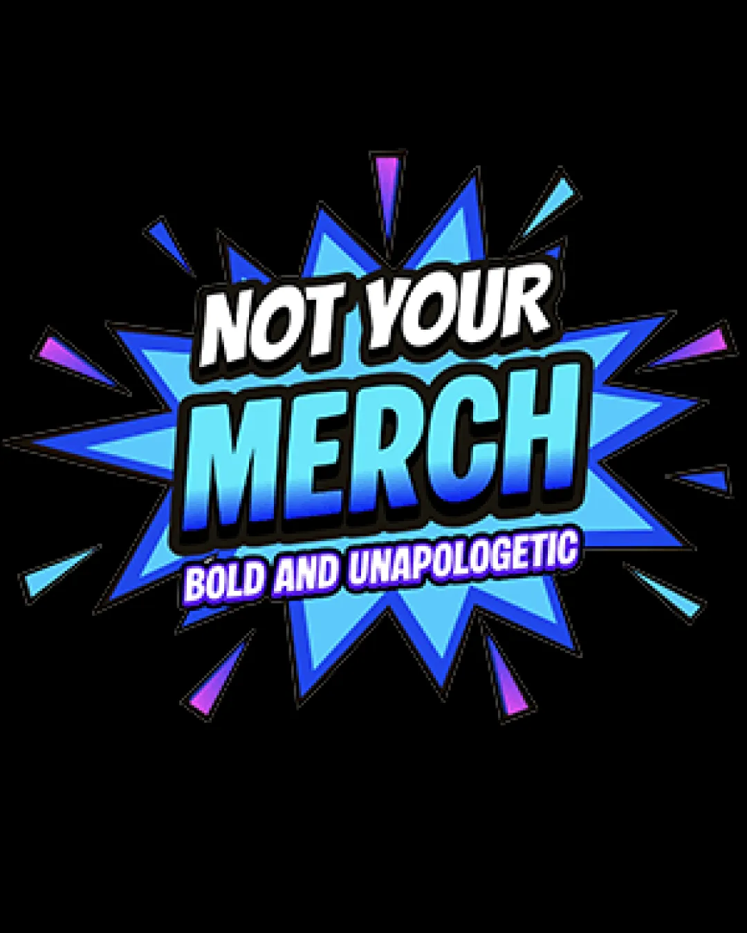
NOT YOUR MERCH BOLD AND UNAPOLOGETIC logo review
3.7 / 5
Logo score
Logo review of

Not Your Merch Bold And Unapologetic

Energetic and well-matched for merch, but clarity and simplicity need strengthening before wide deployment.

Combination Mark Playful Comic-inspired Merchandise
4/5
Legibility
3/5
Originality
5/5
Misread
4/5
Balance
3/5
Scale
Action plan

What to fix first

The most important fixes to handle before polishing the full presentation.

1

Increase clarity and stroke separation on 'BOLD AND UNAPOLOGETIC' to improve legibility at reduced sizes.

High priority

Tagline loses clarity and readability quickly when logo is shrunk.

Impact: Improves Scalability And Ensures Tagline Is Readable In Smaller Applications. · Effort: Low

2

Test simplified and single-color versions to ensure the logo remains effective and recognizable.

Medium priority

The current palette and outline effects may not adapt well in all formats.

Impact: Prepares The Design For Versatile Print/merchandise Scenarios Where Gradients Or Complex Spikes Cannot Be Reproduced. · Effort: Medium

Detailed review

Logo performance breakdown

4/5

Legibility

Checkmark icon Main text 'NOT YOUR MERCH' is bold and highly readable
Checkmark icon Good contrast on key text elements

Warning icon Smallest text 'BOLD AND UNAPOLOGETIC' can get hard to read at small sizes due to narrowness and outline

3/5

Originality

Checkmark icon Energetic comic style is a standout vibe for merch

Warning icon Visual motif is common in pop-culture and comic-related designs

4/5

Color harmony

Checkmark icon Cool tones work well with energetic theme, good contrast

Warning icon Gradient effects may lose clarity or create printing issues in some uses

Blue Ribbon
#2D64F5

Aqua
#4AE5FC

Purple
#8E3AFF

White
#FFFFFF

Black
#000000

Your palette is close. Refine the color roles and combinations before updating the logo.

Build brand colors
4/5

Balance alignment

Checkmark icon Visually centered, clear hierarchy with 'MERCH' as focal point

Warning icon Minor crowding between outline and spiky background

logo 200x250 pixels scalability test alignment grid overlay
3/5

Scalability

Checkmark icon Strong silhouette that stands out, low detail level helps scaling

Warning icon Thin outlines, text stacking, and gradients may blur at small sizes; complex outer spikes could crowd at small scale

logo 200x250 pixels scalability test

200x250 px

logo 100x125 pixels scalability test

100×125 px

logo 50x62 pixels scalability test

50×62 px

5/5

Misinterpretations

Checkmark icon No inappropriate or confusing visual misreads detected

4 / 5

Logo structure & brief match

Checkmark icon Starburst/comic burst ties well with bold text, integrated feel

Warning icon Text and mark are fused—may limit versatility if separated

Checkmark icon Energy And Boldness: The comic-style explosion background and strong bold text communicate a loud, unapologetic personality suitable for merchandise.
Checkmark icon Youthful Audience Appeal: Colors, dynamic shape, and cartoon influence feel targeted to a young, pop-culture-savvy market.

Try your own review

Wondering how your logo performs?

Get a clear logo score, key risks, and priority fix ideas before your client or audience sees it.

Review my logo