 View review
Logo score
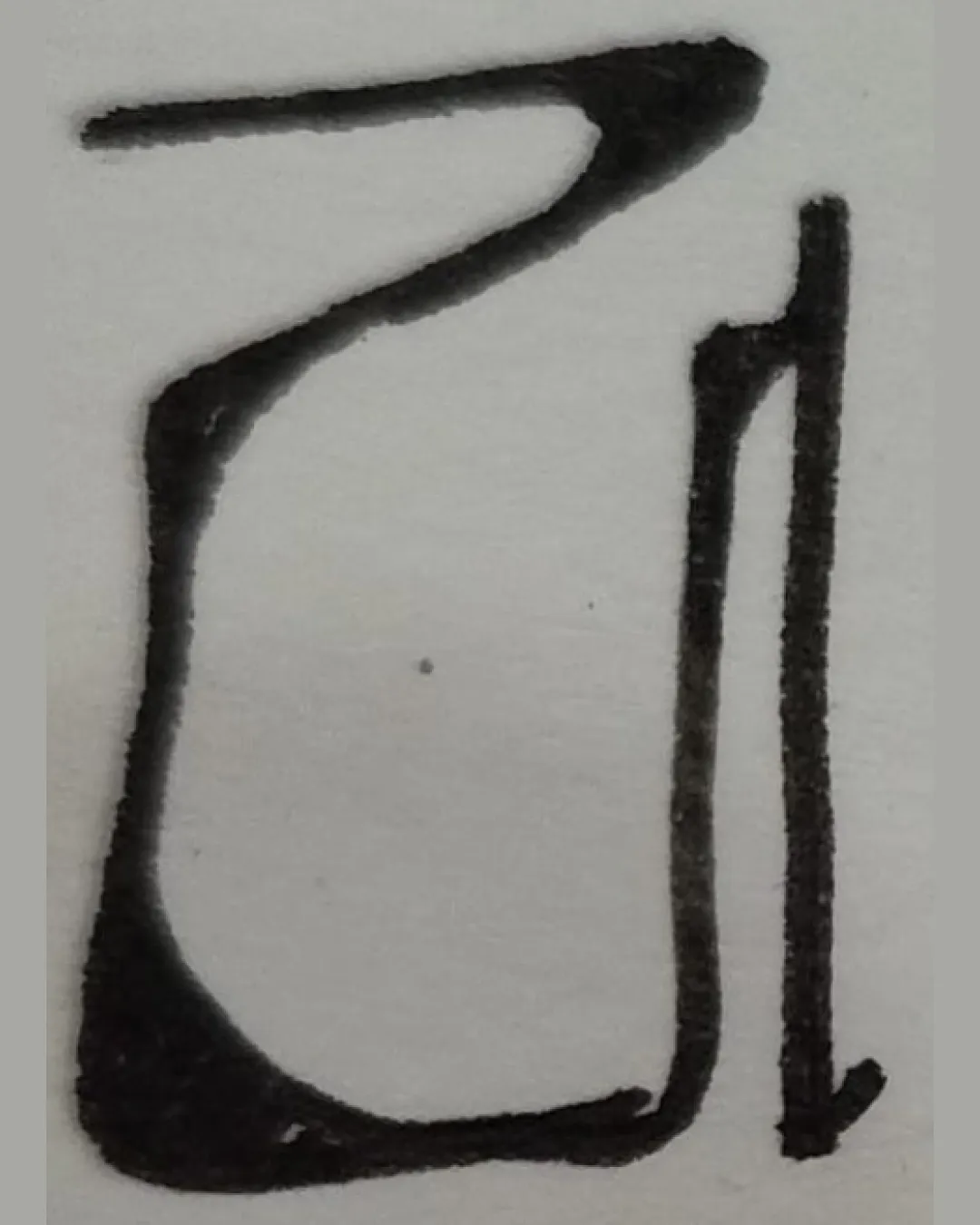
Logo review ofZ1
Review the detailed scores below to see what is working and what should be refined first.
Legibility
Originality
Misread
Balance
Scale
Detailed review
Logo performance breakdown
Legibility
![]() The shapes are distinct and could be interpreted as stylized letters.
The shapes are distinct and could be interpreted as stylized letters.
![]() Letterforms are ambiguous—could be mistaken for other symbols.
Letterforms are ambiguous—could be mistaken for other symbols.![]() The handwritten style compromises immediate readability.
The handwritten style compromises immediate readability.![]() No clear indication of business name or description.
No clear indication of business name or description.
Originality
![]() Unique hand-drawn quality sets it apart from digital generic monograms.
Unique hand-drawn quality sets it apart from digital generic monograms.![]() Abstract form avoids common cliches.
Abstract form avoids common cliches.
![]() Ambiguity makes it hard to associate with a brand or industry.
Ambiguity makes it hard to associate with a brand or industry.![]() Lacks an instantly memorable feature beyond the handwriting.
Lacks an instantly memorable feature beyond the handwriting.
Color harmony
![]() Monochrome choice is simple and effective.
Monochrome choice is simple and effective.
![]() Black and gray coloration is uninspired and could limit brand recall.
Black and gray coloration is uninspired and could limit brand recall.![]() Lacks color dynamism.
Lacks color dynamism.
Black
#191919
Athens Gray
#E3DFDD
Your palette is close. Explore sharper color combinations with Colorfly.design before updating the logo.
Explore palettesBalance alignment
![]() Intentional use of abstract balance.
Intentional use of abstract balance.
![]() Top-heavy appearance and inconsistent stroke thickness lead to visual imbalance.
Top-heavy appearance and inconsistent stroke thickness lead to visual imbalance.![]() No clear alignment between the elements, resulting in a lopsided look.
No clear alignment between the elements, resulting in a lopsided look.

Scalability
![]() Simple shapes may scale reasonably well in some formats.
Simple shapes may scale reasonably well in some formats.
![]() Hand-drawn unevenness could blur or lose definition at small sizes, such as on business cards or app icons.
Hand-drawn unevenness could blur or lose definition at small sizes, such as on business cards or app icons.![]() Not well-suited for embroidery or small-scale applications due to line variation.
Not well-suited for embroidery or small-scale applications due to line variation.
200x250 px
100×125 px
50×62 px
Misinterpretations
![]() No overtly inappropriate or controversial shapes detected.
No overtly inappropriate or controversial shapes detected.
Try your own review
Review my logo
Wondering how your logo performs?
Get a clear logo score, key risks, and priority fix ideas before your client or audience sees it.
Keep exploring