Logo review
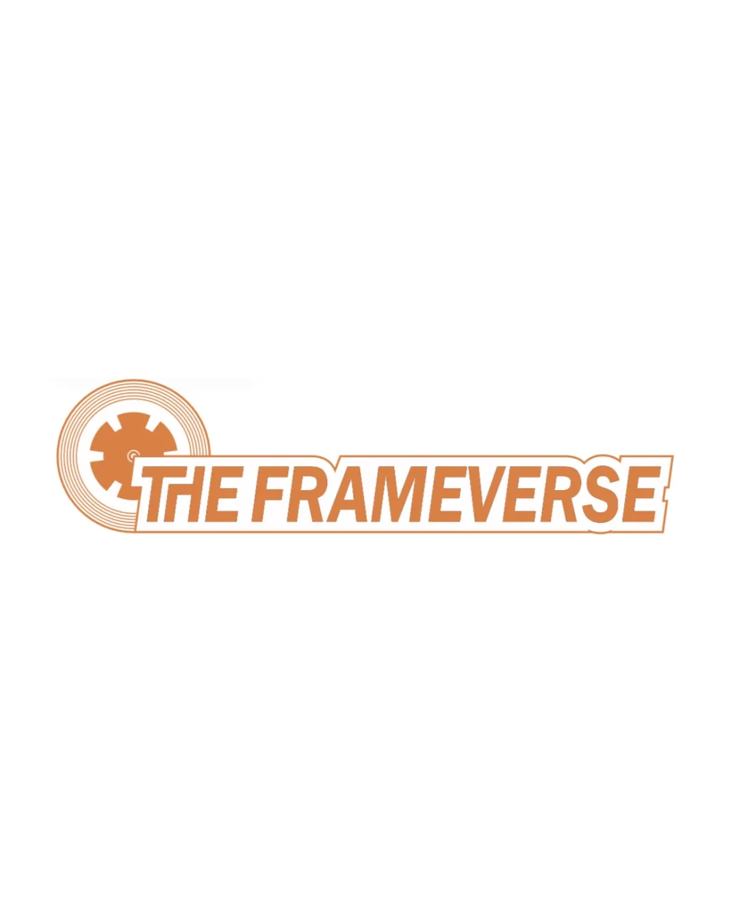
THE FRAMEVERSE
The logo achieves clarity and suggests a digital media focus, but the mark/text junction and generic motifs hold back visual cohesion and brand distinction.