Concept & direction
A gear and circular motif is paired with a bold nameplate, suggesting both technical aspects and broad connection or broadcasting, appropriate for a digitally focused content brand.
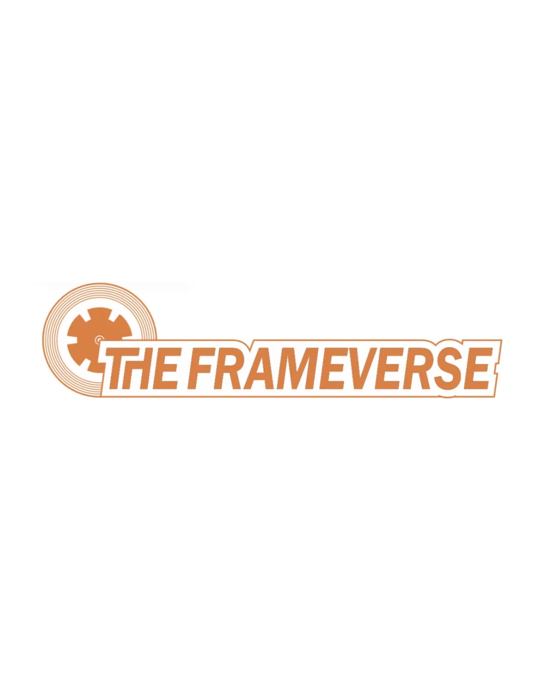
The logo achieves clarity and suggests a digital media focus, but the mark/text junction and generic motifs hold back visual cohesion and brand distinction.
This logo lockup has a workable foundation; improving visual balance is the clearest next step.
Focus on the changes that matter. Keep what makes the logo work.
A gear and circular motif is paired with a bold nameplate, suggesting both technical aspects and broad connection or broadcasting, appropriate for a digitally focused content brand.
Logo preview unavailable. The written feedback is still available on this card.
between the mark and left edge of the text box
The circular gear symbol sits closely to the left of the wordmark, with the rectangular box for the text partially overlapping the gear, resulting in an abrupt transition rather than a smooth or intentional integration.
See the category reviewThe logo's technical gear/circle symbol and clear bold wordmark fit the podcast and social content space, though visual integration and originality can be improved for stronger brand impact.
Wordmark 5/5 · Layout 5/5
Symbol 4/5 · Wordmark 4/5
Estimated colors. Use the original design file for exact values.
Create a full color palette using these colors
Create new paletteSymbol 3/5 · Wordmark 4/5 · Layout 3/5
Fine negative spaces in the gear teeth and thin concentric circle outlines could reduce visibility or merge at small sizes.
Symbol 3/5 · Wordmark 3/5
Gear and concentric circle motifs are common visual tropes for media, tech, or podcasting industries.
Symbol 3/5 · Wordmark 3/5 · Layout 3/5
The circular gear symbol sits closely to the left of the wordmark, with the rectangular box for the text partially overlapping the gear, resulting in an abrupt transition rather than a smooth or intentional integration.
Try: Refine the junction so the transition between the mark and box feels more organic or visually intentional.
Logo preview unavailable. The written feedback is still available on this card.

Inspect spacing with the guide. Optical balance may differ from geometric centering.
This review includes a score but no supporting explanation for this category.
Get a clear logo score, key risks, and priority fix ideas before your client or audience sees it.
More credits needed
Add credits to continue without losing your work.
Then $7/month. Cancel anytime.
Essential logo review with AI
Estimated progress