Logo review
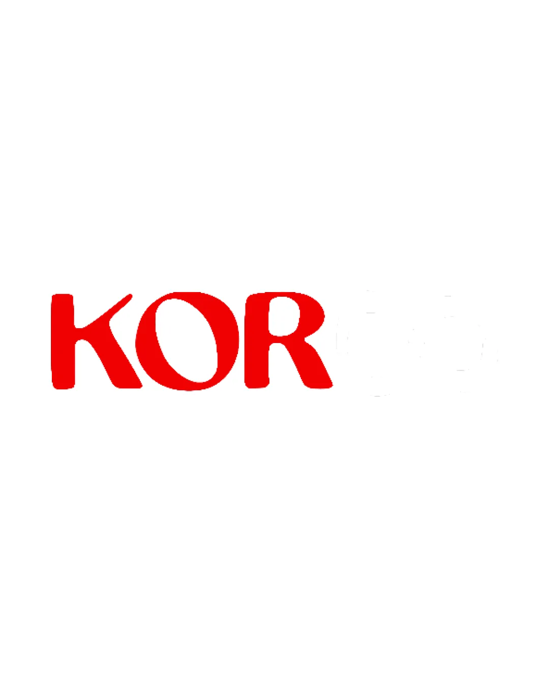
KOR
Clean, legible, and energetic wordmark, but too plain for a creative agency. Needs balancing refinement and a conceptual twist to compete in a saturated sector.