Refine the wordmark for more distinctiveness and balance
Balancing letter weights and adding a subtle twist will elevate originality and alignment.
Improves recognizability and professional polish, important for creative sector impact.
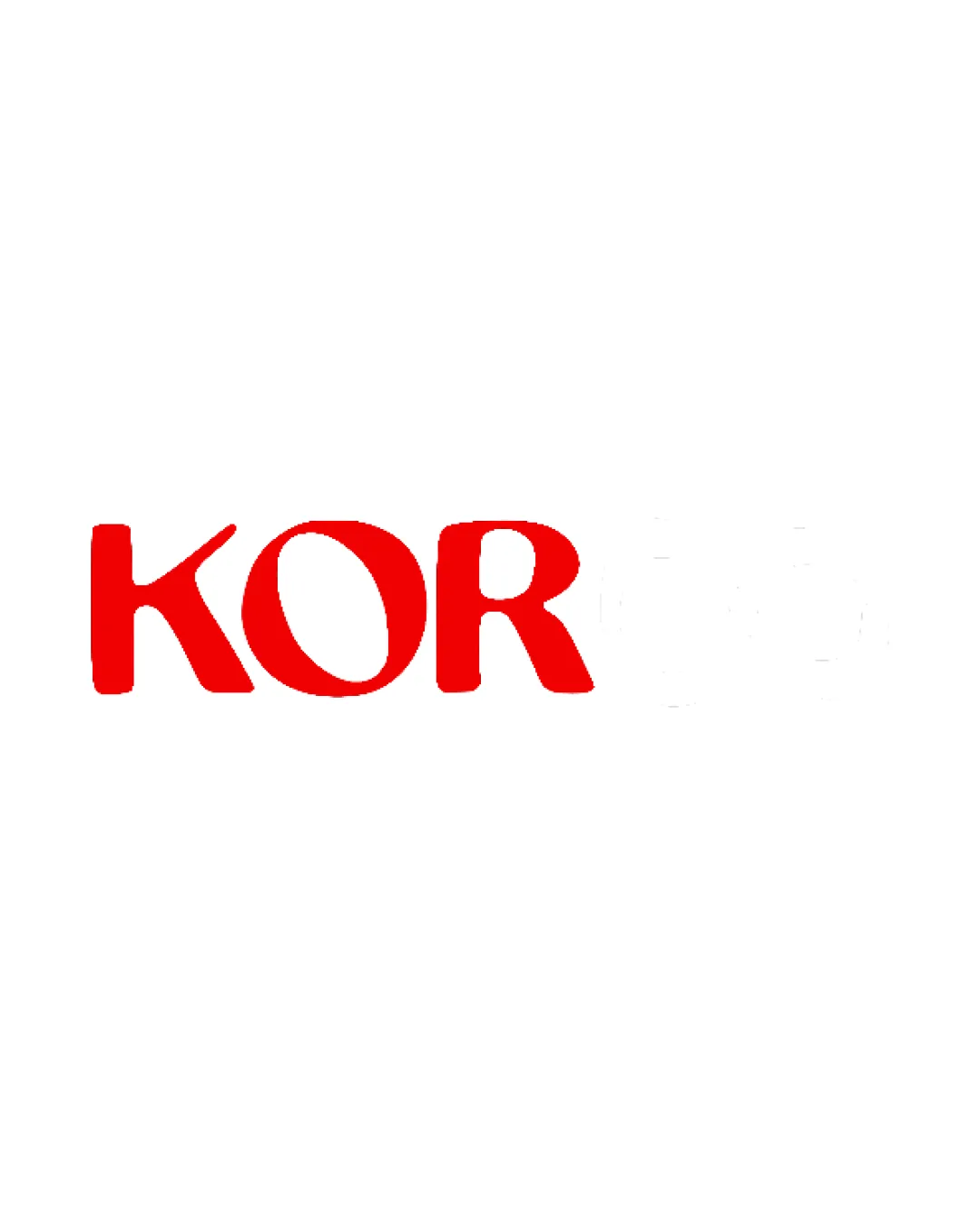
Clean, legible, and energetic wordmark, but too plain for a creative agency. Needs balancing refinement and a conceptual twist to compete in a saturated sector.
Focus on the changes that matter. Keep what makes the logo work.
Balancing letter weights and adding a subtle twist will elevate originality and alignment.
Improves recognizability and professional polish, important for creative sector impact.
A unique accent or mark can make the logo more suitable for a production house/creative agency.
Adds memorability and sector relevance.
Energetic color and clarity are appropriate, but lacks expressive or creative visual concept for the sector.
Estimated colors. Use the original design file for exact values.
Create a full color palette using these colors
Create new palette
Inspect spacing with the guide. Optical balance may differ from geometric centering.
Get a clear logo score, key risks, and priority fix ideas before your client or audience sees it.
More credits needed
Add credits to continue without losing your work.
Then $7/month. Cancel anytime.
Essential logo review with AI
Estimated progress